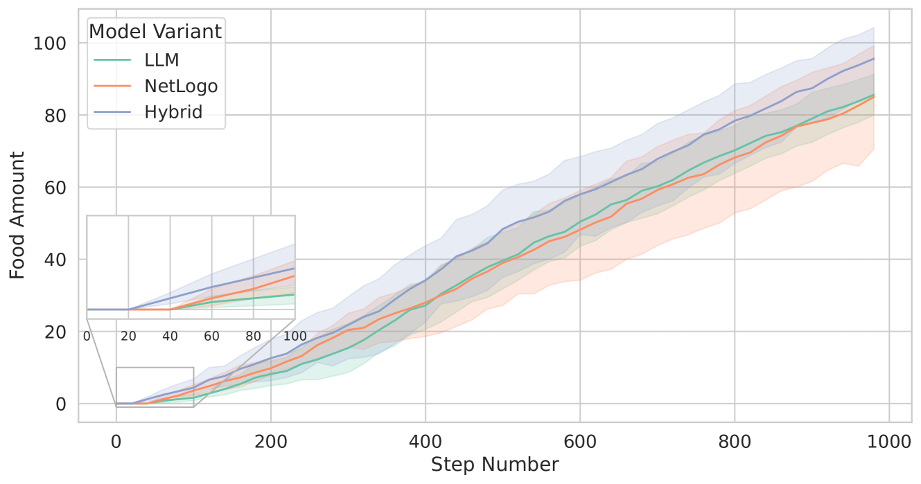
## Line Chart: Food Amount vs. Step Number for Different Model Variants
### Overview
The image is a line chart comparing the "Food Amount" over "Step Number" for three different "Model Variants": LLM, NetLogo, and Hybrid. The chart includes a zoomed-in inset of the initial steps. Each line is accompanied by a shaded region, presumably representing the standard deviation or confidence interval.
### Components/Axes
* **Title:** There is no explicit title on the chart.
* **X-axis:** "Step Number" ranging from 0 to 1000. Axis markers are present at intervals of 200 (0, 200, 400, 600, 800, 1000).
* **Y-axis:** "Food Amount" ranging from 0 to 100. Axis markers are present at intervals of 20 (0, 20, 40, 60, 80, 100).
* **Legend:** Located in the top-left corner.
* LLM (Sea Green)
* NetLogo (Salmon)
* Hybrid (Steel Blue)
* **Inset:** A zoomed-in view of the main chart for Step Number 0-100 and Food Amount 0-40.
### Detailed Analysis
* **LLM (Sea Green):** The line generally slopes upward.
* At Step Number 0, Food Amount is approximately 0.
* At Step Number 200, Food Amount is approximately 10.
* At Step Number 500, Food Amount is approximately 40.
* At Step Number 1000, Food Amount is approximately 80.
* **NetLogo (Salmon):** The line generally slopes upward.
* At Step Number 0, Food Amount is approximately 0.
* At Step Number 200, Food Amount is approximately 10.
* At Step Number 500, Food Amount is approximately 40.
* At Step Number 1000, Food Amount is approximately 75.
* **Hybrid (Steel Blue):** The line generally slopes upward.
* At Step Number 0, Food Amount is approximately 2.
* At Step Number 200, Food Amount is approximately 15.
* At Step Number 500, Food Amount is approximately 50.
* At Step Number 1000, Food Amount is approximately 90.
### Key Observations
* All three model variants show an increase in "Food Amount" as "Step Number" increases.
* The "Hybrid" model variant consistently has a higher "Food Amount" than the "LLM" and "NetLogo" variants.
* The "LLM" and "NetLogo" variants have similar "Food Amount" values throughout the range of "Step Number".
* The shaded regions around each line indicate variability in the "Food Amount" for each model variant. The "Hybrid" model appears to have the largest variability.
* The inset shows that the "Hybrid" model starts with a non-zero "Food Amount," while the other two start at zero.
### Interpretation
The chart compares the performance of three different model variants (LLM, NetLogo, and Hybrid) in terms of "Food Amount" over a series of "Step Number". The "Hybrid" model appears to perform better than the "LLM" and "NetLogo" models, consistently achieving a higher "Food Amount". The variability in "Food Amount," as indicated by the shaded regions, suggests that the performance of each model variant may fluctuate. The inset highlights the initial differences in "Food Amount" between the models, with the "Hybrid" model starting with a non-zero value. This could indicate an initial advantage or a different starting condition for the "Hybrid" model. The data suggests that the "Hybrid" model is more effective at accumulating "Food Amount" over time compared to the other two models.