\n
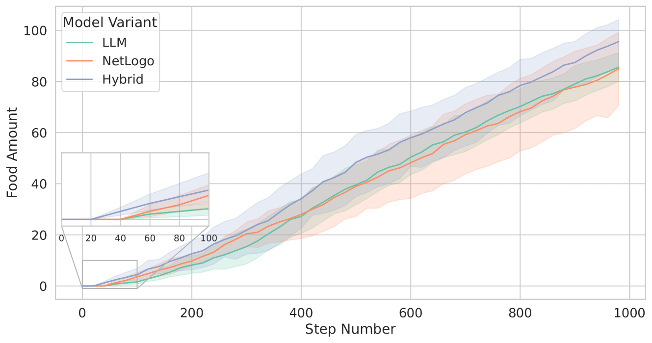
## Line Chart: Food Amount vs. Step Number for Three Model Variants
### Overview
The image displays a line chart comparing the performance of three model variants—LLM, NetLogo, and Hybrid—over 1000 simulation steps. The chart plots the "Food Amount" (y-axis) against the "Step Number" (x-axis). Each model's performance is represented by a central line (mean or median) surrounded by a shaded region indicating variability (likely confidence intervals or standard deviation). An inset graph in the bottom-left corner provides a zoomed-in view of the initial 100 steps.
### Components/Axes
* **Chart Title:** None visible.
* **Y-Axis:** Label is "Food Amount". Scale ranges from 0 to 100, with major tick marks at intervals of 20 (0, 20, 40, 60, 80, 100).
* **X-Axis:** Label is "Step Number". Scale ranges from 0 to 1000, with major tick marks at intervals of 200 (0, 200, 400, 600, 800, 1000).
* **Legend:** Located in the top-left corner of the main chart area. Title is "Model Variant". It defines three series:
* **LLM:** Green line.
* **NetLogo:** Orange line.
* **Hybrid:** Blue line.
* **Inset Graph:** Positioned in the bottom-left quadrant of the main chart.
* **Inset Y-Axis:** No label. Scale appears to be 0 to ~40, with ticks at 0, 20, 40.
* **Inset X-Axis:** No label. Scale is 0 to 100, with ticks at 0, 20, 40, 60, 80, 100.
* **Inset Content:** Shows the same three model lines (Green/LLM, Orange/NetLogo, Blue/Hybrid) for the first 100 steps, providing detail on the initial growth phase.
### Detailed Analysis
**Trend Verification & Data Points (Approximate):**
All three models show a positive, roughly linear trend in Food Amount over steps. The Hybrid model consistently outperforms the other two after the initial phase.
1. **LLM (Green Line):**
* **Trend:** Slopes upward steadily. It is the lowest-performing model for most of the simulation after step ~200.
* **Key Points (Approximate):**
* Step 0: ~0
* Step 100 (from inset): ~10
* Step 200: ~15
* Step 400: ~30
* Step 600: ~50
* Step 800: ~70
* Step 1000: ~85
* **Variability (Shaded Region):** The green shaded area is relatively narrow, suggesting lower variance in performance compared to NetLogo.
2. **NetLogo (Orange Line):**
* **Trend:** Slopes upward. It starts similarly to LLM but begins to diverge slightly higher after step ~200, though it remains below Hybrid.
* **Key Points (Approximate):**
* Step 0: ~0
* Step 100 (from inset): ~15
* Step 200: ~20
* Step 400: ~35
* Step 600: ~55
* Step 800: ~75
* Step 1000: ~85 (appears to converge with LLM at the end)
* **Variability (Shaded Region):** The orange shaded area is the widest, especially from step 400 onward, indicating the highest variance or uncertainty in its results.
3. **Hybrid (Blue Line):**
* **Trend:** Slopes upward most steeply. It separates from the other two models early (visible in the inset) and maintains the highest Food Amount throughout.
* **Key Points (Approximate):**
* Step 0: ~0
* Step 100 (from inset): ~20
* Step 200: ~25
* Step 400: ~40
* Step 600: ~60
* Step 800: ~80
* Step 1000: ~95
* **Variability (Shaded Region):** The blue shaded area is moderate, wider than LLM's but narrower than NetLogo's.
**Inset Analysis (Steps 0-100):**
The inset clarifies the initial dynamics. All models start at 0. The Hybrid (blue) line shows the fastest initial growth, reaching ~20 by step 100. The NetLogo (orange) line is next (~15), and the LLM (green) line is the slowest (~10). This early advantage for the Hybrid model is maintained throughout the simulation.
### Key Observations
1. **Performance Hierarchy:** A clear and consistent hierarchy is established early and maintained: Hybrid > NetLogo > LLM for the majority of the simulation. By step 1000, LLM and NetLogo appear to converge at a similar final value (~85), while Hybrid finishes higher (~95).
2. **Divergence Point:** The models begin to diverge noticeably around step 100-200. The inset is crucial for observing this early separation.
3. **Variability Patterns:** The NetLogo model exhibits the greatest performance variability (widest shaded band), suggesting its outcomes are less predictable. The LLM model shows the most consistent (least variable) performance.
4. **Linear Growth:** All three models demonstrate approximately linear growth in Food Amount over the 1000 steps, with no obvious plateaus or exponential phases.
### Interpretation
The data suggests that the **Hybrid model variant is the most effective** at accumulating "Food Amount" over time in this simulation, demonstrating both a higher growth rate and a superior final outcome. Its early advantage, visible in the inset, compounds over the 1000 steps.
The **NetLogo model**, while achieving a similar final amount to the LLM, shows significantly higher uncertainty in its results. This could imply that its performance is more sensitive to initial conditions or stochastic elements within the simulation.
The **LLM model** is the most consistent but has the lowest growth rate, resulting in the lowest performance for most of the run. The convergence of LLM and NetLogo at step 1000 is an interesting anomaly; it suggests that despite different growth trajectories and variances, these two approaches may have a similar long-term ceiling under these conditions.
The chart effectively communicates that combining approaches (Hybrid) yields better results than using either the LLM or NetLogo methods in isolation for this specific task. The inclusion of the inset is a critical design choice, as it highlights that the decisive performance differences are established very early in the process.