# Technical Data Extraction: Heatmap Analysis of $\Delta W_q$
## 1. Document Overview
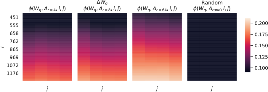
This image contains a series of four heatmaps representing mathematical or neural network weight analysis, specifically focusing on the term $\Delta W_q$. The visualization compares the subspace similarity or projection $\phi$ across different rank settings ($r=4, 8, 64$) against a random baseline.
## 2. Component Isolation
### A. Header / Titles
The image is organized into four distinct columns, each with a specific mathematical label:
1. **Column 1:** $\phi(W_q, A_{r=4}, i, j)$
2. **Column 2:** $\Delta W_q$ (Main Header) / $\phi(W_q, A_{r=8}, i, j)$ (Sub-header)
3. **Column 3:** $\phi(W_q, A_{r=64}, i, j)$
4. **Column 4:** Random (Main Header) / $\phi(W_q, A_{rand}, i, j)$ (Sub-header)
### B. Axis Definitions
* **Y-Axis (Leftmost):** Labeled as $i$. It contains numerical markers: `451`, `555`, `658`, `762`, `865`, `969`, `1072`, `1176`. The values increase from top to bottom.
* **X-Axis (Bottom of each plot):** Labeled as $j$. There are no numerical markers on the x-axis, but the visual grid suggests a low-dimensional space (approximately 4-8 columns per heatmap).
### C. Legend (Color Bar)
* **Location:** Right side of the image.
* **Scale:** Linear gradient from dark purple/black to light peach/white.
* **Numerical Markers:** `0.100`, `0.125`, `0.150`, `0.175`, `0.200`.
* **Interpretation:** Darker colors represent lower values (~0.100), while lighter/brighter colors represent higher values (up to and exceeding 0.200).
## 3. Data Extraction and Trend Analysis
### Trend Verification
* **Vertical Trend:** In the first three heatmaps ($r=4, 8, 64$), there is a strong positive correlation between the index $i$ and the value $\phi$. As $i$ increases (moving down the chart), the color shifts from dark purple to bright orange/peach, indicating higher values.
* **Rank Trend ($r$):** As the rank $r$ increases from 4 to 64, the overall intensity of the heatmap increases. The $r=64$ plot is significantly "brighter" (higher values) than the $r=4$ plot.
* **Baseline Comparison:** The "Random" plot is almost entirely dark (near the 0.100 level), showing no significant correlation with $i$ or $j$.
### Heatmap Data Breakdown
| Feature | $\phi(W_q, A_{r=4}, i, j)$ | $\phi(W_q, A_{r=8}, i, j)$ | $\phi(W_q, A_{r=64}, i, j)$ | Random |
| :--- | :--- | :--- | :--- | :--- |
| **Top Region ($i \approx 451$)** | Dark (~0.100) | Dark (~0.100) | Dark Purple (~0.115) | Black (< 0.100) |
| **Mid Region ($i \approx 865$)** | Magenta (~0.140) | Pink/Red (~0.155) | Bright Red (~0.170) | Black (< 0.100) |
| **Bottom Region ($i \approx 1176$)** | Orange (~0.175) | Peach (~0.190) | Light Peach (> 0.200) | Black (< 0.100) |
## 4. Technical Summary
The visualization demonstrates that the similarity measure $\phi$ is highly dependent on the index $i$ and the rank $r$.
1. **Rank Sensitivity:** Higher ranks ($r=64$) capture more information or show higher similarity to the target $W_q$ compared to lower ranks ($r=4$).
2. **Index Sensitivity:** There is a clear gradient where higher indices ($i$) result in higher $\phi$ values. This suggests that the underlying data structure or weight matrix has a non-uniform distribution of importance or magnitude that correlates with the index.
3. **Significance:** The "Random" baseline confirms that the patterns observed in the first three plots are statistically significant and not a result of random noise, as the random projection yields values consistently at the bottom of the scale (~0.100).