## Bar Chart: Race Distribution
### Overview
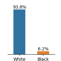
The image is a bar chart showing the distribution of two races: White and Black. The y-axis represents the percentage, and the x-axis represents the race. The chart indicates that White individuals make up 93.8% of the population, while Black individuals make up 6.2%.
### Components/Axes
* **X-axis:** Represents the race categories: White and Black.
* **Y-axis:** Represents the percentage. The scale is not explicitly shown, but the bar heights indicate the percentages.
* **Bars:**
* A blue bar represents the percentage of White individuals.
* An orange bar represents the percentage of Black individuals.
* **Labels:**
* "White" is labeled under the blue bar.
* "Black" is labeled under the orange bar.
* **Values:**
* 93.8% is displayed above the blue bar.
* 6.2% is displayed above the orange bar.
### Detailed Analysis
* **White:** The blue bar extends to a height representing 93.8%.
* **Black:** The orange bar extends to a height representing 6.2%.
### Key Observations
* The percentage of White individuals is significantly higher than the percentage of Black individuals.
### Interpretation
The bar chart illustrates a significant disparity in the distribution of races, with White individuals representing a much larger proportion of the population compared to Black individuals. The data suggests a strong imbalance in the racial composition of the population being represented.