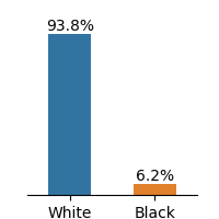
## Bar Chart: Demographic Distribution by Race
### Overview
The image displays a bar chart comparing two racial categories: "White" and "Black". The chart uses vertical bars to represent percentages, with a stark contrast in proportions between the two groups.
### Components/Axes
- **X-axis**: Labeled with two categories: "White" (left) and "Black" (right). No explicit axis title is visible.
- **Y-axis**: Implicitly represents percentages, with values ranging from 0% to 100% (inferred from the labeled percentages).
- **Legend**: Located on the right side of the chart. Blue corresponds to "White", and orange corresponds to "Black".
- **Data Labels**: Percentages are explicitly written above each bar: "93.8%" for "White" and "6.2%" for "Black".
### Detailed Analysis
- **White Category**: A tall blue bar dominates the left side, labeled "93.8%". This indicates the majority representation of the "White" group.
- **Black Category**: A short orange bar on the right side, labeled "6.2%", represents the minority proportion of the "Black" group.
- **Color Consistency**: The legend confirms the color coding: blue = White, orange = Black. No discrepancies observed.
### Key Observations
1. The "White" category accounts for **93.8%** of the total, while the "Black" category constitutes only **6.2%**.
2. The disparity between the two groups is extreme, with the "White" bar being approximately **15 times taller** than the "Black" bar.
3. No additional categories or sub-categories are present in the chart.
### Interpretation
The data suggests a significant imbalance in the representation of racial groups, with the "White" group overwhelmingly dominant. This could reflect demographic trends in a specific population, institutional data, or survey results. The stark contrast raises questions about systemic factors, sampling methods, or contextual factors influencing the distribution. The absence of a chart title or additional context limits the ability to determine the exact scope (e.g., geographic region, institution, or time period). The simplicity of the chart emphasizes the magnitude of the disparity but leaves room for further investigation into the underlying causes.