## Grouped Bar Chart: AUC Comparison of ASGL Variants Across Datasets
### Overview
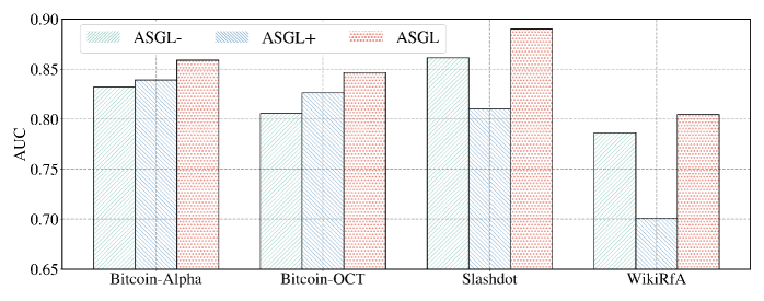
The image displays a grouped bar chart comparing the Area Under the Curve (AUC) performance of three model variants—ASGL-, ASGL+, and ASGL—across four different network datasets. The chart uses hatching patterns instead of solid colors to distinguish the data series.
### Components/Axes
* **Chart Type:** Grouped Bar Chart.
* **Y-Axis:**
- **Label:** "AUC"
- **Scale:** Linear, ranging from 0.65 to 0.90, with major gridlines at intervals of 0.05 (0.65, 0.70, 0.75, 0.80, 0.85, 0.90).
* **X-Axis:**
- **Categories (Datasets):** Four distinct categories are labeled: "Bitcoin-Alpha", "Bitcoin-OCT", "Slashdot", and "WikiRfA".
* **Legend:**
- **Position:** Top-left corner of the chart area.
- **Series:**
1. **ASGL-:** Represented by bars with a diagonal stripe pattern (lines sloping down from left to right).
2. **ASGL+:** Represented by bars with a dotted pattern.
3. **ASGL:** Represented by bars with a cross-hatch pattern (diagonal lines in both directions).
### Detailed Analysis
The chart presents AUC values for each variant on each dataset. Values are approximate based on visual alignment with the Y-axis gridlines.
**1. Bitcoin-Alpha:**
* **ASGL- (Diagonal Stripes):** ~0.83
* **ASGL+ (Dots):** ~0.84
* **ASGL (Cross-hatch):** ~0.86
* **Trend:** Performance increases from ASGL- to ASGL+ to ASGL.
**2. Bitcoin-OCT:**
* **ASGL- (Diagonal Stripes):** ~0.805
* **ASGL+ (Dots):** ~0.825
* **ASGL (Cross-hatch):** ~0.845
* **Trend:** Performance increases from ASGL- to ASGL+ to ASGL.
**3. Slashdot:**
* **ASGL- (Diagonal Stripes):** ~0.86
* **ASGL+ (Dots):** ~0.81
* **ASGL (Cross-hatch):** ~0.89
* **Trend:** Non-monotonic. ASGL- performs better than ASGL+, but ASGL achieves the highest score.
**4. WikiRfA:**
* **ASGL- (Diagonal Stripes):** ~0.785
* **ASGL+ (Dots):** ~0.70
* **ASGL (Cross-hatch):** ~0.805
* **Trend:** Non-monotonic. ASGL+ shows a significant drop in performance compared to ASGL-, while ASGL recovers to achieve the highest score for this dataset.
### Key Observations
1. **Consistent Leader:** The **ASGL** variant (cross-hatch pattern) achieves the highest AUC score on all four datasets.
2. **Dataset Difficulty:** The **WikiRfA** dataset appears to be the most challenging, as all three variants show their lowest performance here. The **ASGL+** variant's performance on WikiRfA (~0.70) is a notable outlier, being the lowest single data point in the chart.
3. **Anomalous Trend on Slashdot:** The **Slashdot** dataset is the only one where the **ASGL-** variant outperforms the **ASGL+** variant. This breaks the pattern seen in the Bitcoin datasets where ASGL+ consistently scored higher than ASGL-.
4. **Visual Encoding:** The chart relies entirely on hatching patterns for differentiation, which is effective for black-and-white printing but requires careful visual matching between the legend and bars.
### Interpretation
This chart demonstrates the comparative effectiveness of the ASGL method and its ablated versions (ASGL-, ASGL+) for a link prediction or network analysis task (inferred from the use of AUC and common network dataset names).
* **Core Finding:** The full **ASGL** model is robust and superior across diverse network types (cryptocurrency trust networks like Bitcoin-Alpha/OCT, social news like Slashdot, and Wikipedia adminship votes like WikiRfA). This suggests its algorithmic components work synergistically.
* **Ablation Insight:** Removing components (to create ASGL- and ASGL+) generally harms performance, but the impact is dataset-dependent. The severe drop of **ASGL+** on **WikiRfA** indicates that the component removed in ASGL- but present in ASGL+ is critical for that specific type of voting/controversy network. Conversely, on **Slashdot**, that same component may be slightly detrimental or noisy.
* **Practical Implication:** The results argue for using the complete ASGL model for general-purpose application. However, the performance variance of the ablated versions provides diagnostic insight into which parts of the model are most valuable for different network structures, guiding future refinement. The chart effectively communicates that model architecture choices have non-uniform effects across different data domains.