## Chart: Logarithmic Plot of Number of Calls vs. Number of Clauses
### Overview
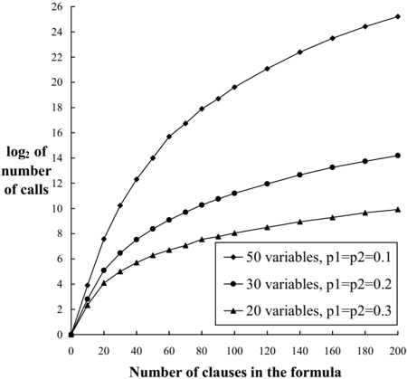
The image is a line chart that plots the base-2 logarithm of the number of calls against the number of clauses in a formula. There are three data series, each representing a different number of variables (50, 30, and 20) with corresponding probabilities p1 and p2. The x-axis represents the number of clauses in the formula, ranging from 0 to 200. The y-axis represents the log base 2 of the number of calls, ranging from 0 to 26.
### Components/Axes
* **X-axis:** "Number of clauses in the formula" with tick marks at intervals of 20, ranging from 0 to 200.
* **Y-axis:** "log2 of number of calls" with tick marks at intervals of 2, ranging from 0 to 26.
* **Legend (bottom-right):**
* Line with diamond markers: "50 variables, p1=p2=0.1"
* Line with circle markers: "30 variables, p1=p2=0.2"
* Line with triangle markers: "20 variables, p1=p2=0.3"
### Detailed Analysis
* **50 variables, p1=p2=0.1 (Line with diamond markers):**
* Trend: The line slopes upward, with a decreasing rate of increase as the number of clauses increases.
* Data Points:
* At 0 clauses, log2(calls) ≈ 0
* At 20 clauses, log2(calls) ≈ 7
* At 40 clauses, log2(calls) ≈ 11
* At 60 clauses, log2(calls) ≈ 14
* At 80 clauses, log2(calls) ≈ 16
* At 100 clauses, log2(calls) ≈ 17.5
* At 120 clauses, log2(calls) ≈ 19
* At 140 clauses, log2(calls) ≈ 20
* At 160 clauses, log2(calls) ≈ 21
* At 180 clauses, log2(calls) ≈ 22
* At 200 clauses, log2(calls) ≈ 23
* **30 variables, p1=p2=0.2 (Line with circle markers):**
* Trend: The line slopes upward, with a decreasing rate of increase as the number of clauses increases.
* Data Points:
* At 0 clauses, log2(calls) ≈ 0
* At 20 clauses, log2(calls) ≈ 5
* At 40 clauses, log2(calls) ≈ 7.5
* At 60 clauses, log2(calls) ≈ 9
* At 80 clauses, log2(calls) ≈ 10
* At 100 clauses, log2(calls) ≈ 11
* At 120 clauses, log2(calls) ≈ 11.7
* At 140 clauses, log2(calls) ≈ 12.3
* At 160 clauses, log2(calls) ≈ 12.8
* At 180 clauses, log2(calls) ≈ 13.3
* At 200 clauses, log2(calls) ≈ 14
* **20 variables, p1=p2=0.3 (Line with triangle markers):**
* Trend: The line slopes upward, with a decreasing rate of increase as the number of clauses increases.
* Data Points:
* At 0 clauses, log2(calls) ≈ 0
* At 20 clauses, log2(calls) ≈ 3
* At 40 clauses, log2(calls) ≈ 5
* At 60 clauses, log2(calls) ≈ 6
* At 80 clauses, log2(calls) ≈ 6.8
* At 100 clauses, log2(calls) ≈ 7.3
* At 120 clauses, log2(calls) ≈ 7.7
* At 140 clauses, log2(calls) ≈ 8
* At 160 clauses, log2(calls) ≈ 8.3
* At 180 clauses, log2(calls) ≈ 8.6
* At 200 clauses, log2(calls) ≈ 9
### Key Observations
* For a fixed number of clauses, the log2 of the number of calls increases as the number of variables increases (and p1=p2 decreases).
* The rate of increase of log2(calls) decreases as the number of clauses increases for all three data series.
* The line representing 50 variables has the highest values for log2(calls) across the entire range of clauses.
* The line representing 20 variables has the lowest values for log2(calls) across the entire range of clauses.
### Interpretation
The chart illustrates the relationship between the number of clauses in a formula and the number of calls required, under different conditions defined by the number of variables and probabilities p1 and p2. The logarithmic scale on the y-axis suggests that the actual number of calls grows exponentially with the number of clauses. The data indicates that increasing the number of variables (while decreasing the probabilities p1 and p2) leads to a higher number of calls for a given number of clauses. This could be interpreted as an increase in the complexity of the problem, requiring more calls to solve. The diminishing rate of increase in log2(calls) as the number of clauses increases suggests that the marginal cost of adding more clauses decreases, possibly due to some form of optimization or saturation effect.