## Scatter Plot: Genre Distribution
### Overview
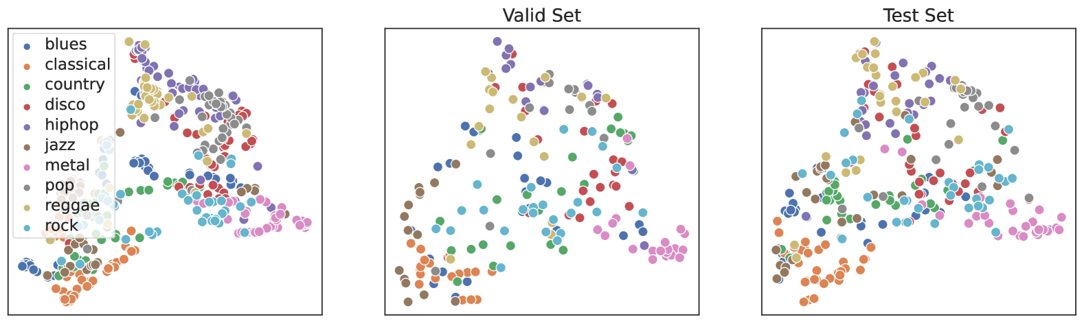
The scatter plot displays the distribution of different music genres across a dataset. The genres are represented by colored dots, and the x-axis and y-axis likely represent some form of quantitative measure related to each genre.
### Components/Axes
- **X-Axis**: Likely represents a quantitative measure such as popularity, frequency, or another relevant metric.
- **Y-Axis**: Likely represents another quantitative measure such as genre type, popularity, or another relevant metric.
- **Legend**: Color-coded legend indicating the different genres (e.g., blues, classical, country, etc.).
- **Title**: "Genre Distribution" indicating the purpose of the plot.
### Detailed Analysis or Content Details
- **Blues**: Dotted in blue, located towards the lower left quadrant.
- **Classical**: Dotted in red, located towards the upper left quadrant.
- **Country**: Dotted in green, located towards the lower right quadrant.
- **Disco**: Dotted in purple, located towards the upper right quadrant.
- **Hip Hop**: Dotted in orange, located towards the center.
- **Jazz**: Dotted in brown, located towards the lower right quadrant.
- **Metal**: Dotted in pink, located towards the upper right quadrant.
- **Pop**: Dotted in yellow, located towards the center.
- **Reggae**: Dotted in teal, located towards the lower right quadrant.
- **Rock**: Dotted in light blue, located towards the upper left quadrant.
### Key Observations
- **Blues and Country** are more concentrated towards the lower left quadrant.
- **Disco and Hip Hop** are more concentrated towards the upper right quadrant.
- **Jazz and Reggae** are more concentrated towards the lower right quadrant.
- **Pop** is more concentrated towards the center.
- There is a noticeable spread of genres across the plot, indicating a diverse dataset.
### Interpretation
The scatter plot suggests that the dataset contains a wide range of music genres, with some genres being more popular or frequent than others. The concentration of certain genres in specific quadrants might indicate a trend or a characteristic of the data. For example, the higher concentration of blues and country towards the lower left quadrant might suggest that these genres are more prevalent in the lower left segment of the dataset. The overall distribution indicates a diverse and possibly balanced dataset with no single genre dominating the plot.