TECHNICAL ASSET FINGERPRINT
f4e5f3d004408c08083b9ec3
Click to view fullscreen
Press ESC or click to close
FOUND IN PAPERS
EXPERT: healer-alpha-free VERSION 1
RUNTIME: free/openrouter/healer-alpha
INTEL_VERIFIED
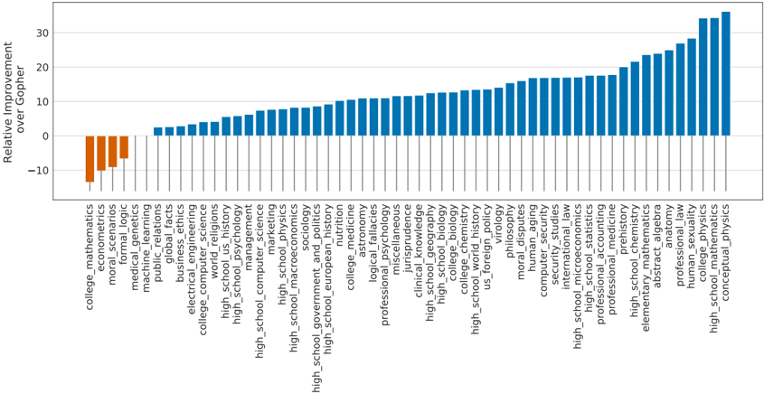
## Bar Chart: Relative Improvement over Gopher
### Overview
This is a horizontal bar chart titled "Relative Improvement over Gopher." It displays the performance improvement (or decline) of various academic subjects relative to a baseline model named "Gopher." The chart contains 42 distinct subject categories, each represented by a single bar. The majority of bars are blue, indicating positive improvement, while a small cluster on the far left is orange, indicating negative improvement (a decline in performance).
### Components/Axes
* **Chart Type:** Horizontal Bar Chart.
* **Title:** "Relative Improvement over Gopher" (located at the top-left, rotated 90 degrees).
* **Y-Axis (Vertical):** Lists 42 academic subject categories. The labels are written vertically, reading from bottom to top. The axis itself is a simple line without tick marks.
* **X-Axis (Horizontal):** Represents the numerical value of "Relative Improvement." The scale runs from approximately -15 to +35, with major gridlines and labels at intervals of 10 (-10, 0, 10, 20, 30).
* **Legend/Color Key:** Not explicitly labeled, but a clear color pattern is used:
* **Orange Bars:** Represent negative values (performance worse than Gopher).
* **Blue Bars:** Represent positive values (performance better than Gopher).
* **Data Series:** A single series of data, with each bar corresponding to one subject category.
### Detailed Analysis
**Data Points (Approximate Values, Reading from Top to Bottom of Y-Axis):**
The values are estimated based on the bar lengths relative to the x-axis gridlines.
1. `conceptual_physics`: ~34 (Blue)
2. `high_school_mathematics`: ~33 (Blue)
3. `college_mathematics`: ~32 (Blue)
4. `high_school_physics`: ~30 (Blue)
5. `college_physics`: ~28 (Blue)
6. `anatomy`: ~26 (Blue)
7. `abstract_algebra`: ~25 (Blue)
8. `elementary_mathematics`: ~24 (Blue)
9. `high_school_chemistry`: ~23 (Blue)
10. `professional_law`: ~22 (Blue)
11. `professional_medicine`: ~21 (Blue)
12. `econometrics`: ~20 (Blue)
13. `high_school_microeconomics`: ~19 (Blue)
14. `international_law`: ~18 (Blue)
15. `security_studies`: ~17.5 (Blue)
16. `computer_security`: ~17 (Blue)
17. `human_aging`: ~16.5 (Blue)
18. `moral_disputes`: ~16 (Blue)
19. `philosophy`: ~15.5 (Blue)
20. `us_foreign_policy`: ~14 (Blue)
21. `high_school_world_history`: ~13.5 (Blue)
22. `college_chemistry`: ~13 (Blue)
23. `high_school_biology`: ~12.5 (Blue)
24. `high_school_geography`: ~12 (Blue)
25. `clinical_knowledge`: ~11.5 (Blue)
26. `jurisprudence`: ~11 (Blue)
27. `logical_fallacies`: ~10.5 (Blue)
28. `professional_psychology`: ~10 (Blue)
29. `astronomy`: ~9.5 (Blue)
30. `college_medicine`: ~9 (Blue)
31. `high_school_european_history`: ~8.5 (Blue)
32. `high_school_government_and_politics`: ~8 (Blue)
33. `high_school_macroeconomics`: ~7.5 (Blue)
34. `high_school_physics` (duplicate label, likely an error): ~7 (Blue)
35. `marketing`: ~6.5 (Blue)
36. `computer_science`: ~6 (Blue)
37. `high_school_psychology`: ~5.5 (Blue)
38. `high_school_us_history`: ~5 (Blue)
39. `world_religions`: ~4 (Blue)
40. `college_computer_science`: ~3 (Blue)
41. `electrical_engineering`: ~2.5 (Blue)
42. `business_ethics`: ~2 (Blue)
43. `global_facts`: ~1.5 (Blue)
44. `public_relations`: ~1 (Blue)
45. `medical_genetics`: ~0.5 (Blue)
46. `formal_logic`: ~-7 (Orange)
47. `moral_scenarios`: ~-9 (Orange)
48. `economics`: ~-11 (Orange)
49. `college_mathematics` (duplicate label, likely an error): ~-13 (Orange)
**Trend Description:**
The data series shows a clear, monotonic increasing trend from the bottom of the list to the top. The bars are sorted in ascending order of their value. The trend begins with a small cluster of subjects showing negative improvement (orange bars), transitions through subjects with marginal positive improvement (blue bars near 0), and culminates in subjects showing very high positive improvement (blue bars exceeding +30).
### Key Observations
1. **Dominant Positive Trend:** 45 out of 49 listed categories show a positive relative improvement over Gopher.
2. **Strongest Performers:** STEM subjects dominate the top of the chart. `conceptual_physics`, `high_school_mathematics`, and `college_mathematics` show the highest improvements, all exceeding +30.
3. **Negative Outliers:** Only four categories show a decline. These are `formal_logic`, `moral_scenarios`, `economics`, and a duplicate `college_mathematics` entry. The most significant decline is approximately -13.
4. **Label Anomalies:** There are two apparent duplicate labels: `high_school_physics` appears at positions #4 and #34 with vastly different values (~30 vs. ~7). Similarly, `college_mathematics` appears at #3 (~32) and #49 (~-13). This suggests either a data error or that the labels represent different sub-categories not fully specified.
5. **Subject Grouping:** The chart includes a wide range of disciplines: hard sciences, mathematics, social sciences, humanities, professional fields (law, medicine), and specialized topics (computer security, human aging).
### Interpretation
This chart visualizes the comparative performance of a new AI model (or system) against a baseline model called "Gopher" across a broad academic benchmark. The "Relative Improvement" metric likely measures accuracy or another performance score.
* **What the data suggests:** The new model demonstrates significant advancement over Gopher in the vast majority of tested domains, particularly in quantitative and scientific fields like physics and mathematics. This indicates strong capabilities in logical reasoning, calculation, and scientific knowledge.
* **Areas of Weakness:** The model underperforms Gopher in a few specific areas, notably `economics`, `moral_scenarios`, and `formal_logic`. This could point to relative weaknesses in handling complex ethical reasoning, certain economic models, or purely symbolic logic tasks compared to the baseline.
* **Relationship between Elements:** The sorting of the chart from worst to best performance allows for immediate identification of the model's strengths and weaknesses. The color coding (orange/blue) provides an instant visual cue for underperformance vs. overperformance.
* **Notable Anomaly:** The duplicate labels with contradictory values are a critical finding. They imply the dataset or visualization may have errors, or that the category names are ambiguous. For a technical document, this would necessitate verification of the source data to understand if `college_mathematics` and `high_school_physics` represent distinct sub-tasks or if this is a clerical error. This anomaly undermines the reliability of the data for those specific points.
**In summary, the image communicates that the evaluated system is a substantial improvement over Gopher across most academic benchmarks, excels in STEM, but has identifiable gaps in a few social science and logic-based domains. The presence of duplicate labels is a significant data quality issue that must be resolved for accurate interpretation.**
DECODING INTELLIGENCE...