## Chart Type: Box Plot of Normalized MSE
### Overview
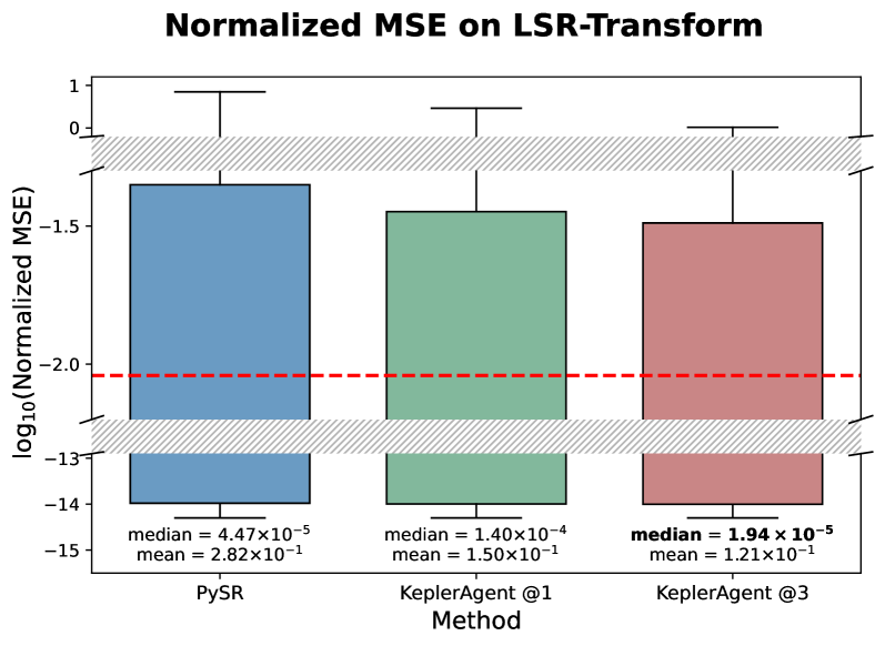
The image is a box plot comparing the normalized Mean Squared Error (MSE) on LSR-Transform for three different methods: PySR, KeplerAgent @1, and KeplerAgent @3. The y-axis represents the log base 10 of the normalized MSE, and the plot shows the distribution of the MSE for each method. A red dashed line is drawn at y = -2.0.
### Components/Axes
* **Title:** Normalized MSE on LSR-Transform
* **X-axis:** Method (categorical): PySR, KeplerAgent @1, KeplerAgent @3
* **Y-axis:** log10(Normalized MSE), with a scale from -15 to 1.
* **Box Plots:** Each box plot represents the distribution of the log10(Normalized MSE) for a given method. The box extends from the first quartile (Q1) to the third quartile (Q3), with a line at the median. Whiskers extend from the box to show the range of the data.
* **Horizontal Red Dashed Line:** Located at log10(Normalized MSE) = -2.0.
* **Hashed Regions:** There are two hashed regions, one near the top of the plot and one near the bottom. The top region spans approximately from log10(Normalized MSE) = -0.5 to 0.5. The bottom region spans approximately from log10(Normalized MSE) = -13 to -12.
* **Median and Mean Values:** The median and mean values are displayed below each box plot.
### Detailed Analysis
**PySR (Blue Box Plot):**
* The box extends from approximately -13 to -1.5.
* Median = 4.47 x 10^-5
* Mean = 2.82 x 10^-1
**KeplerAgent @1 (Green Box Plot):**
* The box extends from approximately -13 to -1.5.
* Median = 1.40 x 10^-4
* Mean = 1.50 x 10^-1
**KeplerAgent @3 (Red Box Plot):**
* The box extends from approximately -13 to -1.5.
* Median = 1.94 x 10^-5
* Mean = 1.21 x 10^-1
### Key Observations
* The median MSE is lowest for KeplerAgent @3 (1.94 x 10^-5) and highest for KeplerAgent @1 (1.40 x 10^-4).
* The mean MSE is lowest for KeplerAgent @3 (1.21 x 10^-1) and highest for PySR (2.82 x 10^-1).
* The boxes for all three methods span a similar range on the y-axis.
* The red dashed line at log10(Normalized MSE) = -2.0 falls within the boxes for all three methods.
### Interpretation
The box plot compares the performance of three different methods (PySR, KeplerAgent @1, and KeplerAgent @3) in terms of normalized MSE on LSR-Transform. The results suggest that KeplerAgent @3 has the lowest median and mean MSE, indicating better performance compared to the other two methods. The wide range of the boxes suggests that there is significant variability in the MSE for all three methods. The red dashed line at log10(Normalized MSE) = -2.0 provides a reference point for comparing the performance of the methods. The hashed regions near the top and bottom of the plot may indicate a threshold or acceptable range for the MSE.