\n
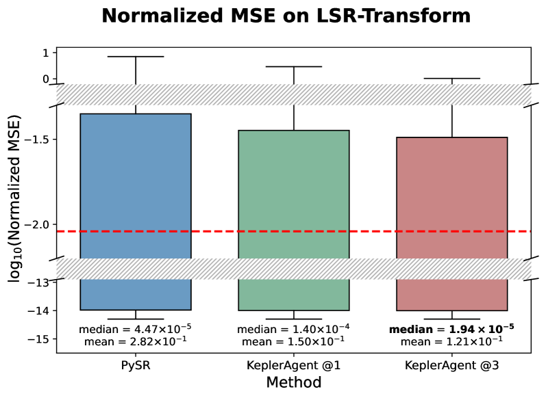
## Box Plot: Normalized MSE on LSR-Transform
### Overview
This image presents a box plot comparing the Normalized Mean Squared Error (MSE) across three different methods: PySR, KeplerAgent @1, and KeplerAgent @3. The y-axis represents the base-10 logarithm of the Normalized MSE, while the x-axis indicates the method used. A horizontal dashed red line is present, likely representing a benchmark or target MSE value.
### Components/Axes
* **Title:** "Normalized MSE on LSR-Transform" (Top-center)
* **X-axis Label:** "Method" (Bottom-center)
* **Y-axis Label:** "log10(Normalized MSE)" (Left-center)
* **Methods (Categories):** PySR, KeplerAgent @1, KeplerAgent @3
* **Benchmark Line:** A horizontal dashed red line at approximately -2.0 on the log10(Normalized MSE) scale.
* **Box Plot Elements:** Each method has a box representing the interquartile range (IQR), with a line indicating the median. Whiskers extend from the boxes to show the range of the data, excluding outliers.
### Detailed Analysis
The box plots show the distribution of Normalized MSE values for each method.
* **PySR (Blue):** The PySR box plot is centered around a median value of approximately 4.47 x 10^-5. The box extends from roughly -3.0 to -1.0 on the log10(Normalized MSE) scale. The mean is reported as 2.82 x 10^-1. The whiskers extend to approximately -14 and 0.
* **KeplerAgent @1 (Green):** The KeplerAgent @1 box plot has a median value of approximately 1.40 x 10^-4. The box extends from roughly -2.5 to -0.5 on the log10(Normalized MSE) scale. The mean is reported as 1.50 x 10^-1. The whiskers extend to approximately -14 and 0.
* **KeplerAgent @3 (Red):** The KeplerAgent @3 box plot has a median value of approximately 1.94 x 10^-5. The box extends from roughly -2.5 to -0.5 on the log10(Normalized MSE) scale. The mean is reported as 1.21 x 10^-1. The whiskers extend to approximately -14 and 0.
**Trends:**
* PySR has the lowest median Normalized MSE.
* KeplerAgent @1 has the highest median Normalized MSE.
* KeplerAgent @3 has a median Normalized MSE between PySR and KeplerAgent @1.
* All three methods have similar ranges, as indicated by the whiskers.
### Key Observations
* PySR consistently performs better than KeplerAgent @1 and KeplerAgent @3, as indicated by its lower median and generally lower distribution of MSE values.
* The benchmark line (dashed red line) appears to be above the median values for all three methods, suggesting that all methods achieve performance better than the benchmark.
* The spread of data (as indicated by the box size and whisker length) is similar across all three methods, suggesting similar variability in performance.
### Interpretation
The data suggests that PySR is the most effective method for the LSR-Transform task, as it consistently achieves the lowest Normalized MSE. KeplerAgent @3 performs better than KeplerAgent @1. The benchmark line indicates a performance threshold, and all methods surpass it. The similar spread of data across methods suggests that while PySR has a lower central tendency, the variability in performance is comparable. The fact that the whiskers extend to the same values for all methods suggests that the extreme values are similar, even if the central values differ. This could indicate that all methods are susceptible to the same types of errors or challenges in certain cases. The use of the log10 scale compresses the range of MSE values, making it easier to visualize differences between methods, especially when dealing with small values.