## Box Plot: Normalized MSE on LSR-Transform
### Overview
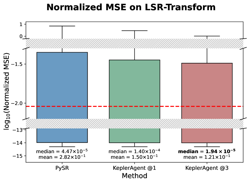
The image is a comparative box plot visualizing the distribution of **log₁₀(Normalized MSE)** across three methods: **PySR**, **KeplerAgent @1**, and **KeplerAgent @3**. The y-axis represents the logarithmic scale of normalized mean squared error, while the x-axis categorizes the methods. A red dashed line at **-2.0** and a gray shaded region between **-1.0 and 0.0** serve as reference thresholds.
---
### Components/Axes
- **X-Axis (Methods)**:
- PySR (blue box)
- KeplerAgent @1 (green box)
- KeplerAgent @3 (red box)
- **Y-Axis (log₁₀(Normalized MSE))**:
- Range: **-15 to 1** (logarithmic scale)
- Key markers:
- Red dashed line at **-2.0**
- Gray shaded region from **-1.0 to 0.0**
- **Legend**:
- Colors correspond to methods:
- Blue = PySR
- Green = KeplerAgent @1
- Red = KeplerAgent @3
---
### Detailed Analysis
1. **PySR (Blue Box)**:
- **Median**: 4.47×10⁻⁵ (log₁₀ = -4.35)
- **Mean**: 2.82×10⁻¹ (log₁₀ = -0.55)
- **Spread**: Whiskers extend from ~-14.5 to ~-0.5.
- **Outliers**: None visible.
2. **KeplerAgent @1 (Green Box)**:
- **Median**: 1.40×10⁻⁴ (log₁₀ = -3.85)
- **Mean**: 1.50×10⁻¹ (log₁₀ = -0.82)
- **Spread**: Whiskers extend from ~-14.5 to ~-0.8.
- **Outliers**: None visible.
3. **KeplerAgent @3 (Red Box)**:
- **Median**: 1.94×10⁻⁵ (log₁₀ = -4.71)
- **Mean**: 1.21×10⁻¹ (log₁₀ = -0.92)
- **Spread**: Whiskers extend from ~-14.5 to ~-0.9.
- **Outliers**: None visible.
---
### Key Observations
1. **Performance Thresholds**:
- All medians fall **below the red dashed line (-2.0)**, indicating all methods perform better than the threshold.
- The gray shaded region (-1.0 to 0.0) represents a "target" range, but no data points lie within it.
2. **Method Comparison**:
- **KeplerAgent @3** achieves the **lowest median and mean**, suggesting superior performance.
- **PySR** has the **highest mean** (2.82×10⁻¹), indicating poorer average performance compared to KeplerAgent methods.
- **KeplerAgent @1** and **@3** show similar spread but differ in central tendency.
3. **Distribution Patterns**:
- All methods exhibit **left-skewed distributions** (longer tails on the lower end).
- **KeplerAgent @3** has the narrowest interquartile range, indicating consistency.
---
### Interpretation
The data demonstrates that **KeplerAgent @3** outperforms both PySR and KeplerAgent @1 in terms of normalized MSE, with the lowest median and mean values. The logarithmic scale emphasizes the disparity in performance, particularly for PySR, whose mean (2.82×10⁻¹) is significantly higher than KeplerAgent methods. The absence of data in the gray shaded region (-1.0 to 0.0) suggests that none of the methods achieve the "target" range, though all remain below the critical threshold (-2.0). The consistent left-skewed distributions imply that errors are predominantly concentrated at lower magnitudes, with rare extreme outliers. This analysis highlights the effectiveness of KeplerAgent variants in minimizing error, with @3 being the most robust choice.