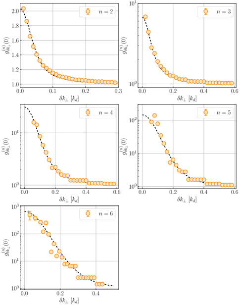
## [Scatter Plots with Error Bars and Fitted Curves]: Decay of g^(n)_δk⊥ (0) vs. δk⊥ for Different n
### Overview
The image contains five separate scatter plots arranged in a grid (two rows: three plots on top, two on bottom). Each plot displays experimental or simulated data points (orange circles with error bars) and a fitted curve (black dashed line) showing the relationship between a quantity `g^(n)_δk⊥ (0)` on the y-axis and `δk⊥ [k_d]` on the x-axis. Each subplot corresponds to a different integer value of `n` (2, 3, 4, 5, 6), as indicated by the legend.
### Components/Axes
* **Subplot Arrangement:**
* Top Row (Left to Right): `n = 2`, `n = 3`, `n = 4`
* Bottom Row (Left to Right): `n = 5`, `n = 6`
* **X-Axis (All Plots):**
* **Label:** `δk⊥ [k_d]`
* **Scale:** Linear.
* **Range:** Approximately 0.0 to 0.3 for `n=2`; 0.0 to 0.6 for `n=3, 4, 5, 6`.
* **Y-Axis (All Plots):**
* **Label:** `g^(n)_δk⊥ (0)`
* **Scale:** Logarithmic for `n=3, 4, 5, 6`. Linear for `n=2`.
* **Range (Approximate):**
* `n=2`: 1.0 to 2.0 (Linear)
* `n=3`: 10^0 (1) to 10^1 (10)
* `n=4`: 10^0 (1) to ~10^2 (100)
* `n=5`: 10^0 (1) to ~10^2 (100)
* `n=6`: 10^0 (1) to ~10^3 (1000)
* **Legend (Each Subplot):**
* **Placement:** Top-right corner within the plot area.
* **Content:** An orange circle symbol followed by `n = [value]`. The value is 2, 3, 4, 5, or 6.
* **Data Series:**
* **Symbol:** Orange circles with vertical error bars.
* **Fitted Curve:** Black dashed line passing through or near the data points.
* **Grid:** Light gray grid lines are present on both axes in all plots.
### Detailed Analysis
**Trend Verification:** For every data series (`n=2` through `n=6`), the visual trend is a monotonic decrease. The value of `g^(n)_δk⊥ (0)` starts at a maximum when `δk⊥` is near zero and decays towards a lower asymptote as `δk⊥` increases. The decay appears steeper on the logarithmic y-axis plots for higher `n`.
**Data Point Extraction (Approximate):**
* **Plot n=2 (Top-Left):**
* At `δk⊥ ≈ 0.0`, `g ≈ 2.0`.
* At `δk⊥ ≈ 0.1`, `g ≈ 1.2`.
* At `δk⊥ ≈ 0.2`, `g ≈ 1.05`.
* At `δk⊥ ≈ 0.3`, `g ≈ 1.0`.
* **Plot n=3 (Top-Middle):**
* At `δk⊥ ≈ 0.0`, `g ≈ 8`.
* At `δk⊥ ≈ 0.2`, `g ≈ 1.5`.
* At `δk⊥ ≈ 0.4`, `g ≈ 1.1`.
* At `δk⊥ ≈ 0.6`, `g ≈ 1.0`.
* **Plot n=4 (Top-Right):**
* At `δk⊥ ≈ 0.0`, `g ≈ 80`.
* At `δk⊥ ≈ 0.2`, `g ≈ 3`.
* At `δk⊥ ≈ 0.4`, `g ≈ 1.2`.
* At `δk⊥ ≈ 0.6`, `g ≈ 1.0`.
* **Plot n=5 (Bottom-Left):**
* At `δk⊥ ≈ 0.0`, `g ≈ 100`.
* At `δk⊥ ≈ 0.2`, `g ≈ 5`.
* At `δk⊥ ≈ 0.4`, `g ≈ 1.5`.
* At `δk⊥ ≈ 0.6`, `g ≈ 1.0`.
* **Plot n=6 (Bottom-Right):**
* At `δk⊥ ≈ 0.0`, `g ≈ 800`.
* At `δk⊥ ≈ 0.2`, `g ≈ 20`.
* At `δk⊥ ≈ 0.4`, `g ≈ 2`.
* At `δk⊥ ≈ 0.5`, `g ≈ 1.0`.
### Key Observations
1. **Consistent Decay Pattern:** All five plots show the same fundamental behavior: `g^(n)_δk⊥ (0)` decreases as `δk⊥` increases.
2. **Increasing Magnitude with n:** The initial value of `g` at `δk⊥ ≈ 0` increases dramatically with `n` (from ~2 for `n=2` to ~800 for `n=6`).
3. **Steepening Decay with n:** The rate of decay (slope on the log-linear plots) becomes steeper as `n` increases. The curve for `n=6` drops over three orders of magnitude, while `n=2` drops by less than a factor of two.
4. **Asymptotic Behavior:** For all `n`, the function appears to approach a lower limit of approximately 1.0 as `δk⊥` becomes large.
5. **Data Fit:** The black dashed line provides a good fit to the orange data points across all plots, suggesting a consistent underlying model or function describes the data for different `n`.
### Interpretation
The plots demonstrate a clear physical or mathematical relationship where the quantity `g^(n)_δk⊥ (0)` is a decreasing function of the parameter `δk⊥`. The parameter `n` acts as a scaling factor that controls both the amplitude (initial value) and the decay rate of this function.
* **What it suggests:** This is characteristic of correlation functions or structure factors in physics, where `g` might represent a correlation strength, and `δk⊥` represents a difference in wavevector. The decay indicates that correlations weaken as the wavevector difference increases. The integer `n` could represent an order parameter, a mode number, or a dimensionality index, where higher orders (`n`) lead to stronger initial correlations that are more sensitive to wavevector mismatch (steeper decay).
* **Relationship between elements:** The x-axis (`δk⊥`) is the independent variable. The y-axis (`g`) is the dependent variable. The legend (`n`) is a categorical parameter that defines distinct data series, each following the same functional form but with different scaling parameters.
* **Notable trends/anomalies:** The most notable trend is the systematic increase in both the magnitude and the decay rate with `n`. There are no obvious outliers; the data points follow the fitted curves closely, indicating high-quality data or a well-chosen model. The transition from a linear y-axis for `n=2` to a logarithmic axis for `n>=3` is a presentation choice to accommodate the exponentially increasing range of the `g` values.