TECHNICAL ASSET FINGERPRINT
f550046fac0bf0e2f0060b38
Click to view fullscreen
Press ESC or click to close
FOUND IN PAPERS
EXPERT: gemini-2.0-flash VERSION 1
RUNTIME: nugit/gemini/gemini-2.0-flash
INTEL_VERIFIED
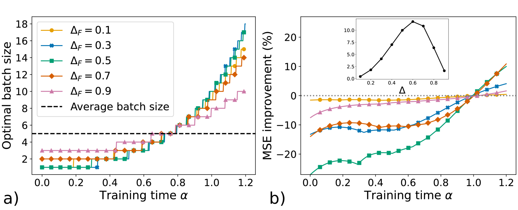
## Chart Type: Line Plots
### Overview
The image contains two line plots, labeled a) and b), that explore the relationship between training time and optimal batch size, and training time and MSE improvement, respectively. The plots analyze the impact of different values of ΔF on these relationships. Plot b) also contains an inset plot showing the relationship between Δ and an unspecified variable.
### Components/Axes
**Plot a)**
* **Title:** Optimal batch size vs. Training time α
* **X-axis:** Training time α, with values ranging from 0.0 to 1.2 in increments of 0.2.
* **Y-axis:** Optimal batch size, with values ranging from 2 to 18 in increments of 2.
* **Legend (Top-Left):**
* Yellow line with circles: ΔF = 0.1
* Blue line with diamonds: ΔF = 0.3
* Green line with squares: ΔF = 0.5
* Orange line with diamonds: ΔF = 0.7
* Pink line with triangles: ΔF = 0.9
* Black dashed line: Average batch size
**Plot b)**
* **Title:** MSE improvement (%) vs. Training time α
* **X-axis:** Training time α, with values ranging from 0.0 to 1.2 in increments of 0.2.
* **Y-axis:** MSE improvement (%), with values ranging from -20 to 20 in increments of 10.
* **Legend:** Same as Plot a).
* **Horizontal dotted line:** Represents 0% MSE improvement.
**Inset Plot (Plot b)**
* **X-axis:** Δ, with values ranging from 0.0 to 0.8 in increments of 0.2.
* **Y-axis:** Unspecified, with values ranging from 0.0 to 10.0 in increments of 2.5.
### Detailed Analysis
**Plot a) - Optimal batch size**
* **Average batch size (Black dashed line):** Constant at approximately 5.
* **ΔF = 0.1 (Yellow line with circles):** Remains relatively constant at approximately 2 until α ≈ 0.8, then increases stepwise to approximately 15 at α = 1.2.
* **ΔF = 0.3 (Blue line with diamonds):** Remains relatively constant at approximately 1 until α ≈ 0.8, then increases stepwise to approximately 16 at α = 1.2.
* **ΔF = 0.5 (Green line with squares):** Remains relatively constant at approximately 1 until α ≈ 0.8, then increases stepwise to approximately 15 at α = 1.2.
* **ΔF = 0.7 (Orange line with diamonds):** Remains relatively constant at approximately 2 until α ≈ 0.8, then increases stepwise to approximately 14 at α = 1.2.
* **ΔF = 0.9 (Pink line with triangles):** Remains relatively constant at approximately 3 until α ≈ 0.8, then increases stepwise to approximately 9 at α = 1.2.
**Plot b) - MSE improvement**
* **ΔF = 0.1 (Yellow line with circles):** Remains relatively constant at approximately -2% throughout the training time.
* **ΔF = 0.3 (Blue line with diamonds):** Starts at approximately -12% and gradually increases to approximately 2% at α = 1.2.
* **ΔF = 0.5 (Green line with squares):** Starts at approximately -24% and increases sharply to approximately 12% at α = 1.2.
* **ΔF = 0.7 (Orange line with diamonds):** Starts at approximately -14% and increases to approximately 12% at α = 1.2.
* **ΔF = 0.9 (Pink line with triangles):** Starts at approximately -7% and increases slightly to approximately 2% at α = 1.2.
**Inset Plot (Plot b)**
* The black line increases from approximately 0 at Δ = 0.0 to a peak of approximately 11 at Δ = 0.6, then decreases to approximately 3 at Δ = 0.8.
### Key Observations
* In Plot a), the optimal batch size remains relatively constant for all ΔF values until a training time of approximately 0.8, after which it increases sharply.
* In Plot b), the MSE improvement varies significantly depending on the ΔF value. Lower ΔF values (0.1 and 0.9) result in relatively constant or slightly increasing MSE improvement, while higher ΔF values (0.3, 0.5, and 0.7) show a more significant increase in MSE improvement as training time increases.
* The inset plot in Plot b) shows a non-linear relationship between Δ and the unspecified variable, with a peak at Δ = 0.6.
### Interpretation
The plots suggest that the optimal batch size is relatively stable during the initial stages of training, but increases significantly as training progresses beyond a certain point (α ≈ 0.8). The value of ΔF has a significant impact on the MSE improvement, with higher values generally leading to greater improvements, especially at later stages of training. The inset plot indicates that there is an optimal value of Δ (around 0.6) for maximizing some other performance metric, which is not explicitly defined in the plot. The relationship between Δ and ΔF is not clear from the plots, but it is possible that they are related.
DECODING INTELLIGENCE...
EXPERT: gemma-3-27b-it-free VERSION 1
RUNTIME: google-free/gemma-3-27b-it
INTEL_VERIFIED
## Charts: Optimal Batch Size vs. Training Time & MSE Improvement
### Overview
The image presents two charts, labeled 'a)' and 'b)'. Chart 'a)' depicts the relationship between optimal batch size and training time (alpha) for different values of Δf. Chart 'b)' shows the MSE improvement (%) as a function of training time (alpha), also for different Δf values. A small inset chart is present in the top-right corner of chart 'b)', showing MSE improvement as a function of Δ.
### Components/Axes
**Chart a):**
* **X-axis:** Training time α (ranging from approximately 0.0 to 1.2)
* **Y-axis:** Optimal batch size (ranging from approximately 0 to 18)
* **Lines:** Represent different values of Δf: 0.1 (orange), 0.3 (blue), 0.5 (green), 0.7 (red), 0.9 (purple).
* **Dashed Line:** Represents the average batch size (black).
**Chart b):**
* **X-axis:** Training time α (ranging from approximately 0.0 to 1.2)
* **Y-axis:** MSE improvement (%) (ranging from approximately -30 to 25)
* **Lines:** Represent different values of Δf: 0.1 (orange), 0.3 (blue), 0.5 (green), 0.7 (red), 0.9 (purple).
* **Dashed Line:** Represents 0% MSE improvement (black).
**Inset Chart (b):**
* **X-axis:** Δ (ranging from approximately 0.0 to 1.0)
* **Y-axis:** MSE improvement (%) (ranging from approximately 0 to 25)
* **Line:** Represents the relationship between Δ and MSE improvement.
### Detailed Analysis or Content Details
**Chart a):**
* **Δf = 0.1 (orange):** Starts at approximately 2.5 at α = 0.0, increases gradually to approximately 5.5 at α = 0.8, and then rises sharply to approximately 14 at α = 1.2.
* **Δf = 0.3 (blue):** Starts at approximately 2.5 at α = 0.0, increases gradually to approximately 6 at α = 0.8, and then rises sharply to approximately 16 at α = 1.2.
* **Δf = 0.5 (green):** Starts at approximately 3 at α = 0.0, increases gradually to approximately 6 at α = 0.6, and then rises sharply to approximately 17 at α = 1.2.
* **Δf = 0.7 (red):** Starts at approximately 3 at α = 0.0, increases gradually to approximately 5 at α = 0.6, and then rises sharply to approximately 13 at α = 1.2.
* **Δf = 0.9 (purple):** Starts at approximately 3 at α = 0.0, increases gradually to approximately 5 at α = 0.6, and then rises sharply to approximately 12 at α = 1.2.
* **Average Batch Size (black):** Remains relatively constant at approximately 4 across all values of α.
**Chart b):**
* **Δf = 0.1 (orange):** Starts at approximately -5% at α = 0.0, fluctuates around 0% until α = 0.6, and then increases to approximately 10% at α = 1.2.
* **Δf = 0.3 (blue):** Starts at approximately -10% at α = 0.0, fluctuates around -5% until α = 0.6, and then increases to approximately 5% at α = 1.2.
* **Δf = 0.5 (green):** Starts at approximately -25% at α = 0.0, increases rapidly to approximately 0% at α = 0.4, and then continues to increase to approximately 20% at α = 1.2.
* **Δf = 0.7 (red):** Starts at approximately -10% at α = 0.0, increases gradually to approximately 0% at α = 0.6, and then increases to approximately 10% at α = 1.2.
* **Δf = 0.9 (purple):** Starts at approximately -10% at α = 0.0, increases gradually to approximately 0% at α = 0.6, and then increases to approximately 5% at α = 1.2.
**Inset Chart (b):**
* The line peaks at approximately 10% MSE improvement when Δ is approximately 0.5. The improvement decreases as Δ moves away from 0.5 towards 0.0 or 1.0.
### Key Observations
* In Chart a), the optimal batch size increases significantly for all Δf values as training time (α) increases, particularly after α = 0.6.
* In Chart b), the MSE improvement is initially negative for all Δf values, but becomes positive as training time (α) increases.
* Δf = 0.5 shows the most significant MSE improvement in Chart b).
* The inset chart in Chart b) suggests that an intermediate value of Δ (around 0.5) yields the best MSE improvement.
### Interpretation
The data suggests that as training progresses (increasing α), the optimal batch size needs to be increased to maintain performance. The value of Δf influences both the optimal batch size and the rate of MSE improvement. A Δf of 0.5 appears to be particularly effective in achieving significant MSE improvement during training. The inset chart indicates that there is an optimal value for Δ, and deviating from this value leads to reduced performance gains. This could be related to the trade-off between exploration and exploitation during the training process. A higher Δf might allow for more exploration, while a lower Δf might focus on exploitation. The optimal balance appears to be around Δf = 0.5. The average batch size remaining constant suggests it is not dynamically adjusted during training, while the optimal batch size is. This implies that a dynamic batch size adjustment strategy, guided by the value of Δf, can lead to better performance.
DECODING INTELLIGENCE...
EXPERT: healer-alpha-free VERSION 1
RUNTIME: free/openrouter/healer-alpha
INTEL_VERIFIED
## [Chart Type: Dual-Panel Line Chart with Inset Plot]
### Overview
The image displays two side-by-side line charts, labeled **a)** and **b)**, which appear to be from a technical or scientific paper. Both charts share the same x-axis variable, "Training time α". Chart **a)** plots "Optimal batch size" against α for different values of a parameter ΔF. Chart **b)** plots "MSE improvement (%)" against α for the same set of ΔF values and includes a smaller inset plot showing a relationship between a variable Δ and an unnamed y-axis metric.
### Components/Axes
**Chart a) - Left Panel:**
* **Y-axis:** Label: "Optimal batch size". Scale: Linear, from 0 to 18, with major ticks every 2 units.
* **X-axis:** Label: "Training time α". Scale: Linear, from 0.0 to 1.2, with major ticks every 0.2 units.
* **Legend:** Located in the top-left corner. Contains six entries:
1. `ΔF = 0.1` (Yellow line, circle marker)
2. `ΔF = 0.3` (Blue line, 'x' marker)
3. `ΔF = 0.5` (Green line, square marker)
4. `ΔF = 0.7` (Orange line, diamond marker)
5. `ΔF = 0.9` (Pink line, triangle-up marker)
6. `Average batch size` (Black dashed line, no marker)
* **Reference Line:** A horizontal black dashed line at y=5, labeled "Average batch size".
**Chart b) - Right Panel:**
* **Y-axis:** Label: "MSE improvement (%)". Scale: Linear, from -20 to 20, with major ticks every 10 units. A horizontal dotted line is present at y=0.
* **X-axis:** Label: "Training time α". Scale: Linear, from 0.0 to 1.2, with major ticks every 0.2 units.
* **Legend:** The same color and marker scheme from chart a) is used here, though the legend itself is not repeated in this panel.
* **Inset Plot:** Located in the top-right corner of panel b).
* **Y-axis:** Unlabeled. Scale: Linear, from 0.0 to 10.0, with ticks every 2.5 units.
* **X-axis:** Label: "Δ". Scale: Linear, from 0.0 to 0.8, with ticks every 0.2 units.
* **Data:** A single black line with circular markers, forming a peaked curve.
### Detailed Analysis
**Chart a) - Optimal Batch Size vs. Training Time:**
* **Trend Verification:** All five colored lines (for ΔF = 0.1 to 0.9) exhibit a clear upward trend as Training time α increases. The lines are step-like, suggesting discrete batch size values.
* **Data Points & Relationships:**
* At α = 0.0, the optimal batch size is low for all ΔF values, ranging from ~1 (for ΔF=0.5) to ~3 (for ΔF=0.9).
* As α increases, the optimal batch size for each ΔF series increases. The rate of increase is steeper for higher ΔF values.
* At the maximum shown α = 1.2:
* ΔF = 0.9 (Pink): ~10
* ΔF = 0.7 (Orange): ~14
* ΔF = 0.5 (Green): ~17
* ΔF = 0.3 (Blue): ~18
* ΔF = 0.1 (Yellow): ~15
* The "Average batch size" reference line is constant at 5. Most series cross above this line between α = 0.6 and α = 0.8.
**Chart b) - MSE Improvement vs. Training Time:**
* **Trend Verification:** The lines show varied initial values but generally trend upward as α increases, crossing from negative to positive MSE improvement.
* **Data Points & Relationships:**
* At α = 0.0:
* ΔF = 0.5 (Green): ~ -25% (lowest)
* ΔF = 0.3 (Blue): ~ -13%
* ΔF = 0.7 (Orange): ~ -13%
* ΔF = 0.9 (Pink): ~ -7%
* ΔF = 0.1 (Yellow): ~ -1% (closest to zero)
* All lines trend upward. They cross the 0% improvement line at different α values:
* ΔF = 0.1 (Yellow) crosses near α = 0.9.
* ΔF = 0.9 (Pink) crosses near α = 1.0.
* ΔF = 0.3 (Blue) and ΔF = 0.7 (Orange) cross near α = 1.05.
* ΔF = 0.5 (Green) crosses last, near α = 1.1.
* At α = 1.2, all series show positive improvement, ranging from ~1% (ΔF=0.9) to ~10% (ΔF=0.7).
* **Inset Plot Analysis:**
* The curve shows a clear peak. The y-value increases from ~0 at Δ=0.0 to a maximum of ~10.0 at Δ=0.6, then decreases back to ~1.5 at Δ=0.8.
### Key Observations
1. **Inverse Relationship at Start:** In chart b), lower ΔF values (e.g., 0.1) start with MSE improvement near zero, while mid-range ΔF values (e.g., 0.5) start with the most negative improvement.
2. **Convergence at High α:** In chart a), the optimal batch sizes for different ΔF values diverge significantly as α increases. In chart b), the MSE improvement percentages for different ΔF values converge into a narrower positive range at high α.
3. **Peak Performance Indicator:** The inset plot in b) suggests there is an optimal value for the parameter Δ (around 0.6) that maximizes the plotted metric.
4. **Step Function Behavior:** The optimal batch size in chart a) changes in discrete steps rather than a smooth curve, which may reflect practical constraints in batch size selection.
### Interpretation
This data explores the relationship between a training time parameter (α), a model or data parameter (ΔF), optimal batch size, and resulting model performance (MSE improvement).
* **Core Finding:** The "optimal" batch size is not static; it depends on both the training progress (α) and the underlying characteristic ΔF. As training progresses (α increases), larger batch sizes become optimal.
* **Performance Trade-off:** Chart b) reveals a critical insight: using a batch size that is not optimal for the current α and ΔF can lead to worse performance (negative MSE improvement) early in training. However, as training continues (α → 1.2), the system appears to recover, showing positive improvement regardless of the initial ΔF.
* **The Role of ΔF:** ΔF seems to control the sensitivity of the system. A mid-range ΔF (0.5) leads to the worst initial performance but also the steepest climb in optimal batch size. A very low ΔF (0.1) is stable initially but offers less potential for improvement.
* **Practical Implication:** The results argue for an **adaptive batch size strategy** during training. A fixed batch size (like the "Average" of 5) is suboptimal. The ideal strategy would start with a small batch size and increase it according to a schedule influenced by ΔF and α to maximize final performance and avoid early degradation. The inset plot likely helps in selecting or understanding the Δ parameter that governs this adaptive process.
DECODING INTELLIGENCE...
EXPERT: nemotron-free VERSION 1
RUNTIME: free/nvidia/nemotron-nano-12b-v2-vl:free
INTEL_VERIFIED
## Line Charts: Optimal Batch Size vs. MSE Improvement Over Training Time
### Overview
The image contains two line charts (a) and (b) analyzing the relationship between training time (α) and two metrics: (a) optimal batch size and (b) mean squared error (MSE) improvement. Both charts use training time (α) on the x-axis, with distinct y-axes for each metric. Multiple data series represent different ΔF values (0.1, 0.3, 0.5, 0.7, 0.9), with trends and key observations extracted below.
---
### Components/Axes
#### Chart a) Optimal Batch Size
- **X-axis**: Training time (α), ranging from 0.0 to 1.2 in increments of 0.2.
- **Y-axis**: Optimal batch size, ranging from 0 to 18 in increments of 2.
- **Legend**: Located in the top-left corner, mapping ΔF values to colors and markers:
- ΔF = 0.1: Orange circles
- ΔF = 0.3: Blue stars
- ΔF = 0.5: Green squares
- ΔF = 0.7: Orange diamonds
- ΔF = 0.9: Pink triangles
- **Average Batch Size**: Dashed black line at ~5.
#### Chart b) MSE Improvement
- **X-axis**: Training time (α), same range as chart a).
- **Y-axis**: MSE improvement (%), ranging from -20% to 20% in increments of 5%.
- **Legend**: Same as chart a), with matching colors/markers.
- **Inset Graph**: Small line chart in the top-right corner showing MSE improvement vs. Δ (ΔF) at fixed training time, peaking at Δ = 0.6.
---
### Detailed Analysis
#### Chart a) Optimal Batch Size
- **Trends**:
- All ΔF lines show **increasing optimal batch size** with training time.
- Higher ΔF values correspond to **steeper slopes** (e.g., ΔF = 0.9 reaches ~10 by α = 1.2, while ΔF = 0.1 plateaus at ~2).
- The average batch size (~5) acts as a baseline, with most lines crossing it after α ≈ 0.4.
- **Data Points**:
- ΔF = 0.1: Starts at 2 (α = 0.0), ends at ~16 (α = 1.2).
- ΔF = 0.3: Starts at 3, ends at ~14.
- ΔF = 0.5: Starts at 4, ends at ~12.
- ΔF = 0.7: Starts at 5, ends at ~10.
- ΔF = 0.9: Starts at 6, ends at ~8.
#### Chart b) MSE Improvement
- **Trends**:
- All ΔF lines show **increasing MSE improvement** with training time.
- Higher ΔF values achieve **faster and greater improvement** (e.g., ΔF = 0.9 reaches ~15% by α = 1.2, while ΔF = 0.1 stays near 0%).
- The inset graph reveals a **peak in MSE improvement at Δ = 0.6**, suggesting this ΔF value optimizes performance.
- **Data Points**:
- ΔF = 0.1: Starts at -5%, ends at ~0%.
- ΔF = 0.3: Starts at -10%, ends at ~5%.
- ΔF = 0.5: Starts at -15%, ends at ~10%.
- ΔF = 0.7: Starts at -20%, ends at ~12%.
- ΔF = 0.9: Starts at -25%, ends at ~15%.
---
### Key Observations
1. **Positive Correlation**: Higher ΔF values consistently yield larger optimal batch sizes and better MSE improvement.
2. **Divergence in Performance**: ΔF = 0.9 outperforms others in both metrics, while ΔF = 0.1 underperforms.
3. **Optimal ΔF**: The inset graph in chart b) identifies Δ = 0.6 as the peak for MSE improvement, aligning with ΔF = 0.6 in chart a).
4. **Average Batch Size**: The dashed line (~5) suggests a typical batch size, but optimal values vary significantly with ΔF.
---
### Interpretation
- **Training Dynamics**: As training progresses (α increases), larger batch sizes and better MSE improvement are achieved, particularly for higher ΔF values. This implies that ΔF influences both computational efficiency (batch size) and model performance (MSE).
- **Critical ΔF Value**: The peak at Δ = 0.6 in the inset graph highlights a potential sweet spot for balancing ΔF and training time to maximize MSE improvement. This could inform hyperparameter tuning strategies.
- **Trade-offs**: While higher ΔF improves performance, it may require larger batch sizes, which could impact computational resources. The average batch size (~5) provides a reference for typical scenarios, but optimal configurations depend on ΔF.
This analysis underscores the importance of ΔF in optimizing training efficiency and model accuracy, with ΔF = 0.6 emerging as a critical parameter for MSE improvement.
DECODING INTELLIGENCE...