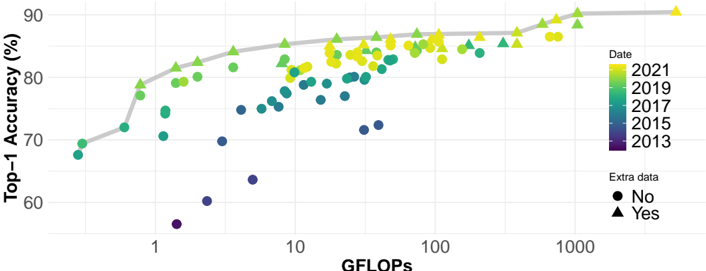
## Scatter Plot: Top-1 Accuracy vs. GFLOPS
### Overview
The image is a scatter plot showing the relationship between Top-1 Accuracy (in percentage) and GFLOPS (floating-point operations per second) for different models, categorized by date (2013-2021) and whether extra data was used. The x-axis (GFLOPS) is on a logarithmic scale. A gray line connects the "Yes" data points, showing the trend of accuracy with increasing GFLOPS when extra data is used.
### Components/Axes
* **X-axis:** GFLOPS (floating-point operations per second). Logarithmic scale with markers at 1, 10, 100, and 1000.
* **Y-axis:** Top-1 Accuracy (%). Linear scale with markers at 60, 70, 80, and 90.
* **Legend (Top-Right):**
* **Date:** Categorizes data points by year, with colors ranging from dark purple (2013) to yellow (2021).
* 2021: Yellow
* 2019: Green
* 2017: Teal
* 2015: Blue
* 2013: Purple
* **Extra data:** Indicates whether extra data was used in the model.
* No: Black circle
* Yes: Black triangle
* **Trend Line:** A gray line connects the "Yes" data points, showing the trend of accuracy with increasing GFLOPS when extra data is used.
### Detailed Analysis
* **Data Points:** Each point represents a model, with its position determined by its GFLOPS and Top-1 Accuracy. The color indicates the year, and the shape (circle or triangle) indicates whether extra data was used.
* **Trend Line:** The gray line connects the "Yes" (triangle) data points, showing the general trend of accuracy increasing with GFLOPS.
**Specific Data Points and Trends:**
* **2013 (Purple):**
* "No Extra Data" (Circle): Points are clustered at the lower left of the chart, with GFLOPS values around 1 and accuracy ranging from approximately 55% to 70%.
* No "Yes Extra Data" points are visible for 2013.
* **2015 (Blue):**
* "No Extra Data" (Circle): Points are clustered between 1 and 10 GFLOPS, with accuracy ranging from approximately 70% to 75%.
* No "Yes Extra Data" points are visible for 2015.
* **2017 (Teal):**
* "No Extra Data" (Circle): Points are clustered between 1 and 10 GFLOPS, with accuracy ranging from approximately 75% to 80%.
* "Yes Extra Data" (Triangle): Points are clustered around 1 GFLOPS, with accuracy around 80%.
* **2019 (Green):**
* "No Extra Data" (Circle): Points are scattered between 1 and 100 GFLOPS, with accuracy ranging from approximately 75% to 85%.
* "Yes Extra Data" (Triangle): Points are scattered between 1 and 100 GFLOPS, with accuracy ranging from approximately 80% to 85%.
* **2021 (Yellow):**
* "No Extra Data" (Circle): Points are scattered between 10 and 1000 GFLOPS, with accuracy ranging from approximately 80% to 90%.
* "Yes Extra Data" (Triangle): Points are scattered between 10 and 1000 GFLOPS, with accuracy ranging from approximately 85% to 90%.
* **Trend Line (Gray):**
* Starts at approximately (0.5 GFLOPS, 68% Accuracy).
* Increases to approximately (1 GFLOPS, 78% Accuracy).
* Increases to approximately (2 GFLOPS, 82% Accuracy).
* Increases to approximately (5 GFLOPS, 83% Accuracy).
* Increases to approximately (10 GFLOPS, 84% Accuracy).
* Increases to approximately (100 GFLOPS, 86% Accuracy).
* Increases to approximately (500 GFLOPS, 88% Accuracy).
* Increases to approximately (1000 GFLOPS, 88% Accuracy).
### Key Observations
* **Accuracy Increase Over Time:** The general trend is that models from later years (2019, 2021) tend to have higher accuracy for a given GFLOPS value compared to models from earlier years (2013, 2015).
* **GFLOPS and Accuracy:** There is a positive correlation between GFLOPS and accuracy, especially when extra data is used, as indicated by the gray trend line.
* **Impact of Extra Data:** Models using extra data (triangles) tend to have slightly higher accuracy compared to models without extra data (circles) for a given GFLOPS value.
* **Saturation:** The trend line suggests that the accuracy gains from increasing GFLOPS diminish at higher GFLOPS values.
### Interpretation
The scatter plot illustrates the evolution of model accuracy in relation to computational power (GFLOPS) over time. The data suggests that advancements in model architecture and training techniques (represented by the year) have led to improved accuracy for a given level of computational power. The use of extra data also contributes to higher accuracy. The trend line indicates that increasing GFLOPS leads to higher accuracy, but the gains diminish as GFLOPS increases, suggesting a point of diminishing returns. The clustering of data points for each year and data type provides insights into the typical performance characteristics of models developed during those periods.