## Scatter Plot with Trend Line: Model Accuracy vs. Computational Cost (GFLOPs)
### Overview
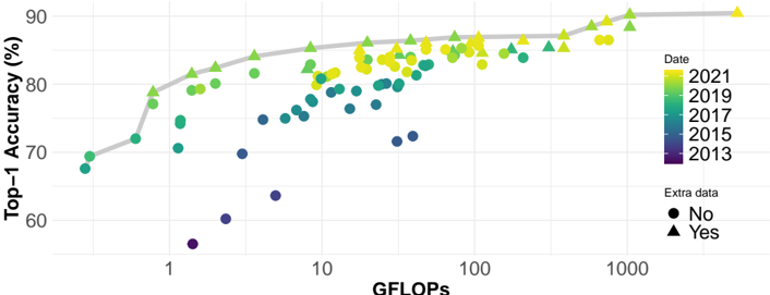
The image is a scatter plot chart illustrating the relationship between the computational cost of machine learning models (measured in GFLOPs) and their performance (Top-1 Accuracy %). Data points are color-coded by the year of the model's publication and shaped by whether "Extra data" was used. A gray trend line suggests a general, logarithmic-like relationship between the variables.
### Components/Axes
* **X-Axis:** Labeled **"GFLOPs"**. It uses a **logarithmic scale**. Major tick marks and labels are visible at **1, 10, 100, and 1000**. The axis spans from approximately 0.5 GFLOPs to over 1000 GFLOPs.
* **Y-Axis:** Labeled **"Top-1 Accuracy (%)"**. It uses a linear scale. Major tick marks and labels are at **60, 70, 80, and 90**.
* **Legend (Right Side):**
* **Date:** A vertical color bar legend titled **"Date"**. It maps colors to years:
* Dark Purple/Blue: **2013**
* Teal: **2015**
* Green: **2017**
* Light Green: **2019**
* Yellow: **2021**
* **Extra data:** A shape legend titled **"Extra data"**.
* Circle (●): **No**
* Triangle (▲): **Yes**
* **Trend Line:** A solid, smooth **gray line** that starts near the bottom-left and curves upward toward the top-right, indicating a general positive correlation.
### Detailed Analysis
* **Data Series & Trends:**
* **General Trend (Gray Line):** The line shows a clear, non-linear positive correlation. Accuracy increases rapidly with GFLOPs at the lower end (1-10 GFLOPs) and then begins to plateau as GFLOPs increase beyond 100.
* **Temporal Trend (Color):** There is a strong temporal progression. The oldest models (dark purple/blue, ~2013) are clustered in the **bottom-left** quadrant (low GFLOPs, low accuracy, ~55-70% accuracy, <10 GFLOPs). The newest models (yellow, ~2021) are predominantly in the **top-right** quadrant (high GFLOPs, high accuracy, ~85-90% accuracy, 100-1000+ GFLOPs). Models from intermediate years (teal, green) fill the space between.
* **Extra Data Effect (Shape):** Models using extra data (triangles) are interspersed with those that do not (circles) across the entire range. However, in the high-accuracy, high-GFLOPs region (top-right), triangles appear very frequently, suggesting that leveraging extra data is a common strategy for state-of-the-art performance.
* **Spatial Distribution & Key Points (Approximate):**
* **Low-End Cluster (Bottom-Left):** Several dark purple/blue circles (2013, no extra data) are located between **0.5-2 GFLOPs** and **55-70% accuracy**. One notable outlier is a dark purple circle at ~1.5 GFLOPs with only ~56% accuracy.
* **Mid-Range Scatter:** Between **2-100 GFLOPs** and **70-85% accuracy**, there is a dense, mixed scatter of teal, green, and light green points (2015-2019), with a combination of circles and triangles.
* **High-Performance Frontier (Top-Right):** The region from **100-1000+ GFLOPs** and **85-90% accuracy** is dominated by yellow (2021) and light green (2019) points. Many of these are triangles (using extra data). The highest visible accuracy point is a yellow triangle at approximately **1000 GFLOPs** and **~90% accuracy**.
### Key Observations
1. **Strong Positive Correlation:** There is an unmistakable trend that models with higher computational cost (GFLOPs) achieve higher Top-1 Accuracy.
2. **Diminishing Returns:** The trend line flattens at higher GFLOPs, indicating that beyond a certain point (roughly 100-200 GFLOPs), large increases in computation yield smaller gains in accuracy.
3. **Technological Progress Over Time:** The color gradient from bottom-left to top-right visually charts the progression of the field from 2013 to 2021, with both accuracy and model complexity increasing dramatically.
4. **Extra Data as a Differentiator:** While not a strict requirement, the use of extra data (triangles) is prevalent among the highest-performing models, especially in the most recent years.
### Interpretation
This chart provides a visual history of progress in computer vision model development (likely image classification, given the "Top-1 Accuracy" metric). It demonstrates the **"scaling laws"** phenomenon observed in deep learning: investing more computational resources (GFLOPs) generally leads to better performance, but with diminishing returns.
The data suggests that achieving state-of-the-art results has required a dual increase in both **model complexity/compute** and **data scale** (as implied by the "Extra data" flag). The temporal trend shows this is not static; the entire frontier of what's possible has shifted upward and to the right over less than a decade. An outlier like the very low-accuracy 2013 model at ~1.5 GFLOPs might represent an early, inefficient architecture or a model trained on a less challenging dataset.
The chart effectively argues that while raw compute is a key driver of accuracy, the most recent and powerful models also rely on additional data strategies. It serves as a benchmark, showing where new models should aim to sit relative to the historical trend line to be considered competitive.