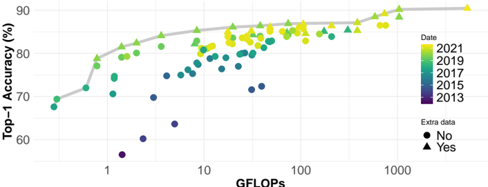
## Scatter Plot with Line Graph: Top-1 Accuracy vs. GFLOPs Over Time
### Overview
The image is a scatter plot overlaid with a line graph, illustrating the relationship between computational power (measured in GFLOPs) and machine learning model performance (Top-1 Accuracy %) across different years. Data points are color-coded by year (2013–2021) and differentiated by shape (circles for "No extra data," triangles for "Yes extra data"). A smooth gray trend line shows the general improvement in accuracy with increasing computational power.
---
### Components/Axes
- **X-axis (GFLOPs)**: Ranges from 1 to 1000, labeled "GFLOPs."
- **Y-axis (Top-1 Accuracy %)**: Ranges from 60% to 90%, labeled "Top-1 Accuracy (%)."
- **Legend**: Located on the right, with:
- **Colors**:
- 2013: Dark blue
- 2015: Blue
- 2017: Teal
- 2019: Green
- 2021: Yellow
- **Shapes**:
- Circles: "No extra data"
- Triangles: "Yes extra data"
---
### Detailed Analysis
1. **Trend Line**:
- The gray line slopes upward from ~70% accuracy at 1 GFLOP to ~90% at 1000 GFLOPs, indicating a strong positive correlation between computational power and accuracy.
- The line’s curvature suggests diminishing returns at higher GFLOP values (e.g., slower improvement beyond 100 GFLOPs).
2. **Data Points**:
- **2013 (Dark Blue Circles/Triangles)**:
- Lowest GFLOPs (1–10 range) and accuracy (55–70%).
- Only one triangle (extra data) at ~1 GFLOP and 55% accuracy.
- **2015 (Blue Circles/Triangles)**:
- GFLOPs: 5–50; Accuracy: 65–75%.
- Triangles appear at higher GFLOPs (e.g., 10 GFLOPs, 70% accuracy).
- **2017 (Teal Circles/Triangles)**:
- GFLOPs: 10–100; Accuracy: 75–85%.
- Triangles cluster near 50–100 GFLOPs (e.g., 80% accuracy at 50 GFLOPs).
- **2019 (Green Circles/Triangles)**:
- GFLOPs: 50–200; Accuracy: 80–88%.
- Triangles dominate at 100–200 GFLOPs (e.g., 85% accuracy at 150 GFLOPs).
- **2021 (Yellow Circles/Triangles)**:
- GFLOPs: 100–1000; Accuracy: 85–90%.
- Triangles spread across the range, with the highest accuracy (90%) at 1000 GFLOPs.
3. **Extra Data (Triangles)**:
- Triangles (extra data) are consistently positioned at higher GFLOPs and accuracy values across all years, suggesting these points may represent optimized or specialized configurations.
---
### Key Observations
- **Upward Trend**: Accuracy improves monotonically with GFLOPs, with the steepest gains between 1–100 GFLOPs.
- **Diminishing Returns**: The trend line flattens slightly after 100 GFLOPs, indicating reduced marginal gains.
- **Yearly Progression**: Later years (2019–2021) achieve higher accuracy at lower GFLOPs compared to earlier years, implying efficiency improvements.
- **Extra Data**: Triangles (extra data) align with higher-performing configurations, possibly indicating advanced techniques or datasets.
---
### Interpretation
The chart demonstrates that increased computational power (GFLOPs) has driven significant improvements in machine learning model accuracy over time. The trend line’s upward trajectory confirms a strong correlation, while the clustering of triangles (extra data) at higher performance levels suggests these points represent optimized or cutting-edge configurations. The flattening of the trend line at higher GFLOPs hints at potential saturation, where additional compute yields diminishing returns. This aligns with real-world observations of hardware-software co-evolution in AI, where newer architectures (e.g., transformers) leverage increased compute to achieve state-of-the-art results. The inclusion of "extra data" flags implies that some data points may incorporate additional training strategies or datasets, further emphasizing the interplay between compute, data, and algorithmic innovation.