TECHNICAL ASSET FINGERPRINT
f5b10804792fe0091366e344
Click to view fullscreen
Press ESC or click to close
FOUND IN PAPERS
EXPERT: healer-alpha-free VERSION 1
RUNTIME: free/openrouter/healer-alpha
INTEL_VERIFIED
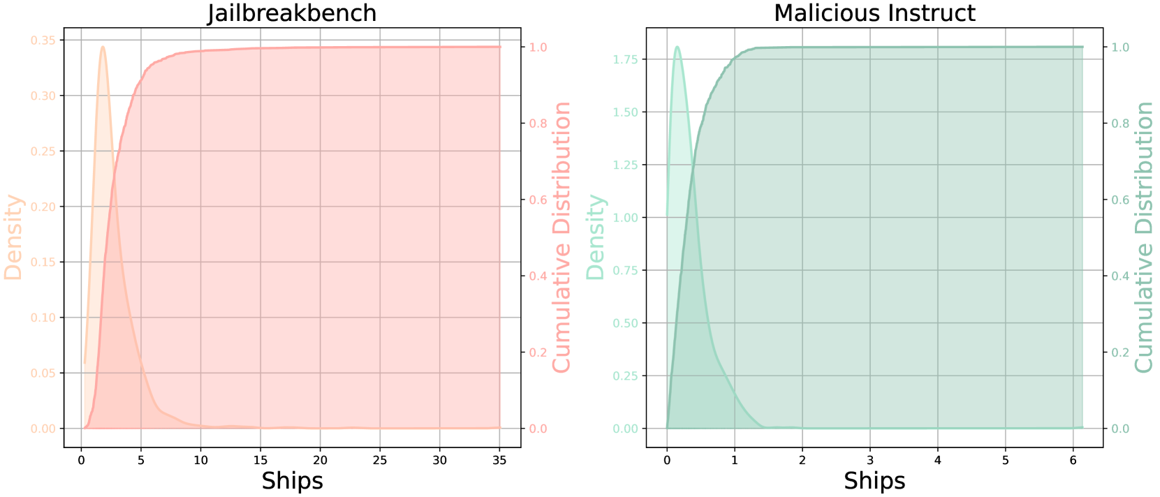
## Dual-Axis Distribution Plots: Jailbreakbench vs. Malicious Instruct
### Overview
The image displays two side-by-side, dual-axis statistical plots. Each plot visualizes the distribution of a variable labeled "Ships" using two complementary representations: a **density plot** (filled area) and a **cumulative distribution function (CDF)** (solid line). The left plot is titled "Jailbreakbench" and uses an orange color scheme. The right plot is titled "Malicious Instruct" and uses a teal color scheme. Both plots share the same structural layout but depict data with significantly different scales and distributions.
### Components/Axes
**Common Elements (Both Plots):**
* **X-Axis Label:** "Ships" (centered at the bottom of each plot).
* **Left Y-Axis Label:** "Density" (rotated 90 degrees, positioned on the left side).
* **Right Y-Axis Label:** "Cumulative Distribution" (rotated 90 degrees, positioned on the right side).
* **Plot Type:** Dual-axis chart combining a Kernel Density Estimate (KDE) plot and a Cumulative Distribution Function (CDF) plot.
* **Grid:** Light gray grid lines are present for both major x and y ticks.
**Plot 1: Jailbreakbench (Left)**
* **Title:** "Jailbreakbench" (centered above the plot).
* **Color Scheme:** Orange.
* **X-Axis Scale:** Linear, ranging from 0 to 35. Major ticks at 0, 5, 10, 15, 20, 25, 30, 35.
* **Left Y-Axis (Density) Scale:** Linear, ranging from 0.00 to 0.35. Major ticks at 0.00, 0.05, 0.10, 0.15, 0.20, 0.25, 0.30, 0.35.
* **Right Y-Axis (Cumulative Distribution) Scale:** Linear, ranging from 0.0 to 1.0. Major ticks at 0.0, 0.2, 0.4, 0.6, 0.8, 1.0.
* **Legend/Visual Encoding:** The density is represented by a filled, semi-transparent orange area under a curve. The cumulative distribution is represented by a solid orange line.
**Plot 2: Malicious Instruct (Right)**
* **Title:** "Malicious Instruct" (centered above the plot).
* **Color Scheme:** Teal.
* **X-Axis Scale:** Linear, ranging from 0 to 6. Major ticks at 0, 1, 2, 3, 4, 5, 6.
* **Left Y-Axis (Density) Scale:** Linear, ranging from 0.00 to 1.75. Major ticks at 0.00, 0.25, 0.50, 0.75, 1.00, 1.25, 1.50, 1.75.
* **Right Y-Axis (Cumulative Distribution) Scale:** Linear, ranging from 0.0 to 1.0. Major ticks at 0.0, 0.2, 0.4, 0.6, 0.8, 1.0.
* **Legend/Visual Encoding:** The density is represented by a filled, semi-transparent teal area under a curve. The cumulative distribution is represented by a solid teal line.
### Detailed Analysis
**Jailbreakbench Plot Analysis:**
* **Density Trend:** The orange density curve shows a sharp, narrow peak. It rises steeply from 0, reaches a maximum density of approximately **0.34** at an x-value ("Ships") of roughly **2.5**, and then declines rapidly. By x=10, the density is near zero and remains flat thereafter.
* **Cumulative Distribution Trend:** The orange CDF line rises very steeply from 0, indicating a high concentration of data points at low "Ships" values. It crosses the 0.5 (50%) cumulative probability mark at approximately x=3. The curve begins to plateau around x=10, reaching a cumulative probability of nearly 1.0 (100%) by x=15. The plateau continues flatly to x=35.
* **Key Data Points (Approximate):**
* Peak Density: ~0.34 at ~2.5 Ships.
* 50% of data (CDF=0.5): ~3 Ships.
* 90% of data (CDF=0.9): ~7 Ships.
* 99% of data (CDF=0.99): ~12 Ships.
* Data Range: Concentrated between 0 and ~15 Ships, with a long, empty tail to 35.
**Malicious Instruct Plot Analysis:**
* **Density Trend:** The teal density curve shows an even sharper and narrower peak than the left plot. It rises extremely steeply from 0, reaches a maximum density of approximately **1.80** at an x-value ("Ships") of roughly **0.3**, and then declines very rapidly. By x=1.5, the density is near zero.
* **Cumulative Distribution Trend:** The teal CDF line rises almost vertically from 0. It crosses the 0.5 (50%) cumulative probability mark at approximately x=0.4. The curve reaches a plateau of 1.0 (100%) by approximately x=2. The plateau continues flatly to x=6.
* **Key Data Points (Approximate):**
* Peak Density: ~1.80 at ~0.3 Ships.
* 50% of data (CDF=0.5): ~0.4 Ships.
* 90% of data (CDF=0.9): ~0.9 Ships.
* 99% of data (CDF=0.99): ~1.3 Ships.
* Data Range: Extremely concentrated between 0 and ~2 Ships.
### Key Observations
1. **Scale Discrepancy:** The most striking difference is the scale of the "Ships" variable. The Jailbreakbench data spans a range roughly 17.5 times wider (0-35) than the Malicious Instruct data (0-6).
2. **Distribution Shape:** Both distributions are heavily right-skewed, with the vast majority of data points clustered near zero. However, the Malicious Instruct distribution is orders of magnitude more concentrated.
3. **Peak Density:** The peak density for Malicious Instruct (~1.80) is over 5 times higher than for Jailbreakbench (~0.34), confirming its much tighter clustering.
4. **Plateau Point:** The cumulative distribution for Jailbreakbench plateaus (reaches ~100%) around 15 Ships, while Malicious Instruct plateaus around 2 Ships.
### Interpretation
These plots compare the distribution of a metric called "Ships" across two different contexts or datasets: "Jailbreakbench" and "Malicious Instruct."
* **What the Data Suggests:** The variable "Ships" is not uniformly distributed in either context. It is a low-count metric for both, but the "Malicious Instruct" scenario involves dramatically fewer "Ships" on average and with much less variation. The "Jailbreakbench" scenario, while still concentrated at the low end, has a longer tail, indicating that some instances involve a moderately higher number of "Ships" (up to ~15).
* **Relationship Between Elements:** The dual-axis design effectively shows two views of the same data. The density plot highlights where the data is most concentrated (the peak), while the CDF plot shows the proportion of data below any given value. The near-vertical initial slope of the CDFs visually reinforces the extreme right-skew seen in the density plots.
* **Potential Meaning of "Ships":** Without external context, "Ships" is an ambiguous label. Given the titles, it could refer to a technical metric in AI safety or cybersecurity research—for example, the number of successful "jailbreak" attempts, malicious instruction iterations, or some unit of adversarial payload. The stark contrast suggests that the "Malicious Instruct" dataset or condition is associated with a much more constrained and minimal manifestation of this metric compared to the broader "Jailbreakbench" benchmark.
* **Anomaly/Notable Feature:** The primary anomaly is the extreme difference in scale and concentration between the two plots for what appears to be the same underlying metric. This implies a fundamental difference in the nature, difficulty, or definition of "Ships" between the two measured scenarios.
DECODING INTELLIGENCE...