## Chart Type: Calibration Comparison Chart
### Overview
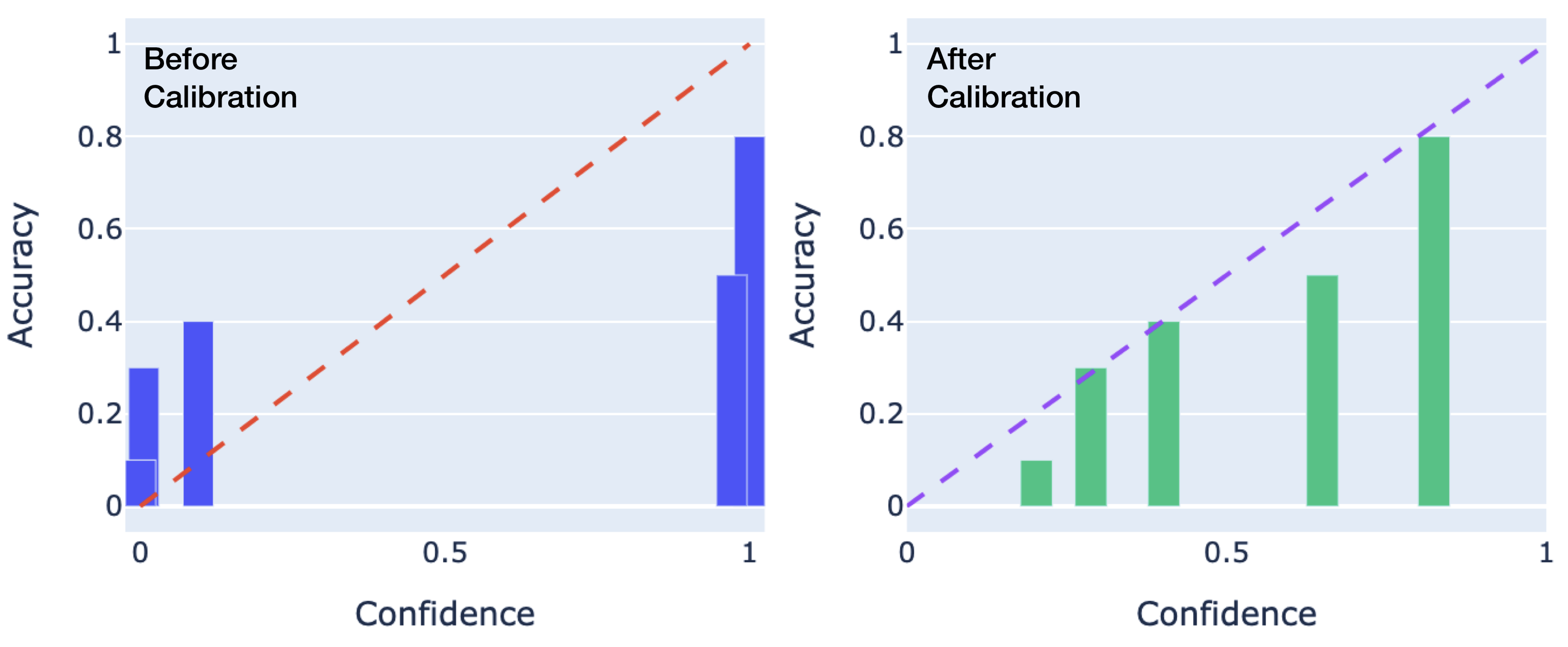
The image presents two bar charts side-by-side, comparing the accuracy of a model before and after calibration. The left chart displays the accuracy before calibration, while the right chart shows the accuracy after calibration. Both charts plot accuracy against confidence, with a dashed line representing perfect calibration.
### Components/Axes
* **Titles:**
* Left Chart: "Before Calibration" (top-left)
* Right Chart: "After Calibration" (top-left)
* **X-axis (Confidence):**
* Label: "Confidence" (bottom)
* Scale: 0 to 1, with markers at 0, 0.5, and 1.
* **Y-axis (Accuracy):**
* Label: "Accuracy" (left side)
* Scale: 0 to 1, with markers at 0, 0.2, 0.4, 0.6, 0.8, and 1.
* **Data Representation:**
* Bars: Represent the accuracy at different confidence levels.
* Left Chart: Blue bars
* Right Chart: Green bars
* Dashed Line: Represents perfect calibration (where accuracy equals confidence).
* Left Chart: Red dashed line
* Right Chart: Purple dashed line
### Detailed Analysis
**Left Chart: Before Calibration**
* **Bars (Blue):**
* Confidence ~0: Accuracy ~0.1
* Confidence ~0.1: Accuracy ~0.3
* Confidence ~0.2: Accuracy ~0.4
* Confidence ~0.9: Accuracy ~0.5
* Confidence ~1: Accuracy ~0.8
* **Dashed Line (Red):**
* Starts at (0,0) and ends at (1,1), indicating perfect calibration.
**Right Chart: After Calibration**
* **Bars (Green):**
* Confidence ~0.2: Accuracy ~0.1
* Confidence ~0.4: Accuracy ~0.3
* Confidence ~0.6: Accuracy ~0.5
* Confidence ~0.9: Accuracy ~0.8
* **Dashed Line (Purple):**
* Starts at (0,0) and ends at (1,1), indicating perfect calibration.
### Key Observations
* **Before Calibration:** The model appears to be overconfident, especially at higher confidence levels. The blue bars deviate significantly from the red dashed line.
* **After Calibration:** The green bars are closer to the purple dashed line, indicating improved calibration. The model's confidence is now more aligned with its actual accuracy.
* The bars in the "After Calibration" chart are generally closer to the dashed line than the bars in the "Before Calibration" chart.
### Interpretation
The charts demonstrate the effect of calibration on a model's confidence scores. Before calibration, the model's confidence was not well-aligned with its accuracy, leading to overconfidence. After calibration, the model's confidence scores are better aligned with its accuracy, resulting in a more reliable and trustworthy model. The calibration process has successfully adjusted the model's confidence to better reflect its true performance.