# Technical Analysis: Model Calibration Reliability Diagrams
This document provides a detailed extraction and analysis of two reliability diagrams comparing model performance before and after calibration.
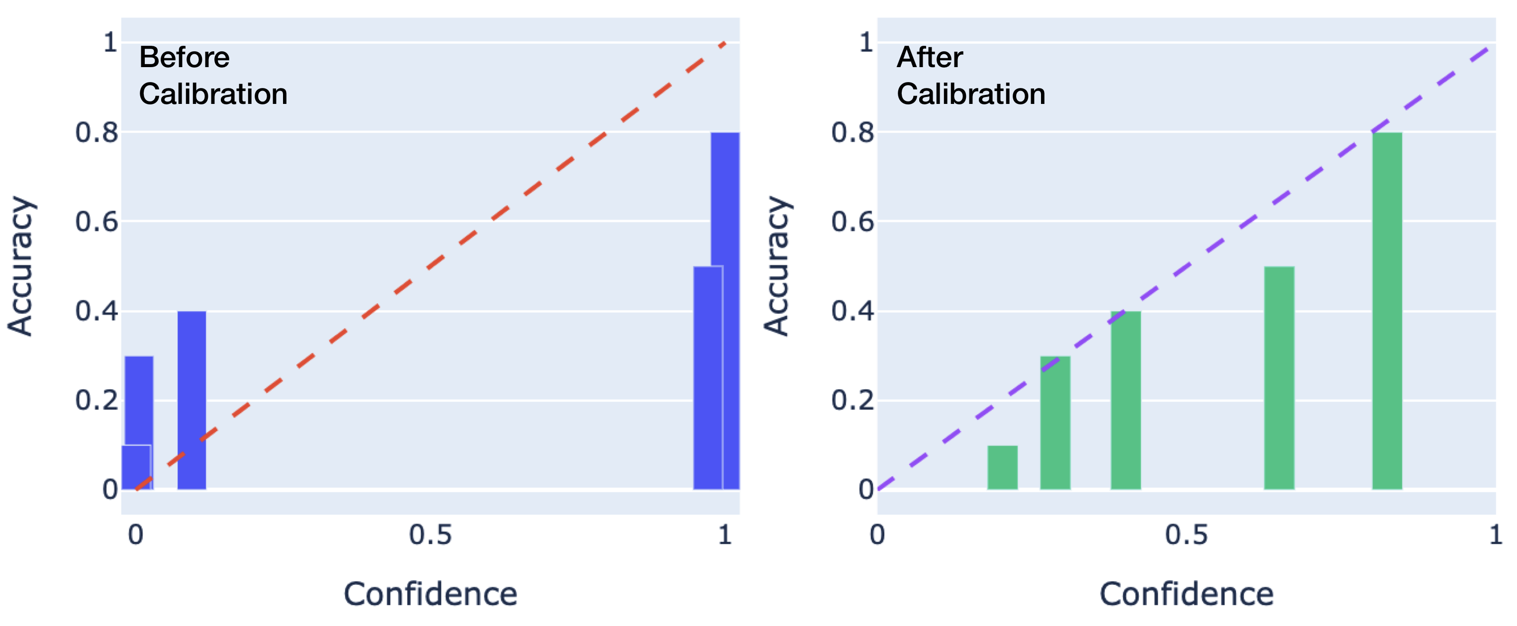
## 1. Document Overview
The image consists of two side-by-side bar charts (reliability diagrams) plotted on a coordinate system where the x-axis represents **Confidence** and the y-axis represents **Accuracy**. Both axes range from 0 to 1.
* **Left Chart:** Labeled "Before Calibration" (Blue bars, Red dashed diagonal).
* **Right Chart:** Labeled "After Calibration" (Green bars, Purple dashed diagonal).
---
## 2. Component Isolation
### A. Shared Axis Definitions
* **X-Axis:** Label: "Confidence". Markers: [0, 0.5, 1].
* **Y-Axis:** Label: "Accuracy". Markers: [0, 0.2, 0.4, 0.6, 0.8, 1].
* **Ideal Calibration Line:** A dashed diagonal line starting at [0,0] and ending at [1,1]. In a perfectly calibrated model, the height of the bars should match this line (Accuracy = Confidence).
### B. Left Chart: "Before Calibration"
* **Header Text:** "Before Calibration" (Top-left quadrant).
* **Reference Line:** Red dashed line ($y = x$).
* **Data Series (Blue Bars):**
* **Trend:** The bars are clustered at the extreme ends of the confidence spectrum (near 0 and near 1). There is a significant gap in the middle confidence ranges (0.2 to 0.9).
* **Data Points (Approximate):**
* At Confidence $\approx$ 0.0: Accuracy is $\approx$ 0.3 (Over-confident in low-probability predictions).
* At Confidence $\approx$ 0.1: Accuracy is $\approx$ 0.4.
* At Confidence $\approx$ 0.95: Accuracy is $\approx$ 0.5.
* At Confidence $\approx$ 1.0: Accuracy is $\approx$ 0.8.
* **Observation:** The model is poorly calibrated. At high confidence (1.0), the actual accuracy is lower (0.8), indicating **over-confidence**. At very low confidence, the accuracy is higher than predicted, indicating **under-confidence** in those specific bins.
### C. Right Chart: "After Calibration"
* **Header Text:** "After Calibration" (Top-left quadrant).
* **Reference Line:** Purple dashed line ($y = x$).
* **Data Series (Green Bars):**
* **Trend:** The bars are distributed more evenly across the confidence spectrum and closely follow the diagonal reference line.
* **Data Points (Approximate):**
* At Confidence $\approx$ 0.2: Accuracy is $\approx$ 0.1.
* At Confidence $\approx$ 0.3: Accuracy is $\approx$ 0.3.
* At Confidence $\approx$ 0.4: Accuracy is $\approx$ 0.4.
* At Confidence $\approx$ 0.65: Accuracy is $\approx$ 0.5.
* At Confidence $\approx$ 0.85: Accuracy is $\approx$ 0.8.
* **Observation:** The model shows significantly improved calibration. The height of the green bars closely tracks the purple dashed line, meaning the predicted probability (confidence) is a much more accurate reflection of the true likelihood of a correct prediction.
---
## 3. Comparative Summary Table
| Feature | Before Calibration (Left) | After Calibration (Right) |
| :--- | :--- | :--- |
| **Bar Color** | Blue | Green |
| **Diagonal Color** | Red (Dashed) | Purple (Dashed) |
| **Distribution** | Polarized (ends of the scale) | Distributed across the scale |
| **Calibration Quality** | Poor (High deviation from diagonal) | Good (Close alignment with diagonal) |
| **Model State** | Over-confident at high values | Well-calibrated |
## 4. Conclusion
The transition from the left chart to the right chart demonstrates a successful calibration process. The "Before" state shows a model that makes many predictions with 100% confidence that are only 80% accurate. The "After" state shows a model where the confidence levels are statistically consistent with the observed accuracy across various bins.