## Calibration Plots: Before and After Calibration
### Overview
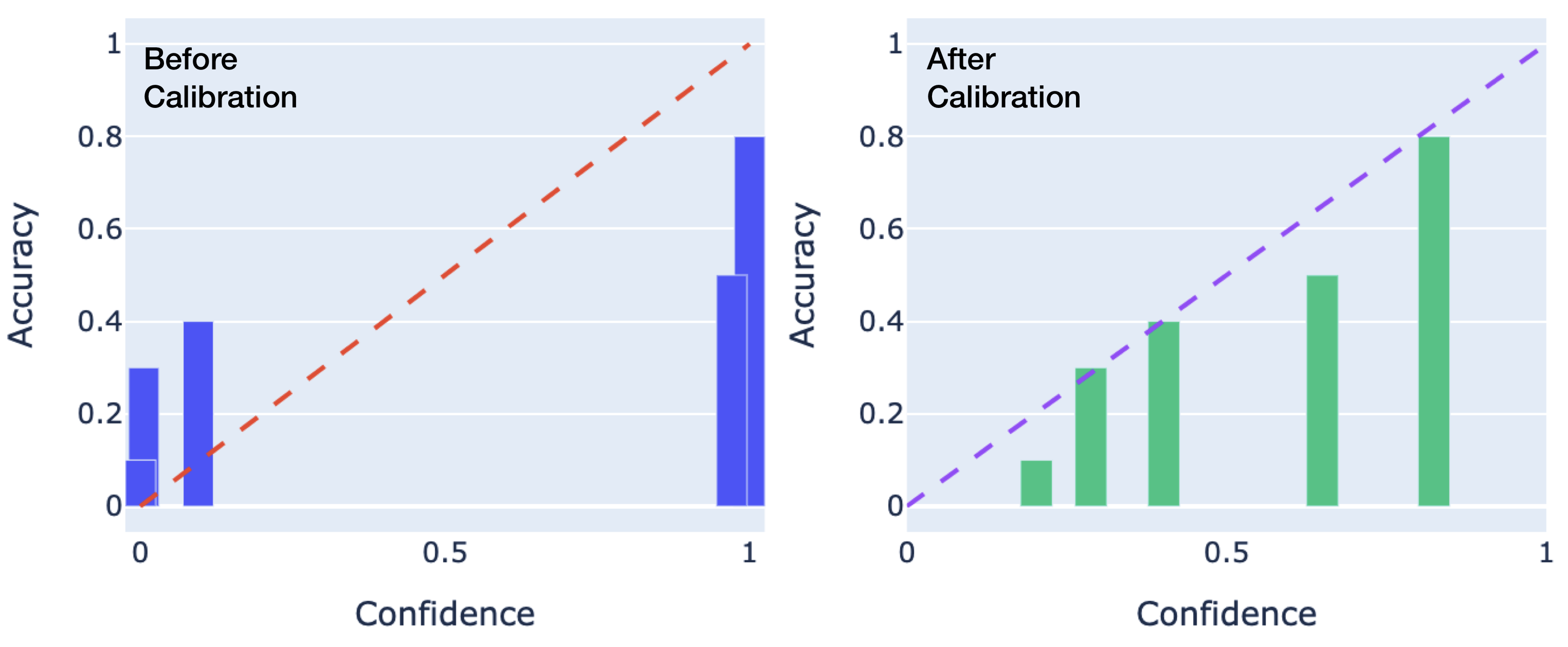
The image displays two side-by-side calibration plots (also known as reliability diagrams) comparing a model's performance before and after a calibration procedure. Each plot graphs the relationship between the model's predicted confidence (x-axis) and its actual accuracy (y-axis). The goal is for the model's confidence to match its accuracy, which would be represented by data points falling along the diagonal line from (0,0) to (1,1).
### Components/Axes
* **Plot Titles:** "Before Calibration" (left plot), "After Calibration" (right plot). Both are positioned in the top-left corner of their respective chart areas.
* **X-Axis:** Labeled "Confidence" on both plots. The scale runs from 0 to 1, with major tick marks at 0, 0.5, and 1.
* **Y-Axis:** Labeled "Accuracy" on both plots. The scale runs from 0 to 1, with major tick marks at 0, 0.2, 0.4, 0.6, 0.8, and 1.
* **Reference Line:** A dashed diagonal line from (0,0) to (1,1) is present in both plots, representing perfect calibration (where confidence equals accuracy). The line is red in the "Before" plot and purple in the "After" plot.
* **Data Representation:** Vertical bars represent the observed accuracy for bins of confidence scores.
* **Left Plot ("Before Calibration"):** Bars are blue.
* **Right Plot ("After Calibration"):** Bars are green.
* **Background:** Both plots have a light blue-gray background with white horizontal grid lines aligned with the y-axis ticks.
### Detailed Analysis
**1. "Before Calibration" Plot (Left, Blue Bars):**
* **Trend Verification:** The blue bars do not follow the diagonal reference line. They show a pattern where low-confidence predictions have higher-than-expected accuracy, and high-confidence predictions have lower-than-expected accuracy. This indicates the model is **underconfident** at low confidence levels and **overconfident** at high confidence levels.
* **Data Points (Approximate):**
* A bar centered near Confidence = 0.1 has an Accuracy of ~0.3.
* A bar centered near Confidence = 0.2 has an Accuracy of ~0.4.
* A bar centered near Confidence = 0.9 has an Accuracy of ~0.5.
* A bar centered near Confidence = 1.0 has an Accuracy of ~0.8.
* **Spatial Grounding:** The bars are clustered at the low end (0.0-0.2) and high end (0.8-1.0) of the confidence axis, with a large gap in the middle range (0.3-0.7).
**2. "After Calibration" Plot (Right, Green Bars):**
* **Trend Verification:** The green bars align much more closely with the purple diagonal reference line. The trend shows a steady, near-linear increase in accuracy as confidence increases, which is the desired behavior for a well-calibrated model.
* **Data Points (Approximate):**
* A bar centered near Confidence = 0.3 has an Accuracy of ~0.1.
* A bar centered near Confidence = 0.4 has an Accuracy of ~0.3.
* A bar centered near Confidence = 0.5 has an Accuracy of ~0.4.
* A bar centered near Confidence = 0.7 has an Accuracy of ~0.5.
* A bar centered near Confidence = 0.9 has an Accuracy of ~0.8.
* **Spatial Grounding:** The bars are distributed more evenly across the confidence axis from ~0.3 to ~0.9, filling the gap seen in the "Before" plot.
### Key Observations
1. **Dramatic Shift in Distribution:** The calibration process fundamentally changed the model's confidence score distribution. Before calibration, scores were polarized (very low or very high). After calibration, scores are spread across the mid-range.
2. **Alignment with Ideal:** The "After" plot shows a strong positive correlation between confidence and accuracy that closely tracks the ideal diagonal line, whereas the "Before" plot shows a weak and inconsistent relationship.
3. **Correction of Overconfidence:** The most significant correction is at the high-confidence end. Before calibration, a confidence of 1.0 corresponded to only ~0.8 accuracy (severe overconfidence). After calibration, a confidence of 0.9 corresponds to ~0.8 accuracy, a much more honest estimate.
4. **Correction of Underconfidence:** At the low end, predictions with ~0.1 confidence were actually correct ~30% of the time (underconfident). After calibration, low-confidence predictions (~0.3) have correspondingly low accuracy (~0.1).
### Interpretation
This visualization demonstrates the successful application of a model calibration technique (e.g., Platt scaling, isotonic regression, or temperature scaling). The core message is that **raw model confidence scores are not reliable probability estimates.**
* **What the data suggests:** Before calibration, the model's "confidence" was not a meaningful measure of the likelihood of being correct. It was systematically biased—overly sure when it was often wrong, and overly unsure when it was often right. This makes the raw scores dangerous for decision-making in risk-sensitive applications (e.g., medical diagnosis, autonomous systems).
* **How elements relate:** The diagonal line serves as the ground truth for what "calibrated" means. The bars represent the model's empirical reality. The distance between a bar and the line is the calibration error. The "After" plot shows this error has been minimized across the confidence spectrum.
* **Why it matters:** A well-calibrated model (right plot) allows its confidence score to be interpreted as a true probability. If it says it is 70% confident, it is correct about 70% of the time. This is essential for:
* **Thresholding:** Setting decision thresholds (e.g., "only act if confidence > 0.9") becomes meaningful.
* **Risk Assessment:** Users can properly weigh the model's output against potential costs of errors.
* **Ensemble Methods:** Combining predictions from multiple models requires their confidence scores to be on the same, reliable scale.
The transformation from the left plot to the right plot represents a critical step in moving a machine learning model from a pure pattern recognizer to a tool for reliable probabilistic reasoning.