\n
## Scatter Plot: A-mem vs. Base
### Overview
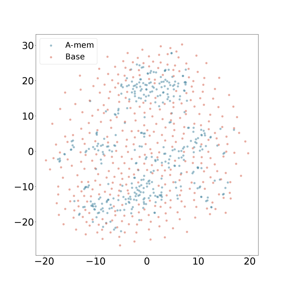
The image presents a scatter plot comparing two datasets, labeled "A-mem" and "Base," plotted against two unnamed axes. The plot displays a distribution of points across a range of values on both axes, with no clear linear correlation.
### Components/Axes
* **X-axis:** Ranges from approximately -20 to 20, with tick marks at intervals of 10. No label is present.
* **Y-axis:** Ranges from approximately -30 to 30, with tick marks at intervals of 10. No label is present.
* **Legend:** Located in the top-left corner.
* "A-mem": Represented by blue dots.
* "Base": Represented by light red dots.
### Detailed Analysis
The plot contains a large number of data points for both "A-mem" and "Base."
**A-mem (Blue Dots):**
The points are distributed across the entire range of the x-axis (-20 to 20) and the y-axis (-30 to 30). There is a slight concentration of points around the origin (0,0). The distribution appears roughly symmetrical around the x-axis.
* Approximate data points (sampled visually):
* (-18, -25)
* (-10, 5)
* (0, 0)
* (5, 10)
* (15, -15)
**Base (Light Red Dots):**
Similar to "A-mem," the points are widely distributed across the x and y axes. There appears to be a slightly higher density of points in the upper-right quadrant (positive x and y values) compared to the lower-left quadrant.
* Approximate data points (sampled visually):
* (-15, -20)
* (-5, 15)
* (0, 10)
* (10, 20)
* (18, -5)
There is significant overlap between the two datasets, making it difficult to visually separate them without the color coding.
### Key Observations
* There is no obvious strong correlation between the x and y values for either dataset.
* The distributions of both datasets appear relatively random, although "Base" may have a slight tendency towards positive values.
* The datasets have similar ranges on both axes.
* The density of points appears to be fairly uniform across the plot, with some minor variations.
### Interpretation
The scatter plot suggests that there is no clear relationship between the two variables being plotted for either the "A-mem" or "Base" datasets. The lack of correlation indicates that changes in one variable do not predictably influence the other. The overlapping distributions suggest that the two datasets may be drawn from similar underlying populations or processes.
The plot could be visualizing the results of a simulation, experimental measurements, or statistical analysis. Without knowing what the axes represent, it's difficult to draw more specific conclusions. The slight tendency of "Base" towards positive values could indicate a systematic difference between the two datasets, but further statistical analysis would be needed to confirm this. The absence of axis labels limits the interpretability of the data.