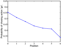
## Chart: Probability of Choosing Action 'Go' vs. Position
### Overview
The image is a line graph showing the probability of choosing the action 'go' as a function of position. The graph shows a decreasing trend, indicating that the probability of choosing 'go' decreases as the position increases.
### Components/Axes
* **X-axis:** Position, labeled from 0 to 6.
* **Y-axis:** Probability of choosing action 'go', ranging from 0.35 to 0.65.
* **Data Series:** A single blue line representing the probability of choosing 'go' at each position.
### Detailed Analysis
The data series (blue line) shows a generally decreasing trend.
* **Position 0:** Probability is approximately 0.56.
* **Position 1:** Probability is approximately 0.50.
* **Position 2:** Probability is approximately 0.48.
* **Position 3:** Probability is approximately 0.44.
* **Position 4:** Probability is approximately 0.42.
* **Position 5:** Probability is approximately 0.41.
* **Position 6:** Probability is approximately 0.34.
### Key Observations
The probability of choosing the action 'go' decreases as the position increases. The most significant drop occurs between positions 5 and 6.
### Interpretation
The graph suggests that as the position increases, the likelihood of selecting the 'go' action diminishes. This could be due to various factors depending on the context of the experiment or simulation. For example, in a game-like scenario, higher positions might represent less favorable conditions for choosing 'go', leading to a shift in strategy. The sharp decline between positions 5 and 6 could indicate a critical threshold or a significant change in the environment that strongly discourages the 'go' action.