# Technical Document Extraction: Spectrogram Analysis
## 1. Image Classification and Overview
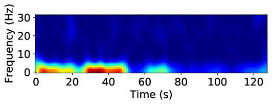
This image is a **spectrogram**, a visual representation of the spectrum of frequencies of a signal as it varies with time. It uses a heatmap color scale to represent the intensity (magnitude/power) of specific frequencies over a duration of approximately 125 seconds.
## 2. Component Isolation
### A. Axis Labels and Markers
* **Vertical Axis (Y-axis):**
* **Label:** `Frequency (Hz)`
* **Markers:** `0`, `10`, `20`, `30`
* **Scale:** Linear, ranging from 0 Hz to slightly above 30 Hz.
* **Horizontal Axis (X-axis):**
* **Label:** `Time (s)`
* **Markers:** `0`, `20`, `40`, `60`, `80`, `100`, `120`
* **Scale:** Linear, representing time in seconds, ending at approximately 128 seconds.
### B. Color Legend (Implicit)
While a formal color bar is not present, the standard jet/thermal colormap is utilized:
* **Dark Blue:** Low intensity / Background noise.
* **Cyan/Green:** Moderate intensity.
* **Yellow/Orange:** High intensity.
* **Dark Red:** Peak intensity (Maximum power).
---
## 3. Data Extraction and Trend Analysis
### Frequency Distribution
The signal energy is heavily concentrated in the low-frequency range, specifically between **0 Hz and 10 Hz**. Frequencies above 10 Hz show negligible activity (dark blue), indicating a low-pass characteristic or a signal dominated by low-frequency oscillations.
### Temporal Trends (0 - 128 seconds)
The data can be segmented into distinct temporal phases based on signal intensity:
1. **Phase 1: Initial Activity (0s to ~22s)**
* **Trend:** Sustained high-intensity activity.
* **Details:** A strong band of energy is visible between 0-5 Hz. Peak intensity (Red) occurs between 5s and 15s at approximately 1-3 Hz.
2. **Phase 2: Brief Attenuation (~22s to ~28s)**
* **Trend:** Sharp decrease in intensity.
* **Details:** The signal drops to moderate levels (Cyan/Green) briefly before the next surge.
3. **Phase 3: Primary Peak Activity (~28s to ~52s)**
* **Trend:** Maximum intensity burst.
* **Details:** This is the most energetic portion of the spectrogram. A deep red core is visible between 30s and 45s, centered around 2 Hz. The frequency spread reaches up to ~8 Hz (Cyan).
4. **Phase 4: Moderate Activity (~52s to ~75s)**
* **Trend:** Significant power drop-off.
* **Details:** The signal intensity shifts to the Green/Cyan range. A small localized "bump" of moderate energy occurs around 65s-70s.
5. **Phase 5: Low Activity / Quiescence (~75s to ~120s)**
* **Trend:** Near-baseline levels.
* **Details:** The spectrogram is predominantly dark blue. Very faint cyan spots appear intermittently near the 0-2 Hz line, but no significant power is recorded.
6. **Phase 6: Terminal Activity (~120s to 128s)**
* **Trend:** Slight uptick at the end of the sample.
* **Details:** A small increase in intensity (Cyan) is visible at the very right edge of the plot in the 0-5 Hz range.
---
## 4. Summary of Key Data Points
| Feature | Value / Range |
| :--- | :--- |
| **Primary Frequency Band** | 0 Hz - 5 Hz |
| **Maximum Frequency Observed** | ~10 Hz (at low intensity) |
| **Total Duration** | ~128 seconds |
| **Peak Intensity Timeframe** | 30s - 45s |
| **Peak Intensity Frequency** | ~2 Hz |
**Language Declaration:** The text in this image is entirely in **English**. No other languages are present.