## Probability Distribution Comparison: Geometric Quantum Theory vs. Quantum Mechanics
### Overview
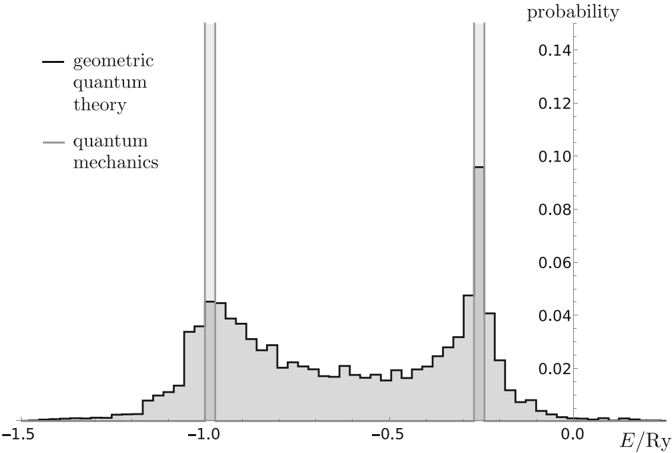
The image is a technical chart comparing the probability distributions of energy (E/Ry) as predicted by two theoretical frameworks: "geometric quantum theory" and "quantum mechanics." It is a histogram-style plot showing the probability density of energy states.
### Components/Axes
* **Chart Type:** Probability distribution histogram (step plot).
* **X-Axis:**
* **Label:** `E/Ry` (Energy in Rydberg units).
* **Range:** Approximately -1.5 to 0.0.
* **Major Tick Marks:** -1.5, -1.0, -0.5, 0.0.
* **Y-Axis:**
* **Label:** `probability` (located on the right side of the chart).
* **Range:** 0.00 to 0.14.
* **Major Tick Marks:** 0.00, 0.02, 0.04, 0.06, 0.08, 0.10, 0.12, 0.14.
* **Legend:**
* **Position:** Top-left corner of the chart area.
* **Entry 1:** A solid black line labeled `geometric quantum theory`.
* **Entry 2:** A solid gray line labeled `quantum mechanics`.
* **Data Series:**
1. **Geometric Quantum Theory (Black Line):** A stepped histogram (step plot) with a gray fill underneath. It forms a broad, bimodal distribution.
2. **Quantum Mechanics (Gray Line/Fill):** Represented by two very narrow, tall, gray-filled peaks (resembling Dirac delta functions) superimposed on the broader distribution.
### Detailed Analysis
* **Quantum Mechanics Distribution (Gray Peaks):**
* **Peak 1:** Centered at approximately **E/Ry = -1.0**. The peak height reaches a probability of ~0.14 (the top of the y-axis scale).
* **Peak 2:** Centered at approximately **E/Ry = -0.25**. The peak height reaches a probability of ~0.10.
* **Trend:** This series shows two discrete, highly localized energy states with very high probability density at specific values and near-zero probability elsewhere.
* **Geometric Quantum Theory Distribution (Black Stepped Line):**
* **Overall Shape:** A broad, continuous, bimodal distribution spanning from roughly -1.4 to -0.1 E/Ry.
* **Primary Peak Region:** The highest probability density for this series occurs in a broad region around **E/Ry = -1.0**, with a maximum step height of approximately **0.05**.
* **Secondary Peak Region:** A second, slightly lower broad peak is centered around **E/Ry = -0.25**, with a maximum step height of approximately **0.045**.
* **Valley:** A distinct minimum in probability occurs between the two peaks, centered near **E/Ry = -0.6**, where the probability density drops to approximately **0.015**.
* **Tails:** The distribution tapers off to near-zero probability at the extremes, below -1.4 and above -0.1 E/Ry.
* **Trend:** This series suggests a smeared or continuous distribution of probable energy states, in contrast to the discrete states of the other theory.
### Key Observations
1. **Discrete vs. Continuous:** The most striking feature is the contrast between the sharp, discrete peaks of "quantum mechanics" and the broad, continuous distribution of "geometric quantum theory."
2. **Peak Alignment:** The centers of the two sharp quantum mechanics peaks (-1.0 and -0.25 E/Ry) align closely with the centers of the two broad peaks in the geometric quantum theory distribution.
3. **Probability Magnitude:** The peak probabilities for the discrete quantum mechanics states (~0.14 and ~0.10) are significantly higher than the maximum probabilities for the continuous geometric theory distribution (~0.05).
4. **Spatial Layout:** The legend is placed in the top-left, avoiding overlap with the data. The y-axis label is unusually placed on the right, but the scale is clear.
### Interpretation
This chart visually demonstrates a fundamental difference in the predictions of two physical theories regarding the energy spectrum of a system.
* **What the data suggests:** "Quantum mechanics," in this specific context or model, predicts that the system can only exist at two precise, discrete energy levels (-1.0 and -0.25 Ry). "Geometric quantum theory" predicts that the system's energy is not sharply defined but has a probability distribution spread over a range, with the highest likelihoods clustered around those same two energy values.
* **How elements relate:** The chart is designed for direct comparison. By overlaying the two distributions, it highlights that the geometric theory's broad peaks are centered on the same energies as the quantum mechanics' sharp peaks. This suggests the geometric theory might be modeling the same underlying physics but with an inherent uncertainty, smearing, or different boundary conditions that lead to a continuous spectrum.
* **Notable implications:** The geometric theory's distribution has non-zero probability for energies between the two discrete states, where standard quantum mechanics (as depicted) assigns zero probability. This could represent a theoretical prediction of allowed transitions, thermal broadening, or a different interpretation of the quantum state. The chart serves as a powerful visual argument for how a geometric formulation might alter the predicted observable properties (like energy measurements) of a quantum system.