\n
## Chart: Probability Distribution of Energy
### Overview
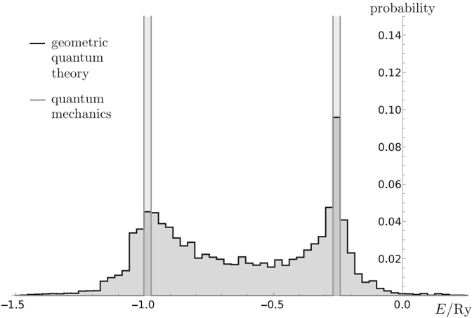
The image presents a chart displaying the probability distribution of energy, normalized by the Rydberg unit (Ry). Two curves are plotted: one representing "geometric quantum theory" and the other "quantum mechanics". Both curves exhibit similar shapes, with two prominent peaks and a dip in the center. The chart appears to be a histogram-like representation of probability versus energy.
### Components/Axes
* **X-axis:** Labeled "E/Ry" (Energy normalized by the Rydberg unit). The scale ranges from approximately -1.5 to 0.0. Axis markers are present at -1.5, -1.0, -0.5, and 0.0.
* **Y-axis:** Labeled "probability". The scale ranges from approximately 0.0 to 0.14. Axis markers are present at 0.0, 0.02, 0.04, 0.06, 0.08, 0.10, 0.12, and 0.14.
* **Legend:** Located in the top-left corner.
* "geometric quantum theory" - represented by a black solid line.
* "quantum mechanics" - represented by a gray solid line.
### Detailed Analysis
* **Geometric Quantum Theory (Black Line):** The curve starts at a probability of approximately 0.01 at E/Ry = -1.5. It increases to a peak of approximately 0.11 at E/Ry = -1.0, then drops sharply to a minimum of approximately 0.01 at E/Ry = -0.5. It then rises again to a secondary peak of approximately 0.06 at E/Ry = 0.0.
* **Quantum Mechanics (Gray Line):** The curve follows a similar trend to the geometric quantum theory. It starts at a probability of approximately 0.01 at E/Ry = -1.5. It increases to a peak of approximately 0.10 at E/Ry = -1.0, then drops sharply to a minimum of approximately 0.01 at E/Ry = -0.5. It then rises again to a secondary peak of approximately 0.05 at E/Ry = 0.0.
* **Peaks:** Both curves exhibit two distinct peaks. The primary peak is located around E/Ry = -1.0, and the secondary peak is located around E/Ry = 0.0.
* **Dip:** Both curves show a significant dip in probability around E/Ry = -0.5.
* **Vertical Lines:** Two vertical lines are present at E/Ry = -1.0 and E/Ry = 0.0. These lines are not part of the curves themselves, but are overlaid on the chart.
### Key Observations
* The two curves are very similar in shape, suggesting that both geometric quantum theory and quantum mechanics predict similar probability distributions for energy.
* The primary peak at E/Ry = -1.0 is significantly higher than the secondary peak at E/Ry = 0.0, indicating that energies around -1.0 Ry are more probable.
* The dip at E/Ry = -0.5 suggests that energies around -0.5 Ry are less probable.
### Interpretation
The chart demonstrates the probability distribution of energy as predicted by two different theoretical frameworks: geometric quantum theory and standard quantum mechanics. The close similarity between the two curves suggests a strong correspondence between the two theories in terms of energy distribution. The peaks and dips in the curves likely correspond to specific energy levels or states within the system being modeled. The vertical lines at E/Ry = -1.0 and E/Ry = 0.0 may indicate specific energy thresholds or boundaries relevant to the system. The data suggests that the system favors energies around -1.0 Ry, with a lower probability of finding the system at energies around -0.5 Ry. Further analysis would be needed to determine the physical significance of these energy levels and the implications of the observed probability distribution.