## Chart: Eigenvalue and Effective Dimension Plots
### Overview
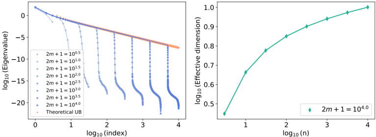
The image presents two plots side-by-side. The left plot shows the logarithm base 10 of the eigenvalue versus the logarithm base 10 of the index for different values of the parameter 2m+1. The right plot shows the logarithm base 10 of the effective dimension versus the logarithm base 10 of n for a specific value of 2m+1.
### Components/Axes
**Left Plot:**
* **X-axis:** log₁₀(index), with tick marks at 0, 1, 2, 3, and 4.
* **Y-axis:** log₁₀(Eigenvalue), with tick marks at 0, -5, -10, -15, and -20.
* **Legend (located in the bottom-left):**
* Light Blue: 2m + 1 = 10⁰.⁵
* Light Blue: 2m + 1 = 10¹.⁰
* Light Blue: 2m + 1 = 10¹.⁵
* Light Blue: 2m + 1 = 10².⁰
* Light Blue: 2m + 1 = 10².⁵
* Light Blue: 2m + 1 = 10³.⁰
* Light Blue: 2m + 1 = 10³.⁵
* Blue: 2m + 1 = 10⁴.⁰
* Orange: Theoretical UB (Upper Bound)
**Right Plot:**
* **X-axis:** log₁₀(n), with tick marks at 1, 2, 3, and 4.
* **Y-axis:** log₁₀(Effective dimension), with tick marks at 0.5, 0.6, 0.7, 0.8, 0.9, and 1.0.
* **Legend (located in the bottom-center):**
* Teal: 2m + 1 = 10⁴.⁰
### Detailed Analysis
**Left Plot (Eigenvalue vs. Index):**
* **Theoretical UB (Orange):** This line shows a linear downward trend. It starts at approximately -1 on the y-axis when x=0, and ends at approximately -4 on the y-axis when x=4.
* **2m + 1 = 10⁰.⁵ (Light Blue):** This line starts at approximately -1 on the y-axis when x=0, and quickly drops to approximately -20 on the y-axis at x=1.
* **2m + 1 = 10¹.⁰ (Light Blue):** This line starts at approximately -1 on the y-axis when x=0, and drops to approximately -20 on the y-axis at x=1.5.
* **2m + 1 = 10¹.⁵ (Light Blue):** This line starts at approximately -1 on the y-axis when x=0, and drops to approximately -20 on the y-axis at x=2.
* **2m + 1 = 10².⁰ (Light Blue):** This line starts at approximately -1 on the y-axis when x=0, and drops to approximately -20 on the y-axis at x=2.5.
* **2m + 1 = 10².⁵ (Light Blue):** This line starts at approximately -1 on the y-axis when x=0, and drops to approximately -20 on the y-axis at x=3.
* **2m + 1 = 10³.⁰ (Light Blue):** This line starts at approximately -1 on the y-axis when x=0, and drops to approximately -20 on the y-axis at x=3.5.
* **2m + 1 = 10³.⁵ (Light Blue):** This line starts at approximately -1 on the y-axis when x=0, and drops to approximately -20 on the y-axis at x=4.
* **2m + 1 = 10⁴.⁰ (Blue):** This line starts at approximately -1 on the y-axis when x=0, and drops to approximately -20 on the y-axis at x=4.
**Right Plot (Effective Dimension vs. n):**
* **2m + 1 = 10⁴.⁰ (Teal):** This line shows an upward trend.
* At x=1, y ≈ 0.45
* At x=2, y ≈ 0.75
* At x=3, y ≈ 0.90
* At x=4, y ≈ 0.98
### Key Observations
* In the left plot, as the value of 2m+1 increases, the point at which the eigenvalue drops significantly shifts to the right.
* The "Theoretical UB" line in the left plot provides an upper bound for the eigenvalues.
* In the right plot, the effective dimension increases with n, but the rate of increase slows down as n increases.
### Interpretation
The plots illustrate the relationship between eigenvalues, index, effective dimension, and the parameter 2m+1. The left plot shows how the eigenvalues decay as the index increases, and how this decay is affected by the value of 2m+1. The right plot shows how the effective dimension increases with n for a specific value of 2m+1. The data suggests that increasing 2m+1 delays the decay of eigenvalues, and that the effective dimension approaches a limit as n increases. The theoretical upper bound provides a benchmark for the eigenvalue decay.