## [Dual Plot Analysis]: Eigenvalue Decay and Effective Dimension Scaling
### Overview
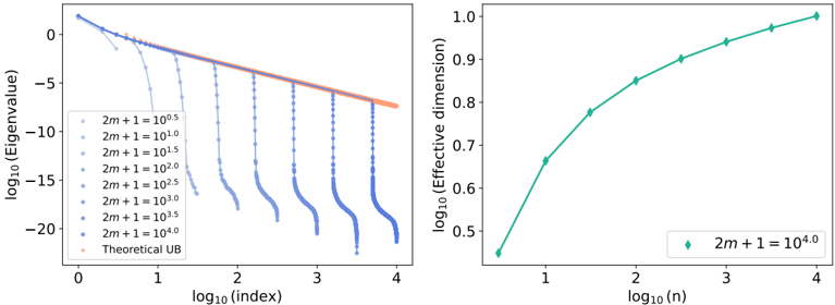
The image contains two separate but related scientific plots presented side-by-side. Both plots use logarithmic scales on both axes (log-log plots). The left plot analyzes the decay of eigenvalues across an index, while the right plot examines the scaling of an "Effective dimension" with respect to a parameter `n`. The plots appear to be from a technical paper, likely in the fields of machine learning, statistics, or numerical analysis, investigating properties of a model or system parameterized by `m` and `n`.
### Components/Axes
**Left Plot:**
* **Chart Type:** Line plot with multiple data series.
* **X-axis:** Label: `log10(index)`. Scale: Linear from 0 to 4.
* **Y-axis:** Label: `log10(Eigenvalue)`. Scale: Linear from approximately -22 to 2.
* **Legend:** Positioned in the top-left corner. Contains 8 entries:
1. `2m + 1 = 10^0.5` (Lightest blue, almost white)
2. `2m + 1 = 10^1.0`
3. `2m + 1 = 10^1.5`
4. `2m + 1 = 10^2.0`
5. `2m + 1 = 10^2.5`
6. `2m + 1 = 10^3.0`
7. `2m + 1 = 10^3.5`
8. `2m + 1 = 10^4.0` (Darkest blue)
9. `Theoretical UB` (Orange line)
* **Data Series:** 8 blue lines of varying shades (darker for higher `2m+1` values) and one orange line.
**Right Plot:**
* **Chart Type:** Line plot with a single data series.
* **X-axis:** Label: `log10(n)`. Scale: Linear from approximately 0.5 to 4.
* **Y-axis:** Label: `log10(Effective dimension)`. Scale: Linear from 0.45 to 1.0.
* **Legend:** Positioned in the bottom-right corner. Contains 1 entry:
1. `2m + 1 = 10^4.0` (Teal/green diamond marker)
* **Data Series:** A single teal/green line with diamond markers.
### Detailed Analysis
**Left Plot - Eigenvalue Spectrum:**
* **Trend Verification:** All blue data series show a general downward trend as `log10(index)` increases. The orange "Theoretical UB" (Upper Bound) line is a straight line with a constant negative slope, serving as an envelope.
* **Data Series Behavior:** Each blue line follows the theoretical bound closely for low indices, then exhibits a sharp, near-vertical drop-off at a specific index. The index of this drop increases with the value of `2m+1`.
* For `2m+1 = 10^0.5`, the drop occurs near `log10(index) ≈ 0.7` (index ≈ 5).
* For `2m+1 = 10^4.0`, the drop occurs near `log10(index) ≈ 3.7` (index ≈ 5000).
* **Approximate Values:** The eigenvalues start near `10^1` (log value ~1) for low indices. The theoretical bound line passes through approximately (0, 1) and (4, -7.5). The sharp drops plummet to values below `10^-20` (log value < -20).
**Right Plot - Effective Dimension Scaling:**
* **Trend Verification:** The single data series shows a clear upward, concave-down trend. The rate of increase slows as `log10(n)` increases.
* **Data Points (Approximate):**
* At `log10(n) ≈ 0.5` (n ≈ 3.16), `log10(Effective dimension) ≈ 0.46` (Effective dimension ≈ 2.88).
* At `log10(n) ≈ 1.0` (n = 10), `log10(Effective dimension) ≈ 0.67` (Effective dimension ≈ 4.68).
* At `log10(n) ≈ 2.0` (n = 100), `log10(Effective dimension) ≈ 0.85` (Effective dimension ≈ 7.08).
* At `log10(n) ≈ 3.0` (n = 1000), `log10(Effective dimension) ≈ 0.94` (Effective dimension ≈ 8.71).
* At `log10(n) ≈ 4.0` (n = 10000), `log10(Effective dimension) ≈ 0.99` (Effective dimension ≈ 9.77).
* The curve appears to be approaching an asymptote near `log10(Effective dimension) = 1.0` (Effective dimension = 10).
### Key Observations
1. **Eigenvalue Decay Regime:** The system exhibits a clear "phase transition." For a given `2m+1`, eigenvalues decay according to a power law (linear on log-log plot) until a critical index, after which they vanish almost completely. This critical index scales with `2m+1`.
2. **Theoretical Bound:** The orange "Theoretical UB" line accurately predicts the pre-cutoff decay rate for all series, regardless of `2m+1`.
3. **Effective Dimension Saturation:** The effective dimension for the case `2m+1 = 10^4.0` grows with `n` but shows diminishing returns, suggesting a capacity limit or saturation point is being approached as `n` becomes large.
4. **Parameter Relationship:** The right plot uses the highest value of `2m+1` from the left plot (`10^4.0`), suggesting the two plots are analyzing different aspects of the same high-complexity model configuration.
### Interpretation
These plots together tell a story about the **capacity and complexity** of a parameterized system (likely a neural network or kernel method).
* **Left Plot (Eigenvalue Spectrum):** This reveals the **effective rank** or **information content** of the system's representation. The sharp cutoff indicates that only a finite number of components (eigenvectors) are significant for a given model size (`2m+1`). Larger models (higher `2m+1`) can sustain meaningful components across a wider spectrum (higher indices), implying they can capture more complex patterns or features. The theoretical bound suggests this decay is a fundamental property, not an artifact.
* **Right Plot (Effective Dimension):** This quantifies the **functional complexity** or **degrees of freedom** of the model as the dataset size (`n`) grows. The sub-linear growth and saturation indicate that while adding more data increases the model's effective complexity, it does so at a decreasing rate. The model's capacity, set by `2m+1 = 10^4.0`, ultimately limits how complex its learned function can become, regardless of how much data (`n`) is provided.
**In essence:** The left plot shows the *potential* complexity available in the model's parameter space (which grows with `2m+1`), while the right plot shows how much of that potential is *actually utilized* as a function of data availability (`n`). The system demonstrates a controlled, power-law-based complexity that is bounded both by its architecture (`2m+1`) and by the data (`n`). This is characteristic of analyses studying generalization, overfitting, or the "double descent" phenomenon in machine learning.