\n
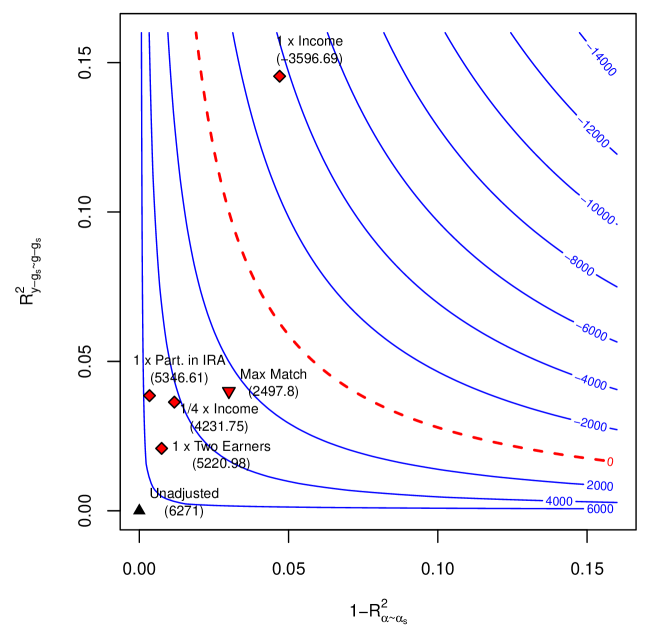
## Contour Plot: Relationship between R-squared values and Benefit Levels
### Overview
This image presents a contour plot illustrating the relationship between two R-squared values (R²<sub>y-αs-gs</sub> and 1-R²<sub>α-αs</sub>) and associated benefit levels, represented by contour lines. Several data points are overlaid on the plot, each labeled with a specific scenario and a numerical value. The plot appears to model some kind of financial benefit or cost, likely related to income and retirement savings.
### Components/Axes
* **X-axis:** Labeled "1-R²<sub>α-αs</sub>", ranging from approximately 0.00 to 0.15.
* **Y-axis:** Labeled "R²<sub>y-αs-gs</sub>", ranging from approximately 0.00 to 0.15.
* **Contour Lines:** Represent different benefit levels, ranging from -6000 to -14000, with increments of 2000. A dashed red line represents a benefit level of 0.
* **Data Points:** Five data points are plotted, each with a unique marker (diamond or triangle) and label.
* **Legend:** The right side of the image displays the contour levels with corresponding colors. The contour lines are blue, and the zero benefit line is dashed red.
### Detailed Analysis
The contour lines are generally curved, indicating a non-linear relationship between the two R-squared values and the benefit level. The benefit levels decrease as both R²<sub>y-αs-gs</sub> and 1-R²<sub>α-αs</sub> increase.
Here's a breakdown of the data points:
1. **Unadjusted:** (0.00, 0.00) - Value: 6271. Marker: Downward-pointing triangle.
2. **1 x Two Earners:** (0.01, 0.01) - Value: 5220.98. Marker: Diamond.
3. **¼ x Income:** (0.02, 0.03) - Value: 4231.75. Marker: Diamond.
4. **1 x Part. in IRA:** (0.03, 0.05) - Value: 5346.61. Marker: Diamond.
5. **1 x Income:** (0.05, 0.15) - Value: -3596.69. Marker: Diamond.
The contour lines are closely spaced in the bottom-left corner of the plot, indicating a steeper gradient of benefit levels in that region. The contour lines become more spread out as you move towards the top-right corner, suggesting a more gradual change in benefit levels.
### Key Observations
* The "1 x Income" scenario results in a negative benefit (-3596.69), while all other scenarios show positive benefits.
* The "Unadjusted" scenario has the highest benefit level (6271).
* As the values of both R-squared terms increase, the benefit generally decreases.
* The benefit levels are sensitive to changes in both R-squared values, particularly in the lower-left region of the plot.
### Interpretation
This plot likely represents a cost-benefit analysis of different financial scenarios, potentially related to retirement savings or tax benefits. The R-squared values likely represent the proportion of variance explained by certain factors (alpha, sigma, gamma, etc.). The benefit level represents the net financial outcome of each scenario.
The negative benefit associated with "1 x Income" suggests that, under those conditions, the costs outweigh the benefits. The "Unadjusted" scenario having the highest benefit implies that, without any adjustments or participation in specific programs (like an IRA), the financial outcome is most favorable.
The contour lines demonstrate that the benefit level is highly sensitive to the values of the R-squared terms, indicating that small changes in these factors can significantly impact the overall financial outcome. The plot could be used to evaluate the effectiveness of different financial strategies or policies. The use of R-squared suggests a regression-based model is being used to predict the benefit.
The plot is a visual representation of a mathematical model, and the specific meaning of the R-squared values and benefit levels would require further context about the underlying financial model.