TECHNICAL ASSET FINGERPRINT
f6fd71076e3582cc6569c7d1
Click to view fullscreen
Press ESC or click to close
FOUND IN PAPERS
EXPERT: healer-alpha-free VERSION 1
RUNTIME: free/openrouter/healer-alpha
INTEL_VERIFIED
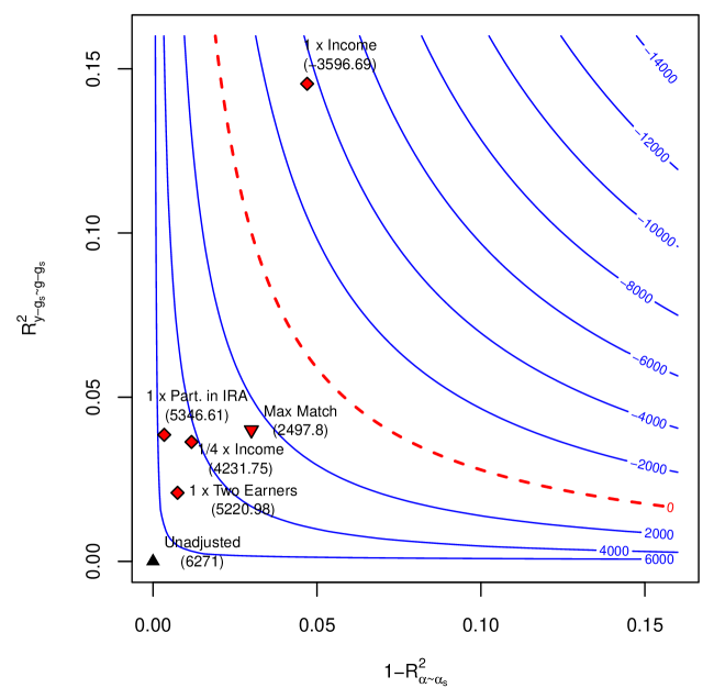
## Contour Plot: Financial Model Optimization Landscape
### Overview
The image is a technical contour plot illustrating a two-dimensional optimization landscape, likely related to financial or econometric modeling. It displays contour lines representing the value of an objective function across a plane defined by two statistical metrics. Several specific model configurations are plotted as labeled points, each with an associated numerical value (presumably the objective function value at that point). The plot uses a combination of blue solid contour lines, one red dashed contour line, and distinct markers for the labeled points.
### Components/Axes
* **X-Axis:**
* **Label:** `1 - R²_{α~α_s}` (This appears to be "1 minus R-squared" for a model relating variables α and α_s).
* **Scale:** Linear scale ranging from 0.00 to 0.15, with major ticks at 0.00, 0.05, 0.10, and 0.15.
* **Y-Axis:**
* **Label:** `R²_{y~g·g_s}` (This appears to be "R-squared" for a model relating variable y to the interaction or product of g and g_s).
* **Scale:** Linear scale ranging from 0.00 to 0.15, with major ticks at 0.00, 0.05, 0.10, and 0.15.
* **Contour Lines (Blue, Solid):**
* These lines represent level sets of an unnamed objective function.
* **Labels (from top-right to bottom-left):** -14000, -12000, -10000, -8000, -6000, -4000, -2000, 0, 2000, 4000, 6000.
* **Spatial Grounding:** The contours are hyperbolic in shape, curving from the top-left quadrant down towards the bottom-right. The values increase (become less negative, then positive) as one moves from the top-right corner towards the bottom-left corner of the plot.
* **Contour Line (Red, Dashed):**
* **Label:** `0`
* **Spatial Grounding:** This line runs roughly diagonally from the top-center (near x=0.05, y=0.15) to the right-center (near x=0.15, y=0.03). It separates the region of negative contour values (above/right) from positive values (below/left).
* **Labeled Data Points:**
* **Point 1:**
* **Marker:** Red diamond.
* **Label:** `x Income`
* **Value:** `(3596.69)`
* **Position:** Top-center, approximately at (x=0.05, y=0.14).
* **Point 2:**
* **Marker:** Red diamond.
* **Label:** `1 x Part. in IRA`
* **Value:** `(5346.61)`
* **Position:** Left-center, approximately at (x=0.005, y=0.04).
* **Point 3:**
* **Marker:** Red diamond.
* **Label:** `1/4 x Income`
* **Value:** `(4231.75)`
* **Position:** Left-center, slightly right and below Point 2, approximately at (x=0.015, y=0.035).
* **Point 4:**
* **Marker:** Red diamond.
* **Label:** `1 x Two Earners`
* **Value:** `(5220.98)`
* **Position:** Left-center, below Point 3, approximately at (x=0.01, y=0.02).
* **Point 5:**
* **Marker:** Red inverted triangle.
* **Label:** `Max Match`
* **Value:** `(2497.8)`
* **Position:** Center-left, approximately at (x=0.03, y=0.04).
* **Point 6:**
* **Marker:** Black triangle.
* **Label:** `Unadjusted`
* **Value:** `(6271)`
* **Position:** Bottom-left corner, very close to the origin at approximately (x=0.001, y=0.001).
### Detailed Analysis
* **Trend Verification:** The blue contour lines show a clear gradient. The objective function value increases (from -14000 to +6000) as one moves from the upper-right region (high `1 - R²_{α~α_s}`, high `R²_{y~g·g_s}`) towards the lower-left region (low values on both axes). The red dashed "0" contour marks the transition between negative and positive regions.
* **Data Point Analysis:** The labeled points represent specific model specifications or scenarios.
* The `Unadjusted` model (black triangle) is located at the extreme bottom-left, corresponding to the highest observed objective function value (6271) and lying on the highest positive contour line (~6000).
* Models incorporating adjustments (`x Income`, `1 x Part. in IRA`, `1/4 x Income`, `1 x Two Earners`) are located in the central and upper-left regions. Their objective function values range from 3596.69 to 5346.61, placing them between the 2000 and 6000 contour lines.
* The `Max Match` point (red inverted triangle) has the lowest value among the labeled points (2497.8) and is situated near the 2000 contour line.
* **Spatial Relationships:** There is a cluster of four diamond-marked adjustment models in the left-center area. The `x Income` model is an outlier within this group, positioned much higher on the y-axis. The `Unadjusted` model is isolated in the corner, suggesting it represents a baseline with very different statistical properties (very low values on both axis metrics).
### Key Observations
1. **Strong Inverse Relationship:** The contour shape indicates a strong inverse relationship or trade-off between the two axis metrics for a given objective function value. To maintain the same objective value, an increase in `1 - R²_{α~α_s}` must be compensated by a decrease in `R²_{y~g·g_s}`, and vice-versa.
2. **Optimal Region:** The highest objective function values are found in the region where both `1 - R²_{α~α_s}` and `R²_{y~g·g_s}` are minimized (close to zero). The `Unadjusted` model sits in this optimal zone.
3. **Impact of Adjustments:** All labeled adjustment models (`x Income`, etc.) move the solution away from the origin (increasing at least one of the axis metrics) and result in a lower objective function value compared to the `Unadjusted` model.
4. **Outlier:** The `x Income` adjustment has a particularly high `R²_{y~g·g_s}` value (~0.14) compared to the other adjustments, suggesting this specific adjustment drastically changes the model's fit on that dimension.
### Interpretation
This plot visualizes the cost, in terms of a defined objective function, of introducing different explanatory variables or adjustments into a statistical model. The axes represent two different measures of model fit or variance explanation (`R²`-like metrics).
* **The `Unadjusted` model** is the most "efficient" according to this objective function, achieving the highest value. However, its position at the extreme low end of both axes suggests it may be a very simple or parsimonious model that explains little variance in the components measured by the axes.
* **The adjustment models** likely represent more complex models that include additional predictors (e.g., income, IRA participation, number of earners). Their movement up and to the right on the plot shows that adding these variables increases the model's explanatory power on the dimensions captured by the axes (higher `R²` values), but this comes at the direct cost of lowering the objective function value. This could represent a trade-off between explanatory power and another criterion like predictive accuracy, simplicity, or a specific loss function.
* **The `Max Match` scenario** appears to be a constrained optimum or a specific policy rule that yields a relatively low objective value, suggesting it may prioritize something other than the metric being optimized here.
* **The contour lines** map out the entire feasible frontier of trade-offs between the two axis metrics. Any model specification can be located on this map, and its objective value can be inferred from the nearest contour. The plot essentially answers: "For a desired level of fit on these two dimensions, what objective function value can I expect, and which known model configurations are nearby?"
DECODING INTELLIGENCE...