## Contour Plot: Relationship Between R²_y and 1-R²_α
### Overview
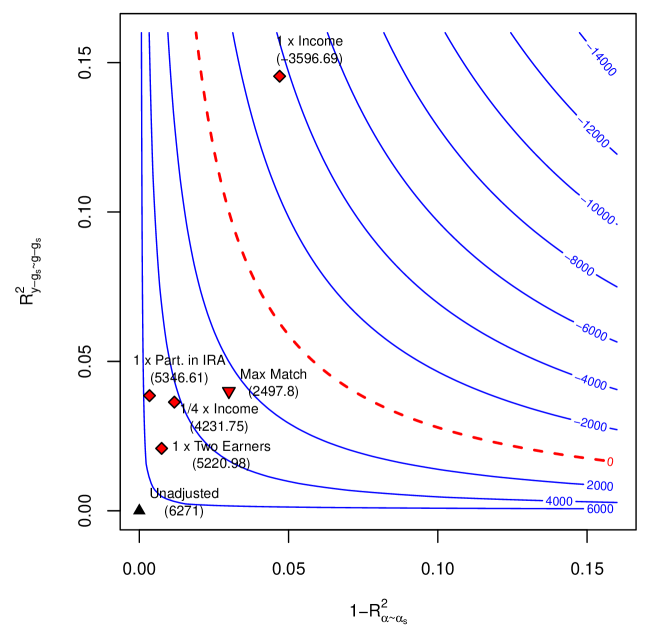
The image is a contour plot visualizing the relationship between two variables: **R²_y** (y-axis) and **1-R²_α** (x-axis). The plot includes labeled contour lines, data points with annotations, and a red dashed "Max Match" curve. The axes range from 0.0 to 0.15 for both variables, with contour values decreasing from -14,000 (top-left) to -4,000 (bottom-right).
---
### Components/Axes
- **X-axis**: **1-R²_α** (0.0 to 0.15), labeled with increments of 0.05.
- **Y-axis**: **R²_y** (0.0 to 0.15), labeled with increments of 0.05.
- **Contour Lines**: Blue lines labeled with negative values (-14,000 to -4,000), decreasing from top-left to bottom-right.
- **Legend**: Located on the right (partially visible), associating colors with data series (e.g., red diamonds, black triangle).
- **Data Points**: Red diamonds and a black triangle with labels (e.g., "1x Income," "Uncluttered").
---
### Detailed Analysis
#### Contour Trends
- Contour lines slope downward from top-left to bottom-right, indicating decreasing values of the plotted function (e.g., cost, error) as **1-R²_α** increases and **R²_y** decreases.
- The steepest gradient occurs near the top-left, where contour values drop rapidly (e.g., -14,000 to -10,000 between 0.0 and 0.05 on the x-axis).
#### Data Points
1. **1x Income**
- Coordinates: (0.035, 0.096)
- Contour Value: ~-3,596.69 (intersects -4,000 line).
2. **1/4 x Income**
- Coordinates: (0.042, 0.075)
- Contour Value: ~-2,497.15 (intersects -2,000 line).
3. **1x Two Earners**
- Coordinates: (0.052, 0.052)
- Contour Value: ~-5,220.98 (intersects -6,000 line).
4. **Max Match**
- Coordinates: (0.036, 0.069)
- Contour Value: ~-3,596.69 (intersects -4,000 line).
5. **Uncluttered**
- Coordinates: (0.062, 0.001)
- Contour Value: ~-4,000 (bottom-right edge).
#### Red Dashed Line ("Max Match")
- Starts near the top-left (0.025, 0.12) and curves downward to the bottom-right (0.15, 0.02).
- Intersects contour lines at key points, suggesting an optimal trade-off region.
---
### Key Observations
1. **Trade-off Relationship**: Higher **R²_y** values (top of the plot) correspond to lower **1-R²_α** (left side), but this comes at the cost of higher negative contour values (e.g., -14,000).
2. **Outliers**:
- The "Uncluttered" point (0.062, 0.001) is an outlier, with minimal **R²_y** but high **1-R²_α**, suggesting a scenario where one variable dominates.
- "1x Two Earners" (0.052, 0.052) lies near the "Max Match" curve, indicating a balanced trade-off.
3. **Scaling Effects**: Labels like "1x Income" and "1/4 x Income" imply multiplicative factors affecting the variables, with smaller multipliers (e.g., 1/4 x) clustering closer to the "Max Match" curve.
---
### Interpretation
- **Functional Relationship**: The plot likely models a system where **R²_y** and **1-R²_α** are competing metrics (e.g., accuracy vs. complexity). The contour values (-14,000 to -4,000) could represent costs, errors, or penalties associated with specific combinations of these variables.
- **Optimal Region**: The "Max Match" curve defines a Pareto frontier, where no improvement in one variable can be made without worsening the other. Data points like "1x Two Earners" and "Max Match" lie near this frontier, suggesting optimal configurations.
- **Scalability**: Smaller multipliers (e.g., "1/4 x Income") achieve better contour values (less negative) but at lower **R²_y**, indicating diminishing returns.
- **Anomalies**: The "Uncluttered" point deviates significantly, possibly representing a simplified or edge-case scenario where **1-R²_α** is maximized at the expense of **R²_y**.
This plot highlights the trade-offs inherent in balancing **R²_y** and **1-R²_α**, with the "Max Match" curve serving as a guide for optimal decision-making under constraints.