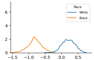
## Chart: Density Plot of Two Races
### Overview
The image is a density plot comparing the distributions of a variable for two racial groups: White and Black. The plot shows the probability density of the variable on the x-axis for each race.
### Components/Axes
* **X-axis:** The x-axis is unlabeled, but ranges from approximately -1.5 to 0.5.
* **Y-axis:** The y-axis represents density and ranges from 0 to 7.
* **Legend:** Located in the top-right corner, the legend identifies the two data series:
* Blue line: "White"
* Orange line: "Black"
### Detailed Analysis
* **White (Blue Line):** The distribution for the White group is centered around 0.1, with a peak density of approximately 2. The distribution is relatively narrow, indicating less variability.
* **Black (Orange Line):** The distribution for the Black group is centered around -0.9, with a peak density of approximately 2.5. The distribution is also relatively narrow.
### Key Observations
* The distributions for the two races are clearly separated, indicating a significant difference in the variable being measured.
* The Black group has a higher peak density than the White group.
* Both distributions appear to be approximately normal.
### Interpretation
The density plot suggests that there is a statistically significant difference in the variable being measured between the White and Black racial groups. The variable tends to be higher for the White group and lower for the Black group. The plot does not provide information about the nature of the variable or the context in which it was measured, so further interpretation would require additional information.