## Line Graph: Comparison of Two Groups (White and Black)
### Overview
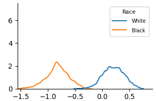
The image is a line graph comparing two data series labeled "White" (blue line) and "Black" (orange line). The x-axis ranges from -1.5 to 0.5, and the y-axis ranges from 0 to 6. Both lines exhibit single-peaked distributions with distinct central tendencies.
### Components/Axes
- **X-axis**: Labeled with numerical values from -1.5 to 0.5 in increments of 0.5. No explicit label provided.
- **Y-axis**: Labeled with numerical values from 0 to 6 in increments of 2. No explicit label provided.
- **Legend**: Located in the top-right corner, with:
- Blue line: "White"
- Orange line: "Black"
### Detailed Analysis
- **Blue Line (White)**:
- Peaks at approximately **x = 0.25**, with a y-value of **~2.0**.
- The line rises from near 0 at x = -0.5, peaks at 0.25, then declines to near 0 at x = 0.5.
- The curve is smooth with no sharp inflections.
- **Orange Line (Black)**:
- Peaks at approximately **x = -1.0**, with a y-value of **~2.5**.
- The line rises from near 0 at x = -1.5, peaks at -1.0, then declines to near 0 at x = -0.5.
- The curve is slightly more jagged than the blue line, with minor fluctuations.
### Key Observations
1. The orange line ("Black") has a **higher peak value** (~2.5 vs. ~2.0) and is centered further left on the x-axis.
2. Both lines exhibit **similar peak heights** but differ in their **central positions** on the x-axis.
3. The blue line ("White") is more centered around x = 0, while the orange line ("Black") is shifted leftward.
### Interpretation
The graph likely represents a comparison of a metric (e.g., test scores, survey responses, or another variable) between two groups ("White" and "Black"). The distinct peaks suggest differences in the distribution or central tendency of the metric between the groups. The orange line's higher peak and leftward shift could indicate a stronger or more concentrated response in the "Black" group for the measured variable. The similar peak heights imply comparable variability or frequency in the data, but the positional differences highlight a key divergence in the groups' characteristics. The lack of explicit axis labels limits direct interpretation of the x-axis variable, but the relative positioning of the peaks provides actionable insights into group differences.