## Diagram: Heart Disease Probability Assessment
### Overview
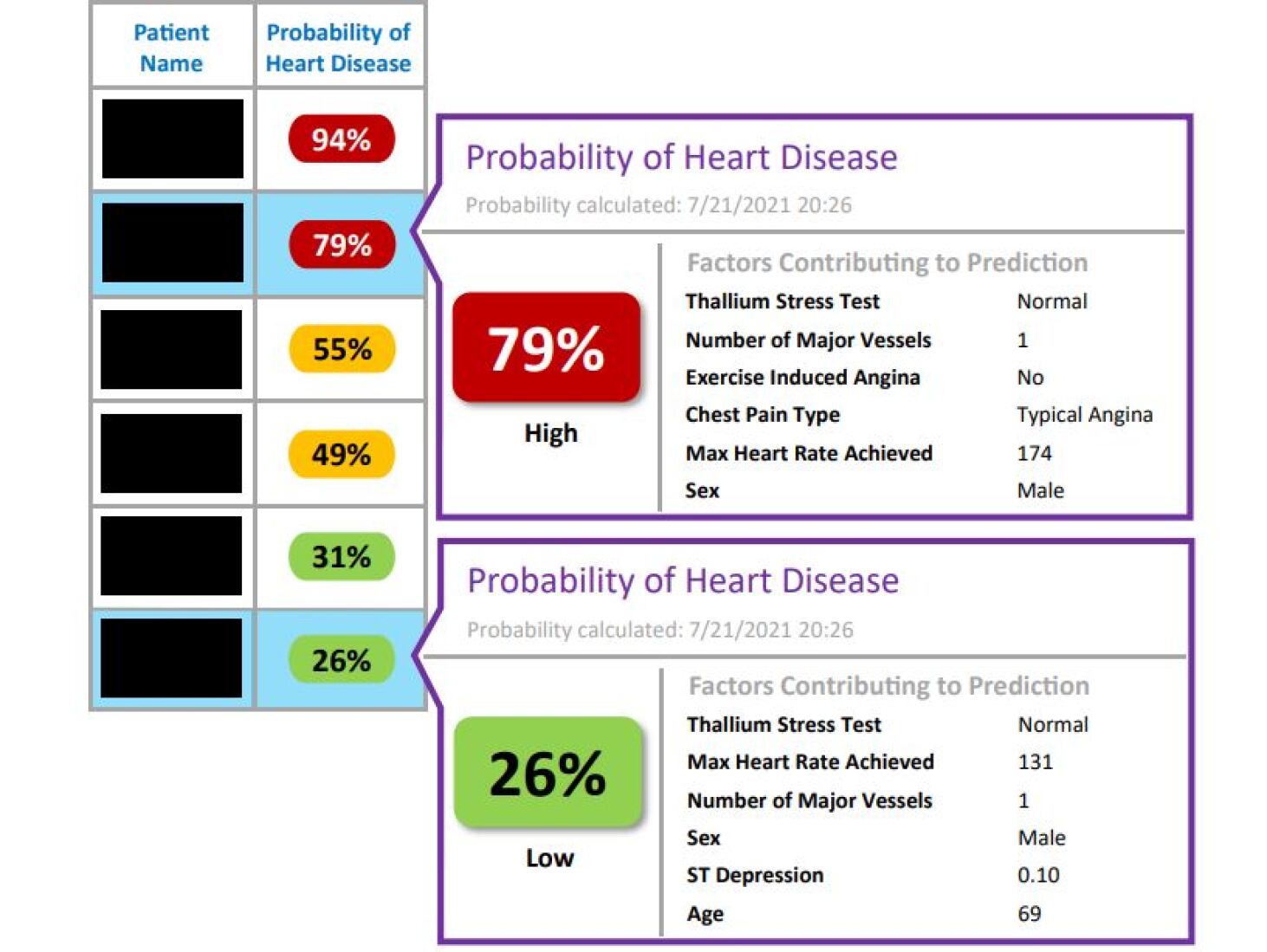
The image presents a visual assessment of the probability of heart disease for multiple patients. The assessment is represented as a series of stacked blocks, each representing a patient, with a color-coded probability percentage. Alongside each probability block are factors contributing to the prediction. The diagram appears to compare patient data to predict heart disease risk.
### Components/Axes
The diagram consists of the following components:
* **Patient Blocks:** Stacked rectangular blocks, each representing a patient. The blocks are colored based on the probability of heart disease (red for high, yellow for moderate, green for low).
* **Probability Percentage:** A large percentage value displayed within each patient block, indicating the probability of heart disease.
* **Probability Labels:** A header section labeled "Probability of Heart Disease" appears twice, once for the high probability assessment and once for the low probability assessment.
* **Factors Contributing to Prediction:** A list of factors used in the prediction, along with their corresponding values for each patient.
* **Date/Time:** "Probability calculated: 7/21/2021 20:26" is displayed twice.
* **Legend:** A small legend in the top-left corner labels the columns as "Patient Name" and "Probability of Heart Disease".
### Detailed Analysis or Content Details
The diagram presents data for six patients, with the following probabilities:
1. **Patient 1:** 94% (Red Block) - No contributing factors are listed.
2. **Patient 2:** 79% (Red Block) - Factors:
* Thallium Stress Test: Normal
* Number of Major Vessels: 1
* Exercise Induced Angina: No
* Chest Pain Type: Typical Angina
* Max Heart Rate Achieved: 174
* Sex: Male
3. **Patient 3:** 55% (Yellow Block) - No contributing factors are listed.
4. **Patient 4:** 49% (Yellow Block) - No contributing factors are listed.
5. **Patient 5:** 31% (Green Block) - No contributing factors are listed.
6. **Patient 6:** 26% (Green Block) - Factors:
* Thallium Stress Test: Normal
* Max Heart Rate Achieved: 131
* Number of Major Vessels: 1
* Sex: Male
* ST Depression: 0.10
* Age: 69
The "Probability calculated" timestamp is consistent across both detailed assessments: 7/21/2021 20:26.
### Key Observations
* The probabilities range from 26% to 94%, indicating a wide variation in heart disease risk among the patients.
* The patients with the highest probabilities (94% and 79%) have detailed contributing factors listed, while those with moderate and low probabilities often lack this information.
* The factors listed for the high-probability patient (79%) suggest a combination of risk factors, including typical angina and a high maximum heart rate.
* The low-probability patient (26%) has factors like normal Thallium Stress Test, but also ST Depression and age (69) which are potential risk factors.
* The diagram uses a color scheme to visually represent the probability levels: red for high, yellow for moderate, and green for low.
### Interpretation
The diagram demonstrates a heart disease risk assessment process. The varying probabilities suggest that the assessment considers multiple factors, and the presence or absence of these factors significantly impacts the predicted risk. The lack of detailed factors for some patients could indicate incomplete data or a simpler assessment model for those cases.
The factors listed provide insight into the criteria used for the assessment. For example, the presence of exercise-induced angina and a high maximum heart rate are associated with increased risk, while a normal Thallium Stress Test is associated with lower risk. The inclusion of age and ST depression in the low-probability assessment suggests that even patients with generally favorable indicators may still be at risk.
The diagram highlights the complexity of heart disease risk assessment and the importance of considering multiple factors to arrive at an accurate prediction. The visual representation makes it easy to compare the risk levels of different patients and identify potential areas for intervention. The timestamp suggests the assessment is dynamic and can be recalculated based on updated data.