## Medical Dashboard: Heart Disease Probability Assessment
### Overview
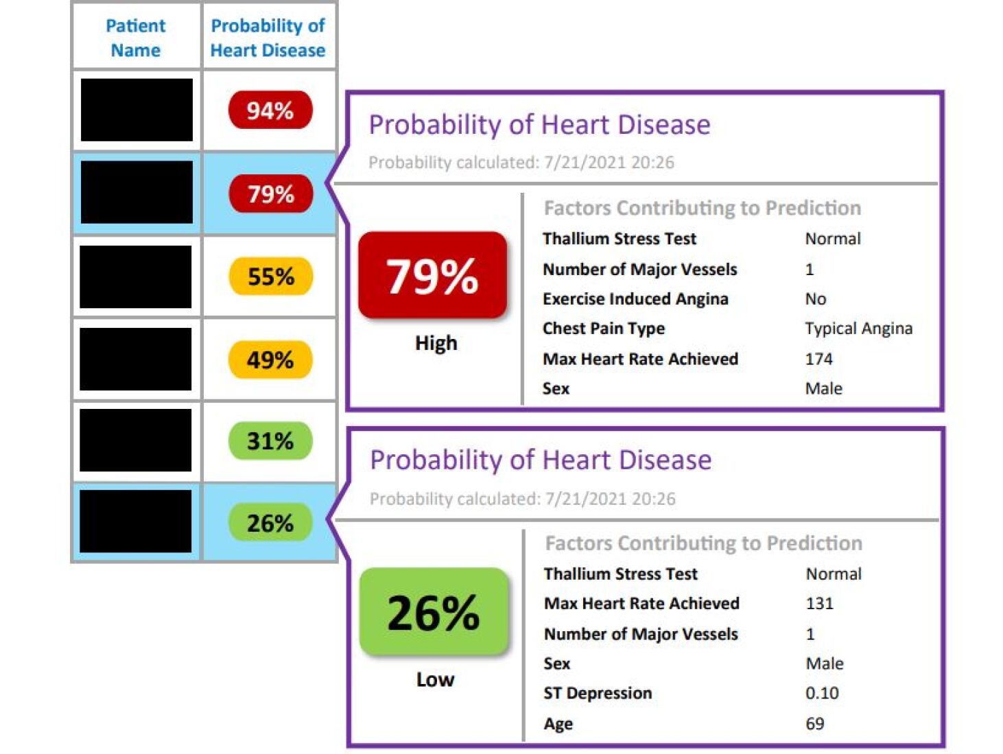
The image displays a medical software interface or report showing heart disease probability predictions for multiple patients. It consists of a summary table on the left and two detailed pop-up panels on the right, which expand on specific patient entries. The interface uses color-coding (red, yellow, green) to indicate risk levels.
### Components
**Left Panel - Patient Summary Table:**
| Patient Name | Probability of Heart Disease |
| :--- | :--- |
| [Redacted] | 94% (Red oval) |
| [Redacted] | 79% (Red oval) - **Highlighted row** |
| [Redacted] | 55% (Yellow oval) |
| [Redacted] | 49% (Yellow oval) |
| [Redacted] | 31% (Green oval) |
| [Redacted] | 26% (Green oval) - **Highlighted row** |
**Right Panel - Detailed Pop-ups:**
Two detailed panels are shown, connected by lines to their corresponding rows in the summary table (79% and 26%).
**Top Detail Panel (for 79% patient):**
* **Header:** "Probability of Heart Disease"
* **Sub-header:** "Probability calculated: 7/21/2021 20:26"
* **Main Display:** A large red rounded rectangle containing "79%" with the label "High" below it.
* **Section Header:** "Factors Contributing to Prediction"
* **Factor List (Key-Value Pairs):**
* Thallium Stress Test: Normal
* Number of Major Vessels: 1
* Exercise Induced Angina: No
* Chest Pain Type: Typical Angina
* Max Heart Rate Achieved: 174
* Sex: Male
**Bottom Detail Panel (for 26% patient):**
* **Header:** "Probability of Heart Disease"
* **Sub-header:** "Probability calculated: 7/21/2021 20:26"
* **Main Display:** A large green rounded rectangle containing "26%" with the label "Low" below it.
* **Section Header:** "Factors Contributing to Prediction"
* **Factor List (Key-Value Pairs):**
* Thallium Stress Test: Normal
* Max Heart Rate Achieved: 131
* Number of Major Vessels: 1
* Sex: Male
* ST Depression: 0.10
* Age: 69
### Detailed Analysis
The system calculates a probability percentage for heart disease for each patient. The probabilities in the sample range from 26% to 94%. The color coding appears to be:
* **Red (High Risk):** 94%, 79%
* **Yellow (Medium Risk):** 55%, 49%
* **Green (Low Risk):** 31%, 26%
The detailed panels reveal the specific clinical factors used in the predictive model for two cases.
* **High-Risk Case (79%):** Characterized by "Typical Angina" chest pain, a high maximum heart rate achieved (174), and one major vessel affected. The thallium stress test was normal, and exercise-induced angina was absent.
* **Low-Risk Case (26%):** Characterized by a lower maximum heart rate (131), a low ST depression value (0.10), and the patient's age (69). It also notes one major vessel affected and a normal thallium test.
### Key Observations
1. **Factor Variability:** The list of contributing factors differs between the two detailed examples. The high-risk panel includes "Chest Pain Type" and "Exercise Induced Angina," while the low-risk panel includes "ST Depression" and "Age." This suggests the model may use different subsets of features for different patients or that the interface displays only the most salient factors for each prediction.
2. **Common Factors:** Both patients are male, have a normal thallium stress test, and have one major vessel affected. Despite these similarities, their risk probabilities differ significantly (79% vs. 26%), highlighting the impact of other variables like chest pain type and achieved heart rate.
3. **Temporal Data:** Both detailed predictions were calculated at the exact same timestamp: July 21, 2021, at 20:26.
### Interpretation
This image depicts a clinical decision support tool designed to quantify heart disease risk. It translates complex patient data into a single, actionable probability score, aiding in triage and prioritization.
The system's logic appears to weigh certain factors heavily. For instance, the presence of "Typical Angina" in the high-risk patient is a strong clinical indicator that likely contributed substantially to the 79% score. Conversely, the low-risk patient's lower max heart rate and minimal ST depression (a measure of heart stress) are negative indicators for significant coronary artery disease.
The discrepancy in listed factors between the two panels is noteworthy. It could indicate an adaptive model that highlights the most influential variables for a given prediction, or it might simply reflect a UI design choice to avoid clutter. The identical calculation timestamp suggests these reports were generated simultaneously, perhaps as part of a batch analysis or a demonstration.
Ultimately, the tool synthesizes objective measurements (e.g., ST Depression, Max Heart Rate) with clinical observations (e.g., Chest Pain Type) to generate a risk stratification, moving beyond qualitative assessment to a data-driven probability.