## Line Graph: Accuracy vs Top η (%)
### Overview
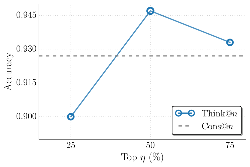
The image is a line graph comparing two performance metrics ("Think@n" and "Cons@n") across varying percentages of "Top η (%)". The graph shows a clear trend in accuracy for "Think@n" with a peak at 50% η, while "Cons@n" remains constant.
### Components/Axes
- **X-axis**: "Top η (%)" with markers at 25%, 50%, and 75%.
- **Y-axis**: "Accuracy" scaled from 0.900 to 0.945 in increments of 0.005.
- **Legend**: Located in the bottom-right corner, with:
- **Blue circles**: "Think@n" (solid line).
- **Gray dashed line**: "Cons@n".
### Detailed Analysis
- **Think@n (Blue Line)**:
- At 25% η: Accuracy = 0.900.
- At 50% η: Accuracy peaks at 0.945.
- At 75% η: Accuracy drops to 0.930.
- **Cons@n (Gray Dashed Line)**:
- Constant accuracy of 0.930 across all η values.
### Key Observations
1. **Peak Performance**: "Think@n" achieves its highest accuracy (0.945) at 50% η.
2. **Decline at Higher η**: Accuracy decreases by 0.015 when η increases from 50% to 75%.
3. **Baseline Comparison**: "Cons@n" maintains a stable accuracy of 0.930, serving as a reference point.
### Interpretation
The data suggests that "Think@n" performs optimally at 50% η, with a significant drop in accuracy at higher η values. This implies a potential trade-off between η percentage and performance for "Think@n". The constant "Cons@n" line indicates a stable baseline, possibly representing a control or alternative method. The sharp decline after 50% η for "Think@n" raises questions about overfitting or diminishing returns at higher η values. The graph highlights the importance of balancing η selection to maximize accuracy while avoiding performance degradation.