TECHNICAL ASSET FINGERPRINT
f863f3fac805bd1f8236a199
Click to view fullscreen
Press ESC or click to close
FOUND IN PAPERS
EXPERT: gemini-3.1-pro-preview VERSION 1
RUNTIME: gemini/gemini-3.1-pro-preview
INTEL_VERIFIED
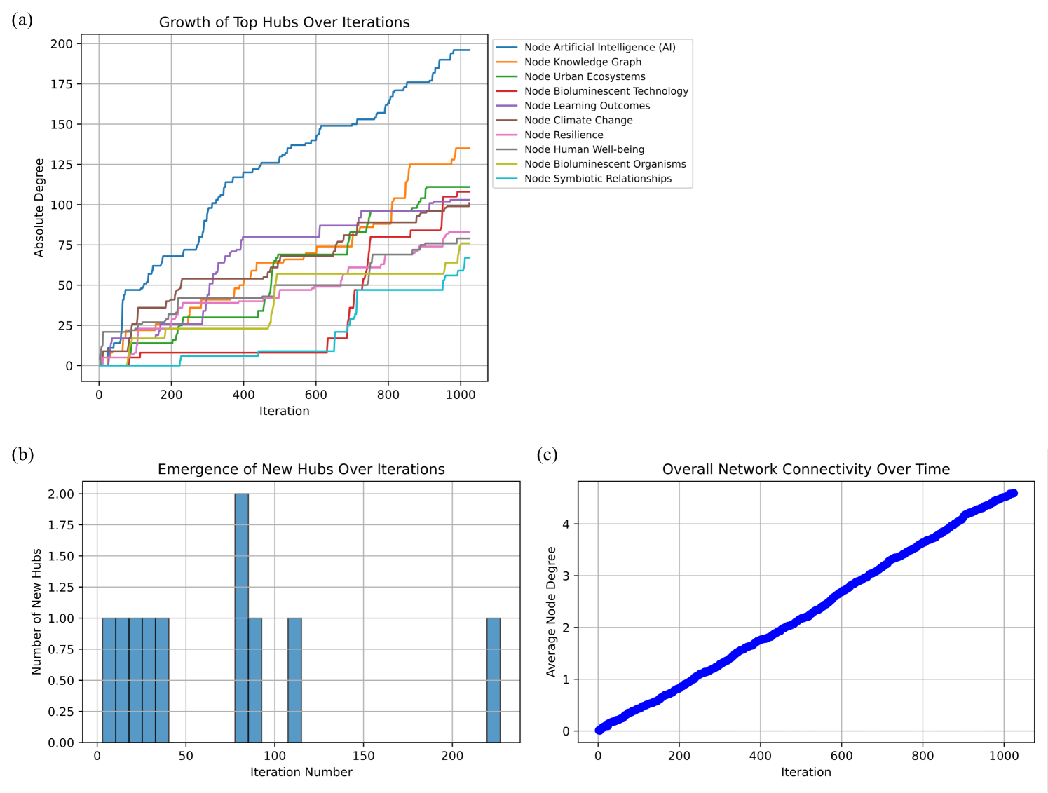
## Multi-Panel Network Analysis Charts: Hub Growth, Emergence, and Connectivity
### Overview
This image is a composite of three distinct data visualizations, labeled (a), (b), and (c), detailing the growth and connectivity metrics of a simulated network over a series of iterations.
- **Chart (a)** (top-left) is a step-line chart tracking the absolute degree of specific top nodes over time.
- **Chart (b)** (bottom-left) is a bar chart showing the frequency of new hub emergence over early iterations.
- **Chart (c)** (bottom-right) is a scatter plot showing the linear growth of the average node degree across the entire network.
**Language Declaration:** All text within the image is in English.
---
### Component Isolation & Detailed Analysis
#### Panel (a): Growth of Top Hubs Over Iterations
**Spatial Grounding:** Located in the top-left quadrant. The legend is positioned outside the chart area to the right.
**Components/Axes:**
* **Title:** Growth of Top Hubs Over Iterations
* **X-axis:** Labeled "Iteration". Scale runs from 0 to 1000, with major gridlines and markers at 0, 200, 400, 600, 800, and 1000.
* **Y-axis:** Labeled "Absolute Degree". Scale runs from 0 to 200, with major gridlines and markers at 0, 25, 50, 75, 100, 125, 150, 175, and 200.
* **Legend:** Contains 10 categories, mapped to specific line colors.
**Trend Verification & Content Details:**
The chart displays step-wise growth for all series, indicating that node degrees increase in discrete jumps rather than continuous flows.
* **Blue Line (Node Artificial Intelligence (AI)):** *Trend:* Dominant, steep upward slope from the beginning. *Data:* Starts at 0, rises rapidly to ~70 by iteration 200, crosses 125 around iteration 450, and finishes as the highest value at ~195 by iteration 1000.
* **Orange Line (Node Knowledge Graph):** *Trend:* Flat initially, with massive late-stage jumps. *Data:* Remains below 25 until iteration ~350. Jumps to ~60 around iteration 400. Experiences a massive spike around iteration 800, ending at ~135.
* **Green Line (Node Urban Ecosystems):** *Trend:* Steady, moderate step-wise growth. *Data:* Reaches ~25 by iteration 200, ~70 by iteration 500, and ends at ~110.
* **Red Line (Node Bioluminescent Technology):** *Trend:* Dormant for the first half, followed by explosive growth. *Data:* Remains near 0-10 until iteration ~620, then shoots up rapidly in a series of steps, ending at ~105.
* **Purple Line (Node Learning Outcomes):** *Trend:* Rapid early growth followed by a long plateau. *Data:* Rises to ~40 by iteration 200, hits ~80 by iteration 400, and then remains almost completely flat, ending at ~80.
* **Brown Line (Node Climate Change):** *Trend:* Consistent, moderate growth. *Data:* Rises to ~50 by iteration 250, steadily climbs to end at ~100.
* **Pink Line (Node Resilience):** *Trend:* Gradual, steady growth. *Data:* Climbs slowly throughout the 1000 iterations, ending at ~85.
* **Grey Line (Node Human Well-being):** *Trend:* Gradual, steady growth, closely mirroring the Pink line. *Data:* Ends at ~75.
* **Olive/Yellow-Green Line (Node Bioluminescent Organisms):** *Trend:* Flat initially, moderate mid-stage growth. *Data:* Stays below 25 until iteration ~480, rises to ~70, and plateaus, ending at ~75.
* **Cyan/Light Blue Line (Node Symbiotic Relationships):** *Trend:* Very late bloomer. *Data:* Stays at 0 until iteration ~200, remains below 10 until iteration ~680, then steps up to end at ~65.
#### Panel (b): Emergence of New Hubs Over Iterations
**Spatial Grounding:** Located in the bottom-left quadrant.
**Components/Axes:**
* **Title:** Emergence of New Hubs Over Iterations
* **X-axis:** Labeled "Iteration Number". Scale runs from 0 to roughly 250, with markers at 0, 50, 100, 150, and 200. *Note: This axis represents a much shorter timeframe than charts (a) and (c).*
* **Y-axis:** Labeled "Number of New Hubs". Scale runs from 0.00 to 2.00, with markers at 0.00, 0.25, 0.50, 0.75, 1.00, 1.25, 1.50, 1.75, and 2.00.
**Trend Verification & Content Details:**
* *Trend:* The emergence of new hubs is heavily front-loaded in the network's lifespan.
* *Data:*
* Single hubs (value 1.00) emerge at approximate iterations: ~5, ~12, ~20, ~28, and ~35.
* A spike of two hubs (value 2.00) emerges at approximate iteration ~80.
* Single hubs (value 1.00) emerge at approximate iterations ~90, ~110, and a final outlier at ~220.
* No new hubs emerge after iteration ~220 (up to the visible edge of the chart).
#### Panel (c): Overall Network Connectivity Over Time
**Spatial Grounding:** Located in the bottom-right quadrant.
**Components/Axes:**
* **Title:** Overall Network Connectivity Over Time
* **X-axis:** Labeled "Iteration". Scale runs from 0 to 1000, with markers at 0, 200, 400, 600, 800, and 1000.
* **Y-axis:** Labeled "Average Node Degree". Scale runs from 0 to roughly 4.5, with markers at 0, 1, 2, 3, and 4.
**Trend Verification & Content Details:**
* *Trend:* A perfectly linear, positive slope.
* *Data:* The chart features a thick blue line (likely composed of dense scatter plot points). It starts at (0, 0) and rises linearly. At iteration 200, the value is ~0.9. At iteration 500, the value is ~2.2. At iteration 1000, the value reaches ~4.5.
---
### Key Observations
1. **The "Rich Get Richer" Phenomenon:** In chart (a), the "Artificial Intelligence (AI)" node establishes dominance early and maintains the highest growth rate throughout the simulation.
2. **Late Bloomers:** Nodes like "Bioluminescent Technology" (Red) show that a node can remain highly disconnected for more than half the simulation (600 iterations) before suddenly experiencing explosive connectivity.
3. **Early Hub Formation:** Chart (b) proves that the "hubs" tracked in chart (a) almost exclusively gained their hub status in the first 120 iterations.
4. **Constant Network Densification:** Chart (c) shows that the average degree of the entire network grows linearly. Because the average degree is growing steadily, edges are being added to the network at a faster rate than new nodes are being added.
### Interpretation
These three charts collectively describe the evolution of a simulated network, highly indicative of a **scale-free network** utilizing a **preferential attachment** mechanism (such as the Barabási–Albert model).
* **Reading between the lines:** Chart (c) shows a smooth, linear increase in average connectivity, meaning the overall system is growing predictably. However, Chart (a) shows that this connectivity is *not* distributed evenly. The step-wise, erratic jumps in Chart (a) indicate that when new connections are formed, they disproportionately attach to specific, already-established nodes.
* **Thematic Context:** The node labels (AI, Knowledge Graph, Urban Ecosystems, Bioluminescent Tech) suggest this is a simulation of technological or conceptual evolution—perhaps mapping how different research topics or patents link together over time. "AI" acts as a foundational, highly-linked concept.
* **The Lifecycle of a Hub:** Chart (b) reveals a critical insight: to become a top hub by iteration 1000, a node generally needs to achieve "hub" status very early in the network's life (before iteration 120). The only way a node overcomes this "first-mover advantage" is through sudden, massive thematic relevance later in the simulation, as seen with the "Bioluminescent Technology" node in Chart (a), which lay dormant until iteration 600 before rapidly acquiring connections.
DECODING INTELLIGENCE...