\n
## Charts: Network Growth and Connectivity Over Iterations
### Overview
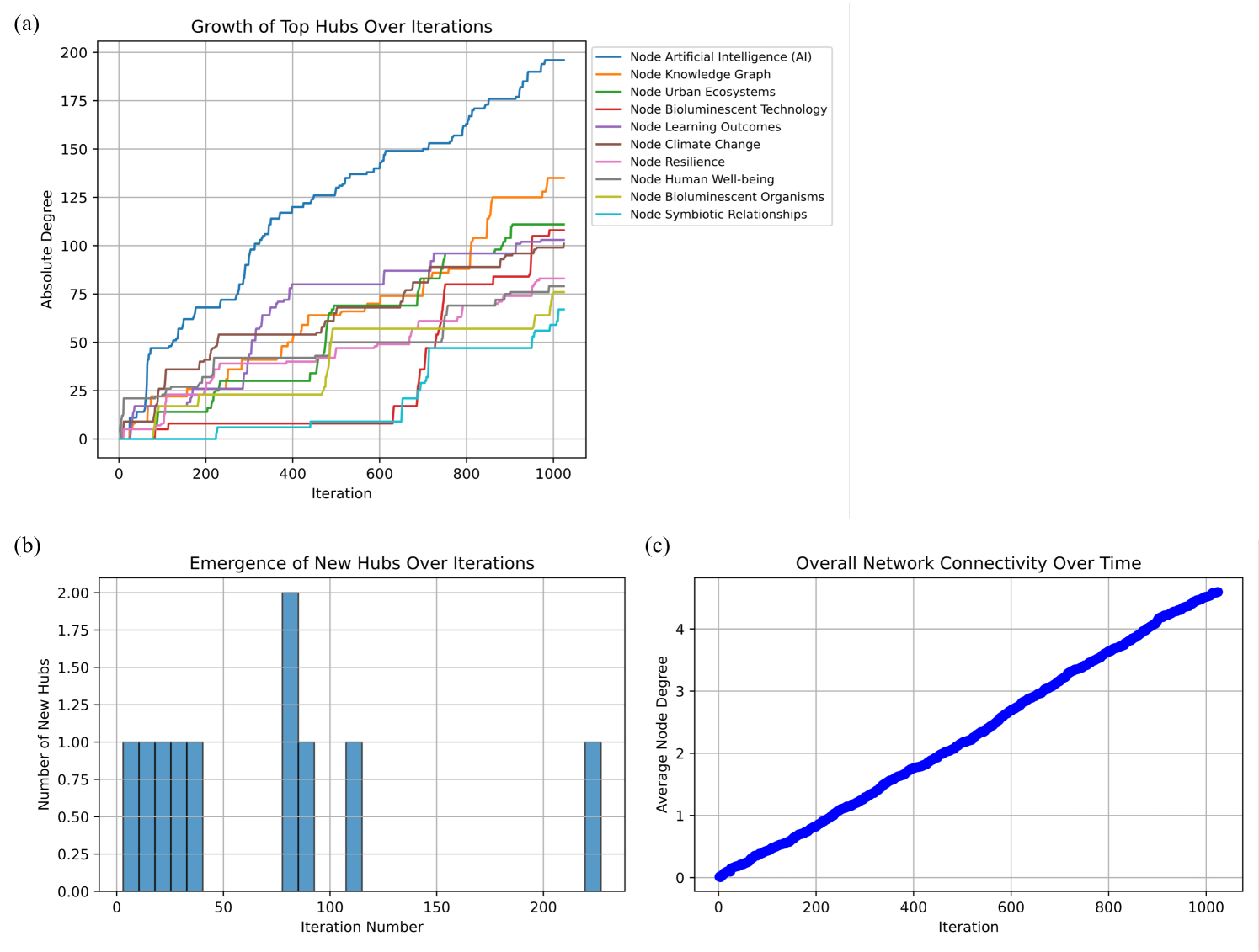
The image presents three charts (a, b, and c) illustrating the growth of network hubs, the emergence of new hubs, and overall network connectivity over iterations. The charts appear to be related to a dynamic network model, potentially representing the evolution of relationships between different nodes representing concepts like Artificial Intelligence, Climate Change, and Symbiotic Relationships.
### Components/Axes
**Chart (a): Growth of Top Hubs Over Iterations**
* **Title:** Growth of Top Hubs Over Iterations
* **X-axis:** Iteration (Scale: 0 to 1000, increments of 100)
* **Y-axis:** Absolute Degree (Scale: 0 to 200, increments of 25)
* **Legend:** Located in the top-right corner. Contains the following nodes with corresponding colors:
* Node Artificial Intelligence (AI) - Brown
* Node Knowledge Graph - Purple
* Node Urban Ecosystems - Light Blue
* Node Bioluminescent Technology - Orange
* Node Learning Outcomes - Red
* Node Climate Change - Green
* Node Resilience - Dark Blue
* Node Human Well-being - Pink
* Node Bioluminescent Organisms - Grey
* Node Symbiotic Relationships - Teal
**Chart (b): Emergence of New Hubs Over Iterations**
* **Title:** Emergence of New Hubs Over Iterations
* **X-axis:** Iteration (Scale: 0 to 200, increments of 50)
* **Y-axis:** Number of New Hubs (Scale: 0 to 2.0, increments of 0.25)
* **Data:** Bar chart with no explicit labels for each bar.
**Chart (c): Overall Network Connectivity Over Time**
* **Title:** Overall Network Connectivity Over Time
* **X-axis:** Iteration (Scale: 0 to 1000, increments of 100)
* **Y-axis:** Average Node Degree (Scale: 0 to 4.5, increments of 0.5)
* **Data:** Line chart with a single blue line and a shaded confidence interval.
### Detailed Analysis or Content Details
**Chart (a): Growth of Top Hubs Over Iterations**
* **Node Artificial Intelligence (AI) (Brown):** The line starts at approximately 0 at iteration 0, rises steadily to around 180 at iteration 1000.
* **Node Knowledge Graph (Purple):** Starts at 0, rises rapidly to around 160 at iteration 1000.
* **Node Urban Ecosystems (Light Blue):** Starts at 0, rises steadily to around 130 at iteration 1000.
* **Node Bioluminescent Technology (Orange):** Starts at 0, rises slowly to around 80 at iteration 1000.
* **Node Learning Outcomes (Red):** Starts at 0, rises moderately to around 100 at iteration 1000.
* **Node Climate Change (Green):** Starts at 0, rises steadily to around 120 at iteration 1000.
* **Node Resilience (Dark Blue):** Starts at 0, rises rapidly to around 170 at iteration 1000.
* **Node Human Well-being (Pink):** Starts at 0, rises slowly to around 60 at iteration 1000.
* **Node Bioluminescent Organisms (Grey):** Starts at 0, rises slowly to around 50 at iteration 1000.
* **Node Symbiotic Relationships (Teal):** Starts at 0, rises moderately to around 90 at iteration 1000.
**Chart (b): Emergence of New Hubs Over Iterations**
* At iteration 0, the number of new hubs is approximately 1.8.
* At iteration 50, the number of new hubs drops to approximately 1.2.
* At iteration 100, the number of new hubs rises to approximately 1.6.
* At iteration 150, the number of new hubs drops to approximately 1.1.
* At iteration 200, the number of new hubs is approximately 1.3.
**Chart (c): Overall Network Connectivity Over Time**
* The line starts at approximately 0.2 at iteration 0.
* The line rises steadily and approximately linearly to around 4.2 at iteration 1000.
* The confidence interval widens slightly over time, indicating increasing uncertainty in the average node degree.
### Key Observations
* In Chart (a), Node Artificial Intelligence (AI) and Node Knowledge Graph consistently exhibit the highest absolute degree, suggesting they are the most prominent hubs in the network.
* The emergence of new hubs (Chart b) fluctuates over iterations, indicating periods of rapid network expansion followed by consolidation.
* Overall network connectivity (Chart c) increases steadily over time, suggesting the network is becoming more densely connected.
* The confidence interval in Chart (c) suggests that while the average node degree is increasing, there is some variability in the connectivity of individual nodes.
### Interpretation
The data suggests a dynamic network model where certain nodes (AI and Knowledge Graph) quickly establish themselves as central hubs. The fluctuating emergence of new hubs indicates a process of continuous network evolution, with new connections and relationships forming over time. The overall increase in network connectivity suggests that the system is becoming more integrated and interconnected. The confidence interval in Chart (c) highlights the inherent complexity of the network, where individual nodes may exhibit varying degrees of connectivity.
The relationship between the charts is clear: the growth of top hubs (a) contributes to the overall network connectivity (c), while the emergence of new hubs (b) drives the dynamic evolution of the network. The choice of nodes (AI, Climate Change, etc.) suggests the model is intended to represent complex systems with interconnected concepts. The model could be used to simulate the spread of information, the evolution of ideas, or the dynamics of complex social or ecological systems. The fact that some nodes grow faster than others suggests that certain concepts or relationships are more influential or resilient than others.