\n
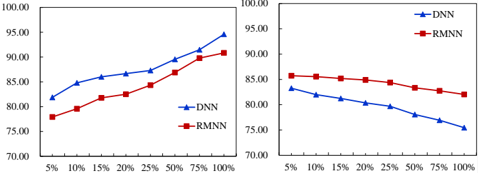
## Line Chart: Performance Comparison of DNN and RNN Models
### Overview
The image presents two line charts side-by-side, comparing the performance of two models, DNN (Deep Neural Network) and RMN (Recurrent Neural Network), across varying percentages of data. The y-axis represents a performance metric (likely accuracy or a similar score), ranging from 70 to 100, while the x-axis represents the percentage of data used, ranging from 5% to 100% in increments of 5%.
### Components/Axes
* **X-axis:** Percentage of Data (5%, 10%, 15%, 20%, 25%, 50%, 75%, 100%)
* **Y-axis:** Performance Score (70 to 100)
* **Data Series 1 (Left Chart):** DNN (represented by a blue line with triangle markers)
* **Data Series 2 (Left Chart):** RMN (represented by a red line with diamond markers)
* **Data Series 1 (Right Chart):** DNN (represented by a blue line with triangle markers)
* **Data Series 2 (Right Chart):** RMN (represented by a red line with diamond markers)
* **Legend (Bottom-Left of Left Chart):** DNN, RMN
* **Legend (Bottom-Right of Right Chart):** DNN, RMN
### Detailed Analysis or Content Details
**Left Chart:**
* **DNN (Blue Line):** The line slopes generally upward, indicating increasing performance with increasing data percentage.
* 5%: ~77
* 10%: ~82
* 15%: ~85
* 20%: ~86
* 25%: ~87
* 50%: ~89
* 75%: ~92
* 100%: ~94
* **RMN (Red Line):** The line also slopes upward, but at a slower rate than DNN.
* 5%: ~77
* 10%: ~80
* 15%: ~82
* 20%: ~84
* 25%: ~86
* 50%: ~89
* 75%: ~90
* 100%: ~91
**Right Chart:**
* **DNN (Blue Line):** The line slopes downward, indicating decreasing performance with increasing data percentage.
* 5%: ~83
* 10%: ~81
* 15%: ~79
* 20%: ~78
* 25%: ~77
* 50%: ~75
* 75%: ~74
* 100%: ~73
* **RMN (Red Line):** The line is relatively flat, with a slight downward trend.
* 5%: ~85
* 10%: ~84
* 15%: ~83
* 20%: ~82
* 25%: ~82
* 50%: ~81
* 75%: ~81
* 100%: ~80
### Key Observations
* In the left chart, DNN consistently outperforms RMN across all data percentages. Both models show improved performance with more data.
* In the right chart, DNN's performance decreases with increasing data, while RMN's performance remains relatively stable. RMN outperforms DNN in this chart.
* The two charts appear to represent different scenarios or datasets, as the trends are opposite.
### Interpretation
The data suggests that the effectiveness of DNN and RMN models is highly dependent on the dataset and the amount of data available. The left chart indicates that DNN benefits significantly from increased data, outperforming RMN. This could be because DNN models are more complex and require more data to learn effectively.
The right chart, however, shows that increasing data actually *decreases* DNN's performance, while RMN remains relatively stable. This could indicate overfitting of the DNN model to the data, or that the dataset contains noise or irrelevant information that negatively impacts DNN's performance as more data is added. RMN, being a simpler model, might be less susceptible to overfitting.
The contrasting trends in the two charts highlight the importance of careful model selection and data preprocessing. It's crucial to consider the characteristics of the dataset and the potential for overfitting when choosing a model and determining the appropriate amount of data to use for training. The charts suggest that DNN is better suited for scenarios where more data is available and beneficial, while RMN might be a better choice when data is limited or potentially noisy.