## Line Graphs: Model Accuracy vs. Training Data Percentage
### Overview
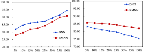
The image contains two side-by-side line graphs comparing the accuracy of two neural network models (DNN and RMNN) across varying percentages of training data. Both graphs share identical axes labels and scales but depict opposing trends: the left graph shows increasing accuracy with more training data, while the right graph shows decreasing accuracy.
### Components/Axes
- **X-Axis (Horizontal):** Labeled "% of Training Data" with markers at 5%, 10%, 15%, 20%, 25%, 50%, 75%, and 100%.
- **Y-Axis (Vertical):** Labeled "Accuracy (%)" with markers from 70.00 to 100.00 in 5% increments.
- **Legends:**
- Left graph: Blue line with triangle markers = DNN; Red line with square markers = RMNN.
- Right graph: Same legend labels and markers.
- **Graph Titles:** Not explicitly labeled, but contextually inferred as "Accuracy vs. Training Data" for both.
### Detailed Analysis
#### Left Graph (Increasing Accuracy)
- **DNN (Blue):**
- Starts at ~82% accuracy at 5% training data.
- Increases steadily to ~95% at 100% training data.
- Key data points:
- 5%: 82.00
- 10%: 85.00
- 20%: 87.00
- 50%: 91.00
- 100%: 95.00
- **RMNN (Red):**
- Starts at ~78% accuracy at 5% training data.
- Rises to ~91% at 100% training data.
- Key data points:
- 5%: 78.00
- 10%: 81.00
- 25%: 85.00
- 50%: 90.00
- 100%: 91.00
#### Right Graph (Decreasing Accuracy)
- **DNN (Blue):**
- Starts at ~84% accuracy at 5% training data.
- Declines to ~75% at 100% training data.
- Key data points:
- 5%: 84.00
- 10%: 82.00
- 20%: 80.00
- 50%: 77.00
- 100%: 75.00
- **RMNN (Red):**
- Starts at ~86% accuracy at 5% training data.
- Declines to ~82% at 100% training data.
- Key data points:
- 5%: 86.00
- 10%: 85.00
- 25%: 84.00
- 50%: 83.00
- 100%: 82.00
### Key Observations
1. **Left Graph Trends:** Both models improve accuracy as training data increases, with DNN consistently outperforming RMNN.
2. **Right Graph Trends:** Both models degrade in accuracy as training data increases, with DNN experiencing a steeper decline.
3. **Contrast:** The left and right graphs represent opposing relationships between training data percentage and accuracy, suggesting differing evaluation contexts (e.g., training vs. validation/test sets).
### Interpretation
- **Left Graph:** Demonstrates typical model behavior where increased training data improves generalization, with DNN benefiting more from additional data.
- **Right Graph:** Indicates potential overfitting or data leakage when training data percentage is high, as accuracy drops sharply. This could reflect evaluation on a fixed test set where more training data introduces noise or bias.
- **Model Comparison:** DNN shows higher sensitivity to training data volume in both scenarios, suggesting architectural differences in handling data scarcity or abundance.
- **Anomaly:** The right graph’s declining trend contradicts standard expectations, warranting investigation into data preprocessing, evaluation methodology, or model hyperparameters.