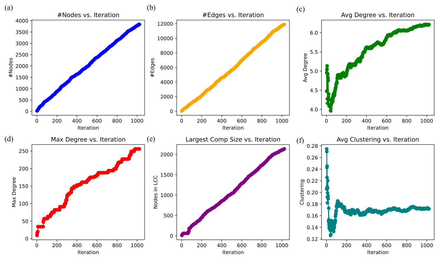
## Line Charts: Network Growth Metrics vs. Iteration
### Overview
The image presents six line charts arranged in a 2x3 grid, each displaying a different network metric plotted against the iteration number. The metrics include the number of nodes, number of edges, average degree, maximum degree, largest component size, and average clustering coefficient. All charts share the same x-axis: "Iteration", ranging from 0 to 1000.
### Components/Axes
* **Overall Layout:** Six line charts labeled (a) through (f), arranged in two rows and three columns.
* **X-Axis (Shared):** "Iteration", with tick marks at 0, 200, 400, 600, 800, and 1000.
* **Chart (a): #Nodes vs. Iteration**
* Y-Axis: "#Nodes", with tick marks at 0, 500, 1000, 1500, 2000, 2500, 3000, 3500, and 4000.
* Data Series: A blue line representing the number of nodes.
* **Chart (b): #Edges vs. Iteration**
* Y-Axis: "#Edges", with tick marks at 0, 2000, 4000, 6000, 8000, 10000, and 12000.
* Data Series: An orange line representing the number of edges.
* **Chart (c): Avg Degree vs. Iteration**
* Y-Axis: "Avg Degree", with tick marks at 4.0, 4.5, 5.0, 5.5, and 6.0.
* Data Series: A green line representing the average degree.
* **Chart (d): Max Degree vs. Iteration**
* Y-Axis: "Max Degree", with tick marks at 0, 50, 100, 150, 200, and 250.
* Data Series: A red line representing the maximum degree.
* **Chart (e): Largest Comp Size vs. Iteration**
* Y-Axis: "Nodes in LCC", with tick marks at 0, 500, 1000, 1500, and 2000.
* Data Series: A purple line representing the number of nodes in the largest connected component (LCC).
* **Chart (f): Avg Clustering vs. Iteration**
* Y-Axis: "Clustering", with tick marks at 0.12, 0.14, 0.16, 0.18, 0.20, 0.22, 0.24, 0.26, and 0.28.
* Data Series: A teal line representing the average clustering coefficient.
### Detailed Analysis
* **#Nodes vs. Iteration (Chart a):** The blue line shows a generally increasing trend. Starting from approximately 0 nodes at iteration 0, the number of nodes increases to approximately 3800 at iteration 1000. The increase is not perfectly linear, showing some fluctuations.
* **#Edges vs. Iteration (Chart b):** The orange line shows a nearly linear increasing trend. Starting from approximately 0 edges at iteration 0, the number of edges increases to approximately 11800 at iteration 1000.
* **Avg Degree vs. Iteration (Chart c):** The green line shows an increasing trend that plateaus. Starting from approximately 4.2 at iteration 0, the average degree increases rapidly until around iteration 200, then continues to increase at a slower rate, reaching approximately 6.2 at iteration 1000.
* **Max Degree vs. Iteration (Chart d):** The red line shows a stepwise increasing trend. Starting from approximately 10 at iteration 0, the maximum degree increases in discrete jumps, reaching approximately 250 at iteration 1000.
* **Largest Comp Size vs. Iteration (Chart e):** The purple line shows an increasing trend. Starting from approximately 0 at iteration 0, the size of the largest connected component increases to approximately 2100 at iteration 1000.
* **Avg Clustering vs. Iteration (Chart f):** The teal line shows a decreasing trend followed by stabilization. Starting from approximately 0.28 at iteration 0, the average clustering coefficient decreases rapidly until around iteration 100, then fluctuates around a value of approximately 0.17 for the remaining iterations.
### Key Observations
* The number of nodes and edges generally increase with iteration.
* The average degree increases and then plateaus, suggesting a limit to how connected nodes become.
* The maximum degree increases in steps, indicating the addition of highly connected nodes at certain iterations.
* The largest component size increases, showing the network becoming more connected.
* The average clustering coefficient decreases initially and then stabilizes, suggesting that while the network grows, the local clustering of nodes does not continue to increase.
### Interpretation
The charts illustrate the evolution of a network as it grows over iterations. The increasing number of nodes and edges indicates network expansion. The average degree reaching a plateau suggests that nodes do not become arbitrarily connected; there might be constraints or preferential attachment mechanisms at play. The stepwise increase in maximum degree could indicate the addition of "hub" nodes at specific points in the network's evolution. The initial decrease and subsequent stabilization of the average clustering coefficient suggest that while the network becomes larger and more connected, the tendency for nodes to form tightly knit clusters does not continue to increase indefinitely. This could be due to the network expanding into new regions or the emergence of a core-periphery structure.