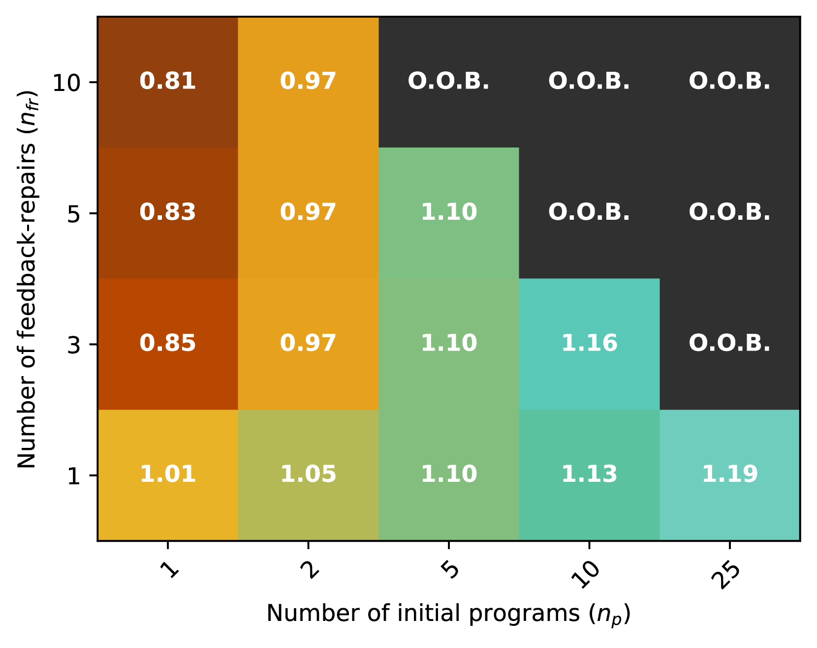
## Heatmap: Relationship Between Initial Programs and Feedback-Repairs
### Overview
The image is a heatmap chart visualizing a numerical metric (unspecified, but likely a performance ratio or efficiency score) across a grid defined by two variables: the "Number of initial programs (n_p)" on the horizontal axis and the "Number of feedback-repairs (n_fr)" on the vertical axis. The chart uses a color gradient from yellow to teal to dark gray to represent the metric's value, with specific numerical values annotated in each cell. Cells marked "O.O.B." indicate values that are "Out Of Bounds" or undefined for that combination.
### Components/Axes
* **X-Axis (Horizontal):** Labeled "Number of initial programs (n_p)". The axis has five discrete, non-linearly spaced tick marks at values: **1, 2, 5, 10, 25**.
* **Y-Axis (Vertical):** Labeled "Number of feedback-repairs (n_fr)". The axis has four discrete tick marks at values: **1, 3, 5, 10**.
* **Legend/Color Scale:** There is no separate legend. The color of each cell corresponds to the numerical value within it, following a gradient:
* **Yellow/Gold:** Represents lower values (approx. 1.01 to 1.05).
* **Light Green/Teal:** Represents mid-range values (approx. 1.10 to 1.19).
* **Dark Brown/Orange:** Represents values below 1.0 (0.81 to 0.97).
* **Dark Gray/Black:** Represents "O.O.B." (Out Of Bounds) cells.
* **Data Grid:** A 4-row (n_fr) by 5-column (n_p) matrix of colored cells, each containing a white text annotation of its value.
### Detailed Analysis
The heatmap data is extracted below, organized by the number of feedback-repairs (n_fr, rows from bottom to top) and the number of initial programs (n_p, columns from left to right).
| n_fr \ n_p | 1 | 2 | 5 | 10 | 25 |
| :--- | :--- | :--- | :--- | :--- | :--- |
| **1** | 1.01 | 1.05 | 1.10 | 1.13 | 1.19 |
| **3** | 0.85 | 0.97 | 1.10 | 1.16 | O.O.B. |
| **5** | 0.83 | 0.97 | 1.10 | O.O.B. | O.O.B. |
| **10** | 0.81 | 0.97 | O.O.B. | O.O.B. | O.O.B. |
**Row 1: n_fr = 1 (Bottom Row)**
* n_p = 1: Color = Yellow. Value = **1.01**
* n_p = 2: Color = Light Yellow-Green. Value = **1.05**
* n_p = 5: Color = Light Green. Value = **1.10**
* n_p = 10: Color = Teal-Green. Value = **1.13**
* n_p = 25: Color = Teal. Value = **1.19**
* *Trend:* Values increase steadily from left to right (1.01 to 1.19).
**Row 2: n_fr = 3**
* n_p = 1: Color = Dark Orange. Value = **0.85**
* n_p = 2: Color = Gold. Value = **0.97**
* n_p = 5: Color = Light Green. Value = **1.10**
* n_p = 10: Color = Teal. Value = **1.16**
* n_p = 25: Color = Dark Gray. Value = **O.O.B.**
* *Trend:* Values increase from left to right until n_p=10, then become O.O.B. at n_p=25.
**Row 3: n_fr = 5**
* n_p = 1: Color = Dark Orange-Brown. Value = **0.83**
* n_p = 2: Color = Gold. Value = **0.97**
* n_p = 5: Color = Light Green. Value = **1.10**
* n_p = 10: Color = Dark Gray. Value = **O.O.B.**
* n_p = 25: Color = Dark Gray. Value = **O.O.B.**
* *Trend:* Values increase from left to right until n_p=5, then become O.O.B. for n_p=10 and 25.
**Row 4: n_fr = 10 (Top Row)**
* n_p = 1: Color = Dark Brown. Value = **0.81**
* n_p = 2: Color = Gold. Value = **0.97**
* n_p = 5: Color = Dark Gray. Value = **O.O.B.**
* n_p = 10: Color = Dark Gray. Value = **O.O.B.**
* n_p = 25: Color = Dark Gray. Value = **O.O.B.**
* *Trend:* Values increase from n_p=1 to n_p=2, then become O.O.B. for all n_p ≥ 5.
### Key Observations
1. **Diagonal Boundary of O.O.B.:** There is a clear diagonal frontier separating defined values from O.O.B. regions. As both n_p and n_fr increase, the combination is more likely to be O.O.B. The boundary runs roughly from the top-middle (n_p=5, n_fr=10) to the bottom-right (n_p=25, n_fr=3).
2. **Value Plateau at n_p=2:** For n_fr ≥ 3, the value at n_p=2 is consistently **0.97**, regardless of the number of feedback-repairs.
3. **Value Plateau at n_p=5:** For n_fr ≤ 5, the value at n_p=5 is consistently **1.10**.
4. **Lowest Values:** The lowest defined values (0.81, 0.83, 0.85) occur at the lowest n_p (1) combined with higher n_fr (10, 5, 3 respectively).
5. **Highest Value:** The highest defined value (**1.19**) occurs at the highest n_p (25) combined with the lowest n_fr (1).
### Interpretation
The heatmap suggests a complex, non-linear relationship between the number of initial programs (n_p) and feedback-repairs (n_fr) on the measured metric. The data implies:
* **Trade-off and Feasibility Frontier:** The O.O.B. region likely represents combinations of parameters that are computationally infeasible, unstable, or yield no valid result. The diagonal boundary indicates that increasing both parameters simultaneously quickly leads to this infeasible region.
* **Diminishing Returns or Saturation:** The consistent values at n_p=2 (0.97) and n_p=5 (1.10) across multiple n_fr levels suggest a saturation point where adding more initial programs (up to that point) yields a predictable outcome regardless of repair attempts. Beyond these points (e.g., n_p=10, 25), the outcome becomes highly dependent on n_fr.
* **Optimal Configuration:** The highest metric value (1.19) is achieved with a high number of initial programs (25) but only a single feedback-repair cycle. This could indicate that for this system, investing heavily in the initial program set is more effective than engaging in extensive iterative repair, provided the initial set is large enough.
* **Performance Degradation with More Repairs:** Counter-intuitively, for a fixed, low number of initial programs (n_p=1), increasing the number of feedback-repairs (n_fr) leads to a *decrease* in the metric (from 1.01 at n_fr=1 down to 0.81 at n_fr=10). This suggests that excessive repair cycles on a poor initial program may be detrimental.
In summary, the chart maps a performance or efficiency landscape, highlighting a clear infeasibility boundary and suggesting that system optimization favors either a large initial investment (high n_p) with minimal repair, or a moderate initial investment with a specific, limited number of repair cycles.