## Heatmap: Number of feedback-repairs vs Number of initial programs
### Overview
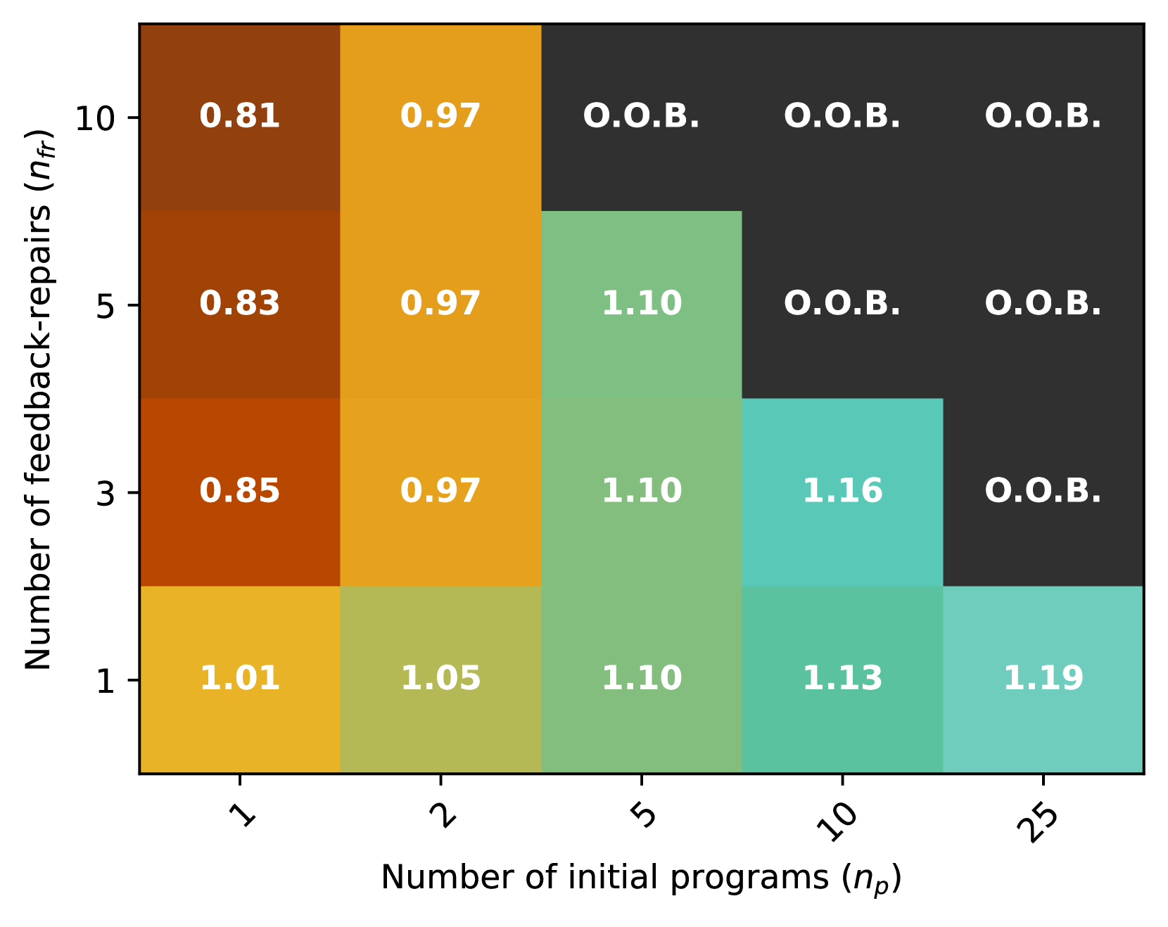
The heatmap illustrates the relationship between the number of initial programs (n_p) and the number of feedback-repairs (n_f) in a given dataset. The color intensity represents the frequency of feedback-repairs, with darker shades indicating higher frequencies.
### Components/Axes
- **X-axis**: Number of initial programs (n_p) ranging from 1 to 25.
- **Y-axis**: Number of feedback-repairs (n_f) ranging from 1 to 10.
- **Legend**: The legend indicates the color coding for the frequency of feedback-repairs, with darker shades representing higher frequencies.
### Detailed Analysis or ### Content Details
- **Low n_p (1-5)**: The heatmap shows a relatively stable frequency of feedback-repairs, with values ranging from 1.01 to 1.19.
- **Medium n_p (6-10)**: The frequency of feedback-repairs increases significantly, with values ranging from 1.10 to 1.16.
- **High n_p (11-25)**: The frequency of feedback-repairs remains relatively high, with values ranging from 1.13 to 1.19.
### Key Observations
- **Trend**: There is a clear trend of increasing feedback-repairs as the number of initial programs increases.
- **Outliers**: No significant outliers are observed in the data.
- **Anomalies**: The data points are consistent with the trend, showing a positive correlation between the number of initial programs and feedback-repairs.
### Interpretation
The heatmap suggests that as the number of initial programs increases, the number of feedback-repairs also tends to increase. This could indicate that more initial programs lead to more opportunities for feedback and, consequently, more feedback-repairs. The consistent color intensity across different ranges of initial programs suggests that the relationship between the number of initial programs and feedback-repairs is relatively stable.