## Candlestick Chart: Stock Price Fluctuation
### Overview
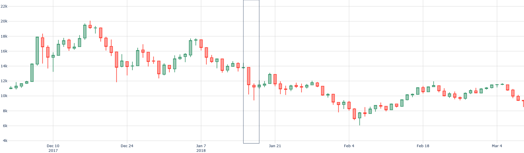
The image presents a candlestick chart illustrating price fluctuations over time. The chart spans from December 2017 to March 2018. The y-axis represents price in thousands (k), ranging from 4k to 22k. The x-axis represents time, marked with dates. The chart uses green and red candlesticks to indicate price increases and decreases, respectively. A vertical grey box highlights a specific time period.
### Components/Axes
* **Y-Axis:** Price (in thousands), ranging from 4k to 22k, with increments of 2k.
* **X-Axis:** Time, labeled with dates: Dec 10 2017, Dec 24, Jan 7 2018, Jan 21, Feb 4, Feb 18, Mar 4.
* **Candlesticks:** Green candlesticks indicate price increases, while red candlesticks indicate price decreases. Each candlestick represents the open, close, high, and low prices for a specific period.
* **Grey Box:** A vertical grey box highlights the period between Jan 7 2018 and Jan 21.
### Detailed Analysis
* **Dec 10 2017 to Dec 24:** The price generally increases from approximately 11k to 20k, with some fluctuations. There are both green and red candlesticks, but the overall trend is upward.
* **Dec 24 to Jan 7 2018:** The price decreases from approximately 20k to 14k. The candlesticks are predominantly red, indicating a downward trend.
* **Jan 7 2018 to Jan 21:** The price continues to decrease, reaching approximately 11k. The candlesticks are mostly red.
* **Jan 21 to Feb 4:** The price decreases further, reaching a low of approximately 7k. The candlesticks are predominantly red.
* **Feb 4 to Feb 18:** The price increases from approximately 7k to 10k. The candlesticks are mostly green, indicating an upward trend.
* **Feb 18 to Mar 4:** The price fluctuates around 10k, with both green and red candlesticks. The overall trend is relatively stable.
### Key Observations
* The period from Dec 10 2017 to Dec 24 shows a significant price increase.
* The period from Dec 24 to Feb 4 shows a significant price decrease.
* The price appears to stabilize around 10k from Feb 18 to Mar 4.
* The grey box highlights a period of price decline.
### Interpretation
The candlestick chart illustrates the volatility of the price over time. The initial increase from Dec 2017 is followed by a significant decline into early February 2018. The price then shows signs of stabilization. The grey box highlights a period of significant price decline, suggesting a period of market correction or negative news. The chart provides a visual representation of market trends and can be used to identify potential buying or selling opportunities.