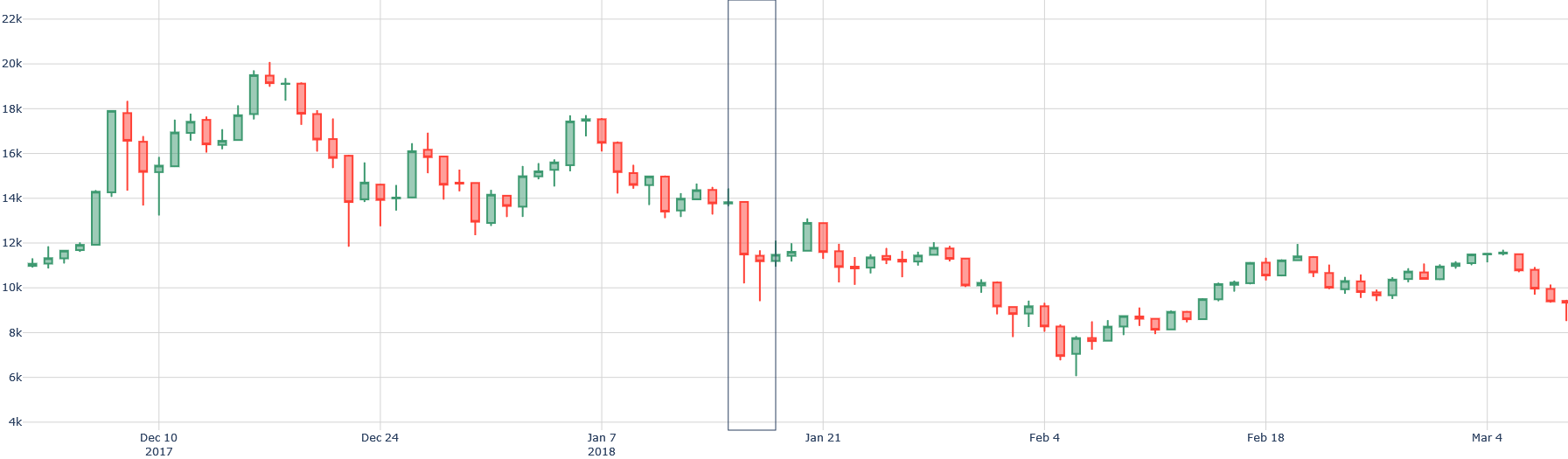
## Candlestick Chart: Bitcoin Price Trend (Dec 2017 - Mar 2018)
### Overview
The image displays a candlestick chart representing the price trend of Bitcoin (likely BTC/USD) from approximately December 10th, 2017, to March 4th, 2018. The chart shows a significant decline in price over this period, starting from a high around 20,000 and falling to approximately 8,000. The chart uses the standard candlestick representation, with green candles indicating price increases and red candles indicating price decreases.
### Components/Axes
* **X-axis:** Represents time, spanning from December 10th, 2017, to March 4th, 2018. Key dates marked are: Dec 10, Dec 24, Jan 7 (2018), Jan 21, Feb 4, Feb 18, and Mar 4.
* **Y-axis:** Represents price, ranging from approximately 4,000 to 22,000 (units not explicitly stated, but assumed to be USD). The scale is linear, with increments of 2,000.
* **Candlesticks:** Each candlestick represents the price movement over a specific time interval (likely daily, but not explicitly stated).
* **Green Candlestick:** Indicates the closing price was higher than the opening price.
* **Red Candlestick:** Indicates the closing price was lower than the opening price.
* **Wicks/Shadows:** The thin lines extending above and below the candlestick body represent the highest and lowest prices reached during that time interval.
* **Vertical Gray Bars:** Two vertical gray bars are present, marking Jan 7 and Jan 21, 2018. Their purpose is not immediately clear, but they may indicate significant events or periods.
### Detailed Analysis
The chart can be divided into three main phases:
1. **December 10th - January 7th (2018):** The price fluctuates between approximately 12,000 and 20,000. There's a general downward trend, but with significant volatility.
* Around Dec 17th: Price is approximately 19,000.
* Around Dec 24th: Price is approximately 16,000.
* Around Jan 7th: Price is approximately 14,000.
2. **January 7th - February 4th (2018):** A steep and rapid decline in price. The price falls from around 14,000 to approximately 6,000.
* Around Jan 21st: Price is approximately 10,000.
* Around Feb 4th: Price is approximately 6,000.
3. **February 4th - March 4th (2018):** The price stabilizes somewhat, fluctuating between approximately 6,000 and 11,000. There's a slight upward trend, but it doesn't recover the losses from the previous phase.
* Around Feb 18th: Price is approximately 9,000.
* Around Mar 4th: Price is approximately 8,000.
It's difficult to provide precise numerical values for each candlestick without higher resolution. However, the general trends are clear.
### Key Observations
* **Significant Downtrend:** The most prominent feature is the dramatic price decline from December 2017 to February 2018.
* **Volatility:** The price exhibits high volatility, especially in the early part of the period (December 2017 - January 2018).
* **Recovery Attempt:** There's a slight recovery attempt in February and March 2018, but it's insufficient to reverse the overall downward trend.
* **Gray Bar Significance:** The vertical gray bars at Jan 7 and Jan 21 may indicate specific events that triggered price movements, but this is speculative without additional context.
### Interpretation
The chart illustrates a major correction in the Bitcoin price following a period of rapid growth in late 2017. The steep decline suggests a significant loss of investor confidence or a market correction after a speculative bubble. The stabilization in February/March 2018 could indicate a bottoming-out process, but the price remains significantly lower than its peak in December 2017. The gray bars could represent news events, exchange issues, or regulatory announcements that impacted the market. The candlestick patterns themselves (long red bodies, short green bodies) suggest strong selling pressure during the downturn and limited buying pressure during the recovery attempts. The chart provides a visual representation of a bear market in Bitcoin during this period.