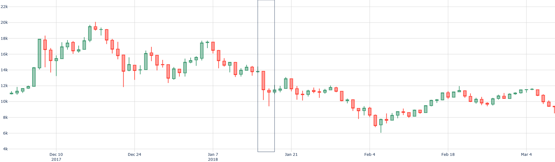
## Candlestick Chart: Price Action (December 2017 - March 2018)
### Overview
This is a financial candlestick chart displaying price movements over a period of approximately three months, from early December 2017 to early March 2018. The chart shows a significant price peak in mid-December, followed by a sustained downtrend with a sharp drop in mid-January, and a partial recovery into March. A prominent vertical line is drawn through the chart around mid-January 2018, likely marking a specific event or date of interest.
### Components/Axes
* **Chart Type:** Candlestick chart.
* **Y-Axis (Vertical):** Represents price. The scale is linear, with major gridlines and labels at 2,000-unit intervals, starting from 4k (4,000) at the bottom and extending to 22k (22,000) at the top. Labels present: `4k`, `6k`, `8k`, `10k`, `12k`, `14k`, `16k`, `18k`, `20k`, `22k`.
* **X-Axis (Horizontal):** Represents time. The axis is labeled with specific dates at roughly two-week intervals. Labels present: `Dec 10 2017`, `Dec 24`, `Jan 7 2018`, `Jan 21`, `Feb 4`, `Feb 18`, `Mar 4`.
* **Legend:** No explicit legend is present. The standard candlestick color convention is used:
* **Green (or hollow) candlesticks:** Indicate the closing price was higher than the opening price for that period (bullish).
* **Red (or filled) candlesticks:** Indicate the closing price was lower than the opening price for that period (bearish).
* **Key Visual Element:** A single, thin, dark vertical line is drawn through the chart, intersecting the X-axis between the `Jan 7 2018` and `Jan 21` labels. Its exact date is approximate but appears to be around January 15-17, 2018.
### Detailed Analysis
**Trend Verification & Data Points:**
1. **Early December 2017 (Bullish Surge):** The chart begins with a strong upward trend. Prices rise from approximately 11k to a peak.
* **Peak:** The highest point on the chart occurs in mid-December. The upper wick of a green candlestick reaches just below the 20k line, approximately **19,800**. The body of the highest candlestick closes around **19,200**.
2. **Late December 2017 (Initial Decline):** Following the peak, a downtrend begins. A series of red candlesticks shows prices falling from ~19k to a local low near **12,000** around December 24-26.
3. **Early January 2018 (Consolidation & Breakdown):** Prices attempt a recovery, rising back to approximately **17,500** by early January. This is followed by a period of choppy, sideways movement between ~14k and ~17k.
4. **Mid-January 2018 (Sharp Drop - Marked by Vertical Line):** Coinciding with the vertical line, a dramatic sell-off occurs. A very long red candlestick shows the price plunging from an open near **13,500** to a close near **10,500**. The lower wick of this candle extends down to approximately **9,500**. This is the most significant single-period decline on the chart.
5. **Late January to Early February 2018 (Continued Downtrend):** The decline continues after the sharp drop, albeit with less volatility. The price makes a series of lower highs and lower lows.
* **Trough:** The lowest point on the chart is reached in early February. The lower wick of a red candlestick dips to approximately **6,000**. The closing prices in this region are around **7,000 - 8,000**.
6. **February to March 2018 (Recovery Phase):** From the early February low, a gradual recovery begins. The chart shows a pattern of higher lows and higher highs, with a predominance of green candlesticks. By early March, the price has recovered to the **11,000 - 12,000** range.
### Key Observations
* **Volatility:** The chart exhibits high volatility, especially during the December peak and the January crash. The length of the candlestick bodies and wicks varies dramatically.
* **The January Crash:** The vertical line highlights a pivotal moment. The price action around this line shows a breakdown from a consolidation pattern, leading to a capitulation move that established the cycle low weeks later.
* **Volume (Inferred):** While not plotted, the size of the candlesticks (particularly the long red one in mid-January) suggests very high trading volume during the sharp decline.
* **Support/Resistance:** The **12,000** level acted as support in late December and was later broken in January, potentially turning into resistance. The **6,000** level established as strong support in early February.
### Interpretation
This chart depicts a classic market cycle of a parabolic rise, a sharp correction, and a subsequent recovery phase, likely for a volatile asset such as a cryptocurrency (the price range and timeframe are consistent with Bitcoin's 2017-2018 bull market and crash).
* **What the data suggests:** The data demonstrates extreme market sentiment shifts. The initial surge reflects euphoric buying. The peak and subsequent decline show profit-taking and the onset of a bearish trend. The sharp drop marked by the vertical line indicates a panic-selling event, possibly triggered by external news (regulatory announcements, exchange hacks, etc.). The final recovery phase suggests a return of cautious buying interest after the asset found a valuation floor.
* **Relationship between elements:** The vertical line is the chart's focal point, separating the initial decline from the final capitulation and subsequent recovery. The X-axis dates provide the temporal framework, showing the entire cycle unfolded over roughly one quarter. The Y-axis quantifies the magnitude of the moves, showing the asset lost approximately **70%** of its peak value (from ~20k to ~6k) before recovering about 50% of that loss.
* **Notable Anomalies:** The most notable anomaly is the sheer speed and magnitude of the decline from the peak, especially the single-period drop in mid-January. This is characteristic of a liquidity crisis or a fundamental shift in market narrative. The recovery, while steady, is notably less volatile than the preceding decline, suggesting a more cautious market sentiment post-crash.
**Language Note:** All text visible in the image is in English.