## Candlestick Chart: Price Movement Analysis (Dec 2017–Mar 2018)
### Overview
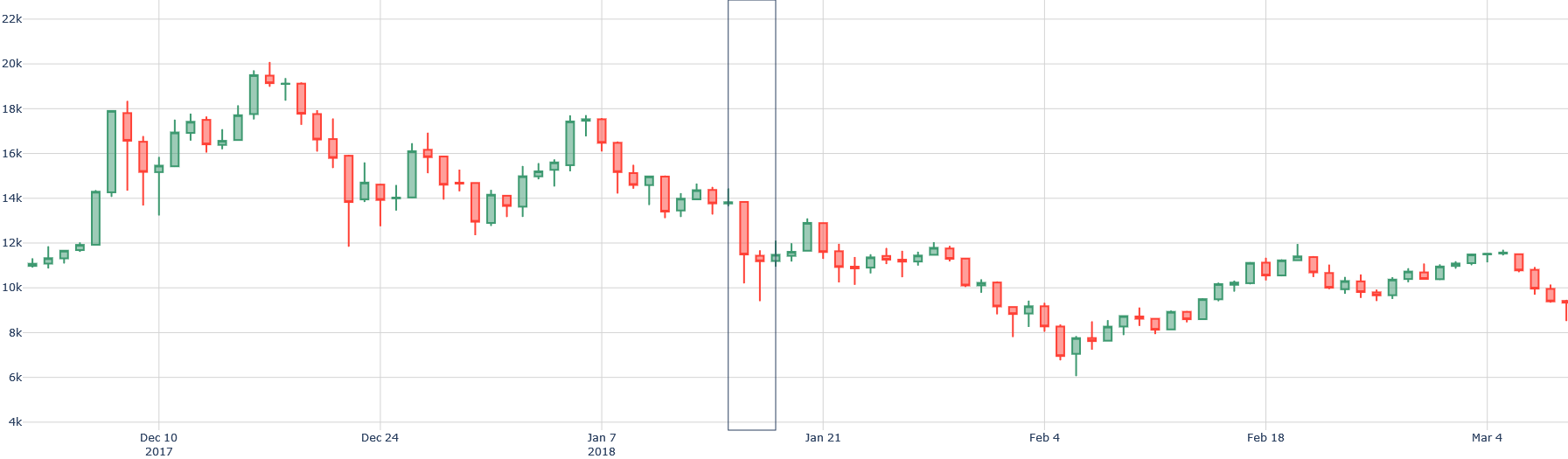
The image displays a candlestick chart tracking price fluctuations over time, with green candlesticks representing upward price movements and red candlesticks indicating downward trends. The chart spans from December 2017 to March 2018, with price values ranging from ~4,000 to ~22,000 units (likely currency or stock index points).
---
### Components/Axes
- **X-Axis (Horizontal)**:
- Labeled with dates:
- December 10, 2017 (leftmost)
- December 24, 2017 (midpoint)
- January 7, 2018 (right of midpoint)
- January 21, 2018 (center-right)
- February 4, 2018 (far right)
- Tick marks at ~1-week intervals.
- **Y-Axis (Vertical)**:
- Labeled with price values in increments of 2,000:
- 4,000 (bottom)
- 6,000
- 8,000
- 10,000
- 12,000
- 14,000
- 16,000
- 18,000
- 20,000
- 22,000 (top).
- **Legend**:
- Located on the right side of the chart.
- Green: Upward price movement (closing price > opening price).
- Red: Downward price movement (closing price < opening price).
---
### Detailed Analysis
1. **Price Trends**:
- **December 2017**:
- Initial upward trend from ~11,000 to ~19,500 (peak ~Dec 15).
- Sharp decline to ~13,000 by December 24.
- **January 2018**:
- Volatile period with a high of ~17,500 (Jan 7) and a low of ~9,500 (Jan 15).
- Gradual recovery to ~12,000 by January 21.
- **February–March 2018**:
- Sideways consolidation between ~8,000 and ~12,000.
- Final upward movement to ~11,500 by March 4.
2. **Key Data Points**:
- **Highest Peak**: ~19,500 (Dec 15, 2017).
- **Lowest Trough**: ~9,500 (Jan 15, 2018).
- **Final Value**: ~11,500 (Mar 4, 2018).
3. **Candlestick Patterns**:
- Large green candlesticks dominate early December, indicating strong buying pressure.
- Red candlesticks with long lower shadows appear in mid-January, suggesting panic selling.
- Smaller green/red candlesticks in February–March reflect indecision and consolidation.
---
### Key Observations
- **Bearish Phase (Dec 15–Jan 15)**:
- A ~50% drop from the December peak to the January trough.
- Sharpest decline occurs between December 24 (~13,000) and January 15 (~9,500).
- **Bullish Reversal (Jan 15–Mar 4)**:
- Recovery of ~20% from the January low to the March value.
- No single candlestick exceeds ~2,000 in size during this period, indicating muted momentum.
- **Volatility Clustering**:
- High volatility in December and January, followed by reduced activity in February–March.
---
### Interpretation
The chart suggests a classic **bearish-to-bullish reversal** pattern. The December–January decline may reflect external factors (e.g., market corrections, economic news), while the February–March recovery hints at renewed investor confidence. The lack of strong upward momentum in March raises questions about sustainability.
- **Notable Anomalies**:
- The January 7 candlestick (~17,500) stands out as a false peak, followed by a steep drop.
- The March 4 closing value (~11,500) is 25% below the December high, suggesting unresolved bearish sentiment.
- **Implications**:
- The chart could represent a stock, cryptocurrency, or commodity index.
- The absence of volume data limits conclusions about liquidity or institutional activity.
- The pattern aligns with a "head and shoulders" formation, though incomplete without additional data.
---
**Note**: All values are approximate, derived from visual estimation of candlestick heights and axis labels. Uncertainty arises from the lack of gridlines and precise numerical annotations.