## Heatmaps: Similarity Matrices for Network Security
### Overview
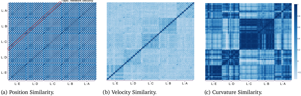
The image presents three heatmaps, labeled (a) Position Similarity, (b) Velocity Similarity, and (c) Curvature Similarity. All three heatmaps share the same axes labels: L:A, L:B, L:C, L:D, and L:E, representing five categories. The color scale ranges from approximately -0.2 to 0.8, indicating the strength of similarity between the categories. The overall topic is "Network Security".
### Components/Axes
* **Axes Labels:** Both the x-axis and y-axis are labeled with "L:A", "L:B", "L:C", "L:D", and "L:E".
* **Color Scale:** A gradient color scale is present on the right side of the image, ranging from dark blue (approximately -0.2) to white (approximately 0.0) to light orange/yellow (approximately 0.8).
* **Titles:** Each heatmap has a title indicating the type of similarity being represented: "Position Similarity", "Velocity Similarity", and "Curvature Similarity".
* **Arrangement:** The three heatmaps are arranged horizontally, side-by-side.
### Detailed Analysis or Content Details
**Heatmap (a): Position Similarity**
* **Trend:** A strong diagonal line is visible, indicating high similarity between each category and itself. Above and below the diagonal, the heatmap shows a gradient of similarity, with values decreasing as you move away from the diagonal.
* **Data Points:**
* L:A vs L:A: ~0.8
* L:B vs L:B: ~0.8
* L:C vs L:C: ~0.8
* L:D vs L:D: ~0.8
* L:E vs L:E: ~0.8
* L:A vs L:B: ~0.2
* L:A vs L:C: ~0.1
* L:A vs L:D: ~0.05
* L:A vs L:E: ~0.0
* L:B vs L:A: ~0.2
* L:B vs L:C: ~0.3
* L:B vs L:D: ~0.2
* L:B vs L:E: ~0.1
* L:C vs L:A: ~0.1
* L:C vs L:B: ~0.3
* L:C vs L:D: ~0.4
* L:C vs L:E: ~0.3
* L:D vs L:A: ~0.05
* L:D vs L:B: ~0.2
* L:D vs L:C: ~0.4
* L:D vs L:E: ~0.5
* L:E vs L:A: ~0.0
* L:E vs L:B: ~0.1
* L:E vs L:C: ~0.3
* L:E vs L:D: ~0.5
**Heatmap (b): Velocity Similarity**
* **Trend:** Similar to (a), a strong diagonal line indicates high self-similarity. However, the off-diagonal values are generally lower and more dispersed than in (a). There is a noticeable pattern of higher similarity between adjacent categories.
* **Data Points:** (Values are approximate due to the granularity of the heatmap)
* L:A vs L:A: ~0.8
* L:B vs L:B: ~0.8
* L:C vs L:C: ~0.8
* L:D vs L:D: ~0.8
* L:E vs L:E: ~0.8
* L:A vs L:B: ~0.1
* L:A vs L:C: ~0.0
* L:A vs L:D: ~0.0
* L:A vs L:E: ~0.0
* L:B vs L:A: ~0.1
* L:B vs L:C: ~0.4
* L:B vs L:D: ~0.2
* L:B vs L:E: ~0.0
* L:C vs L:A: ~0.0
* L:C vs L:B: ~0.4
* L:C vs L:D: ~0.6
* L:C vs L:E: ~0.3
* L:D vs L:A: ~0.0
* L:D vs L:B: ~0.2
* L:D vs L:C: ~0.6
* L:D vs L:E: ~0.5
* L:E vs L:A: ~0.0
* L:E vs L:B: ~0.0
* L:E vs L:C: ~0.3
* L:E vs L:D: ~0.5
**Heatmap (c): Curvature Similarity**
* **Trend:** This heatmap exhibits a more complex pattern than (a) and (b). While the diagonal remains strong, there are multiple areas of high similarity off-diagonal, creating a checkerboard-like pattern.
* **Data Points:** (Values are approximate)
* L:A vs L:A: ~0.8
* L:B vs L:B: ~0.8
* L:C vs L:C: ~0.8
* L:D vs L:D: ~0.8
* L:E vs L:E: ~0.8
* L:A vs L:B: ~0.4
* L:A vs L:C: ~0.2
* L:A vs L:D: ~0.1
* L:A vs L:E: ~0.0
* L:B vs L:A: ~0.4
* L:B vs L:C: ~0.6
* L:B vs L:D: ~0.3
* L:B vs L:E: ~0.1
* L:C vs L:A: ~0.2
* L:C vs L:B: ~0.6
* L:C vs L:D: ~0.5
* L:C vs L:E: ~0.3
* L:D vs L:A: ~0.1
* L:D vs L:B: ~0.3
* L:D vs L:C: ~0.5
* L:D vs L:E: ~0.6
* L:E vs L:A: ~0.0
* L:E vs L:B: ~0.1
* L:E vs L:C: ~0.3
* L:E vs L:D: ~0.6
### Key Observations
* All three heatmaps demonstrate high self-similarity (diagonal).
* Position Similarity (a) shows a relatively smooth gradient of similarity.
* Velocity Similarity (b) exhibits higher similarity between adjacent categories.
* Curvature Similarity (c) displays a more complex, checkerboard-like pattern, suggesting non-adjacent categories can also be highly similar.
### Interpretation
These heatmaps likely represent the relationships between different network security features or events, categorized as L:A through L:E.
* **Position Similarity** could represent the correlation of where events occur within the network. A strong diagonal indicates events are most similar when they happen in the same location.
* **Velocity Similarity** might indicate the correlation of the rate of change of network traffic or event frequency. The higher similarity between adjacent categories suggests events with similar rates of change are more related.
* **Curvature Similarity** is the most complex. Curvature could represent the rate of change of velocity, or the complexity of the event. The checkerboard pattern suggests that events can be similar based on their complexity, even if they are not close in position or velocity alone.
The differences between the heatmaps suggest that different aspects of network security events are correlated in different ways. Analyzing these relationships can help identify patterns, anomalies, and potential security threats. The checkerboard pattern in Curvature Similarity is particularly interesting, as it suggests that complex relationships exist that are not immediately apparent from position or velocity alone. Further investigation into what L:A through L:E represent is needed to fully understand the implications of these findings.