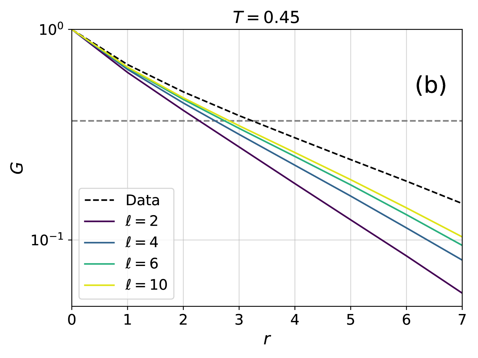
## Line Graph: G vs. r at T = 0.45
### Overview
The image is a semi-logarithmic line graph plotting the variable **G** (y-axis, logarithmic scale from 10⁻¹ to 10⁰) against **r** (x-axis, linear scale from 0 to 7). The graph includes five data series: a dashed black line labeled "Data" and four solid lines representing different values of **l** (2, 4, 6, 10). All lines slope downward from the top-left to the bottom-right, with the dashed "Data" line consistently above the others.
### Components/Axes
- **X-axis (r)**: Linear scale from 0 to 7, labeled "r".
- **Y-axis (G)**: Logarithmic scale from 10⁻¹ to 10⁰, labeled "G".
- **Legend**: Located in the bottom-left corner, with the following entries:
- Dashed black line: "Data"
- Solid purple line: **l = 2**
- Solid blue line: **l = 4**
- Solid green line: **l = 6**
- Solid yellow line: **l = 10**
- **Title**: "T = 0.45" is displayed in the top-right corner.
### Detailed Analysis
1. **Data Series**:
- **Dashed Black Line ("Data")**: Starts near (0, 10⁰) and slopes downward to approximately (7, 10⁻¹).
- **Solid Purple Line (l = 2)**: Starts near (0, 10⁰) and slopes steeply downward to (7, ~10⁻¹.5).
- **Solid Blue Line (l = 4)**: Starts near (0, 10⁰) and slopes less steeply than l = 2, ending at (7, ~10⁻¹).
- **Solid Green Line (l = 6)**: Starts near (0, 10⁰) and slopes gently, ending at (7, ~10⁻¹).
- **Solid Yellow Line (l = 10)**: Starts near (0, 10⁰) and slopes the least steeply, ending at (7, ~10⁻¹).
2. **Key Trends**:
- All lines intersect at the origin (0, 10⁰), suggesting a shared initial condition.
- The "Data" line (dashed black) remains consistently above the other lines across all **r** values, indicating it represents a distinct dataset or condition.
- Lines for higher **l** values (e.g., l = 10) exhibit shallower slopes, suggesting weaker dependence of **G** on **r** for larger **l**.
3. **Spatial Grounding**:
- Legend is positioned in the bottom-left corner, clearly associating colors with labels.
- Title "T = 0.45" is anchored in the top-right corner, separate from the main graph.
- Axis labels are placed adjacent to their respective axes (left for **G**, bottom for **r**).
### Key Observations
- The "Data" line (dashed black) does not correspond to any **l** value and likely represents empirical measurements or a reference dataset.
- Lines for **l = 2** and **l = 4** show the steepest declines, implying stronger sensitivity of **G** to **r** for smaller **l**.
- The logarithmic y-axis compresses the range of **G** values, emphasizing relative changes rather than absolute differences.
### Interpretation
The graph demonstrates an inverse relationship between **G** and **r**, with the magnitude of **G** decreasing as **r** increases. The parameter **l** modulates this relationship: smaller **l** values (e.g., 2, 4) produce steeper declines in **G**, while larger **l** values (e.g., 6, 10) result in gentler slopes. The "Data" line’s consistent elevation above the modeled lines suggests it may represent a baseline or control condition, or it could reflect experimental measurements that deviate from theoretical predictions. The logarithmic scale highlights proportional changes, which is critical for interpreting trends in systems where **G** spans orders of magnitude.
The parameter **T = 0.45** (likely temperature or a similar variable) may influence the scaling of **G** and **r**, but its exact role is not explicitly defined in the graph. Further context would be needed to link **T** to the observed trends.