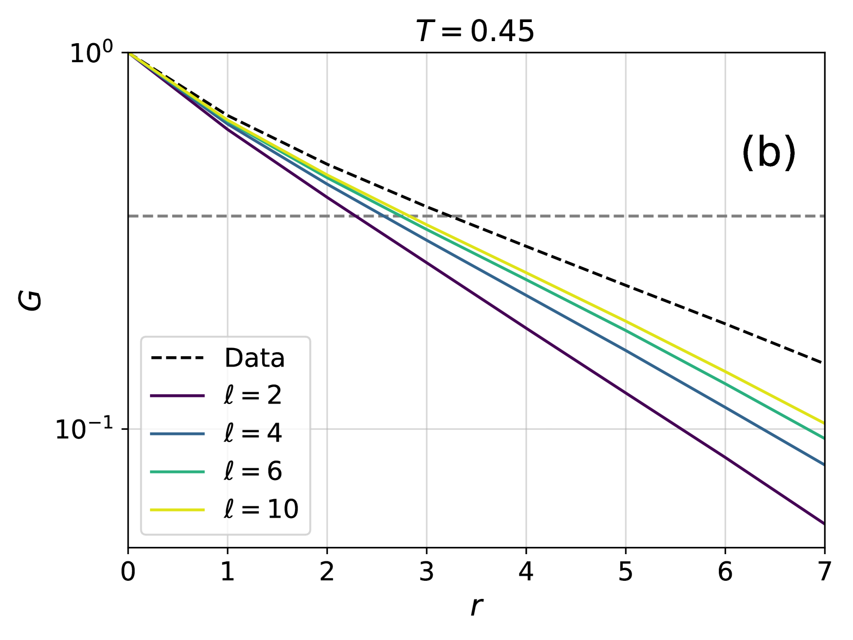
## Chart: Correlation Function G vs. Distance r
### Overview
The image is a semi-logarithmic plot showing the correlation function G as a function of distance r for different values of a parameter 'l' at a fixed temperature T = 0.45. The plot includes a "Data" series represented by a dashed line, and four other series for l = 2, 4, 6, and 10, each represented by a solid line of different colors. A horizontal dashed line is present at approximately G = 0.25.
### Components/Axes
* **Title:** T = 0.45
* **X-axis:** r (distance), linear scale from 0 to 7.
* Axis markers: 0, 1, 2, 3, 4, 5, 6, 7
* **Y-axis:** G (correlation function), logarithmic scale from 10<sup>-1</sup> to 10<sup>0</sup> (0.1 to 1).
* Axis markers: 10<sup>-1</sup>, 10<sup>0</sup>
* **Legend:** Located in the bottom-left corner.
* Data: Black dashed line
* l = 2: Dark purple solid line
* l = 4: Dark blue-grey solid line
* l = 6: Green solid line
* l = 10: Yellow-green solid line
* **Annotation:** "(b)" in the top-right corner.
* **Horizontal Line:** Dashed grey line at approximately G = 0.25
### Detailed Analysis
* **Data (Black Dashed Line):** Starts at G = 1 at r = 0 and decreases to approximately G = 0.15 at r = 7. The trend is downward, indicating a decreasing correlation with increasing distance.
* r = 0, G = 1
* r = 7, G ≈ 0.15
* **l = 2 (Dark Purple Solid Line):** Starts at G = 1 at r = 0 and decreases to approximately G = 0.03 at r = 7. This line has the steepest downward slope.
* r = 0, G = 1
* r = 7, G ≈ 0.03
* **l = 4 (Dark Blue-Grey Solid Line):** Starts at G = 1 at r = 0 and decreases to approximately G = 0.07 at r = 7.
* r = 0, G = 1
* r = 7, G ≈ 0.07
* **l = 6 (Green Solid Line):** Starts at G = 1 at r = 0 and decreases to approximately G = 0.09 at r = 7.
* r = 0, G = 1
* r = 7, G ≈ 0.09
* **l = 10 (Yellow-Green Solid Line):** Starts at G = 1 at r = 0 and decreases to approximately G = 0.1 at r = 7. This line has the shallowest downward slope among the 'l' series.
* r = 0, G = 1
* r = 7, G ≈ 0.1
* **Horizontal Dashed Line:** Located at G ≈ 0.25, it serves as a reference point.
### Key Observations
* All data series start at G = 1 when r = 0.
* The correlation function G decreases with increasing distance r for all values of 'l' and for the "Data" series.
* The rate of decrease of G with respect to r is most rapid for l = 2 and least rapid for l = 10.
* As 'l' increases, the curves become less steep, indicating a slower decay of the correlation function with distance.
* The "Data" series lies above all the 'l' series, indicating a slower decay of correlation compared to the model with specific 'l' values.
### Interpretation
The plot illustrates how the correlation function G decays with distance r at a fixed temperature T = 0.45. The different values of 'l' represent different parameters in a model, and the plot shows how these parameters affect the spatial correlation. The "Data" series represents experimental or simulation results, and the comparison with the 'l' series indicates how well the model fits the data for different parameter values. The fact that the "Data" series decays slower than any of the individual 'l' series suggests that the model may need to be refined or that a combination of different 'l' values might better represent the actual data. The horizontal line at G = 0.25 provides a visual reference for comparing the decay rates of the different series.